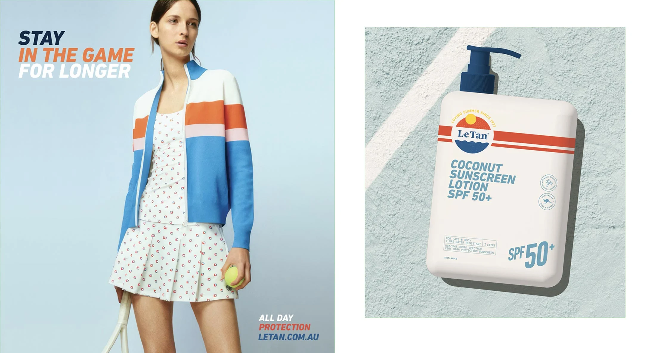
LE TAN
An iconic Australian brand for nearly 50 years, our rebrand for Le Tan embraces a nostalgic but fresh and contemporary appeal.
Innovation is paramount in the minds of the customer in the SPF suncare and sunless tanning categories.
Ludbrook Agency was engaged to develop a brand refresh for Le Tan, evolving the visual identity of one of Australia’s most recognised suncare and tanning brands for a more contemporary beauty market.
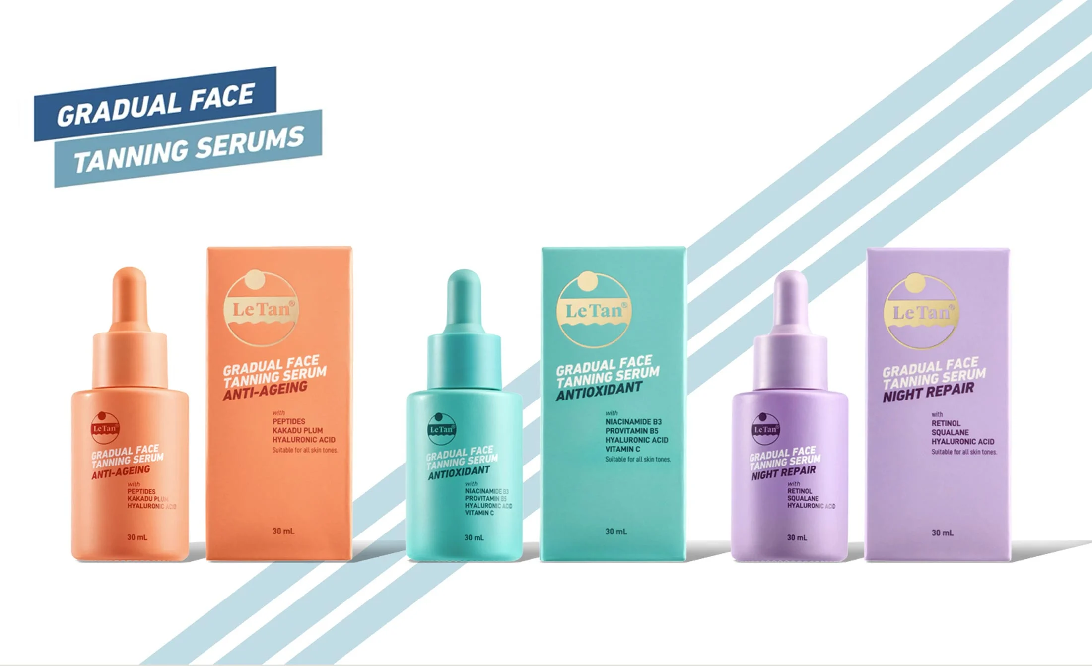
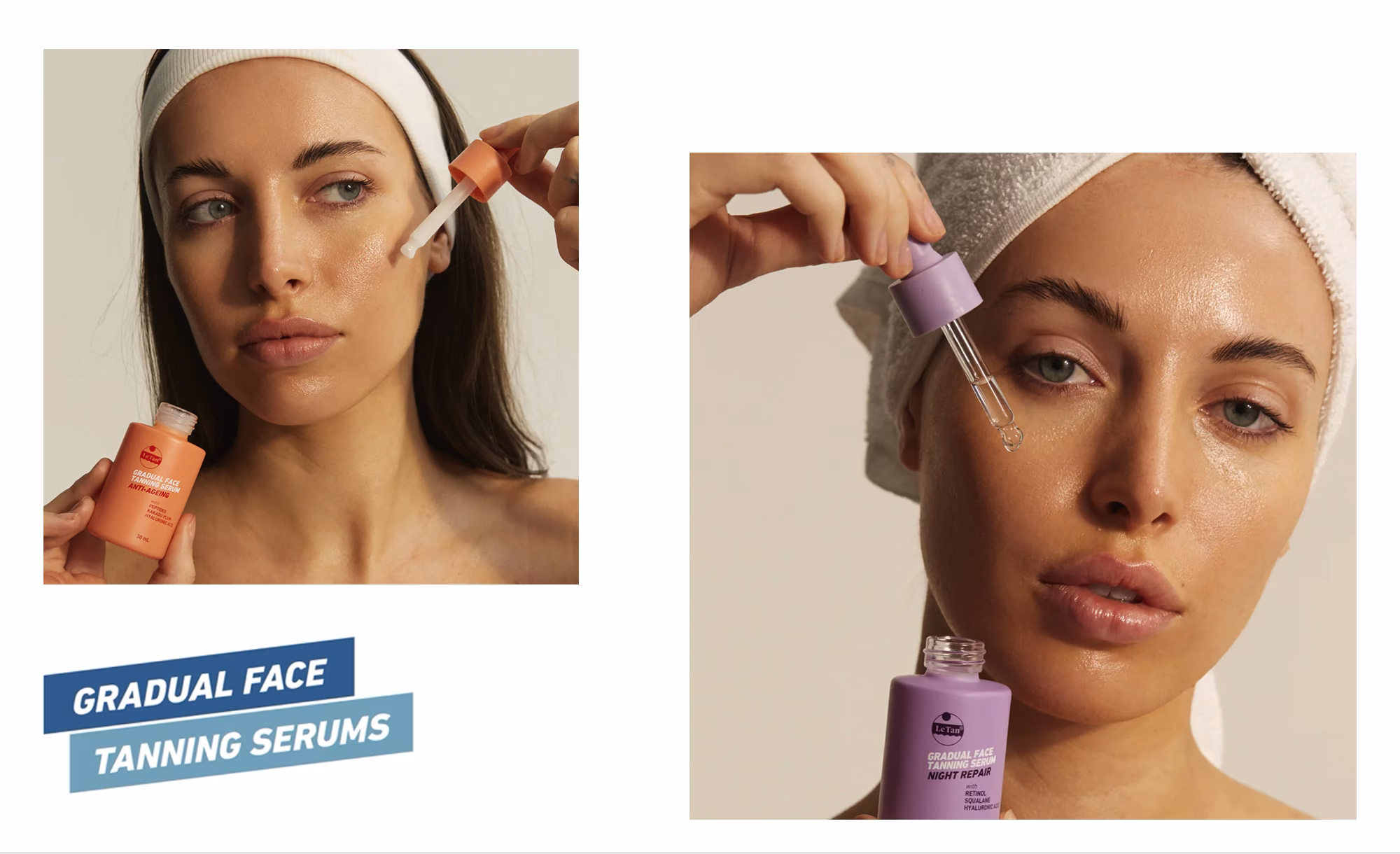
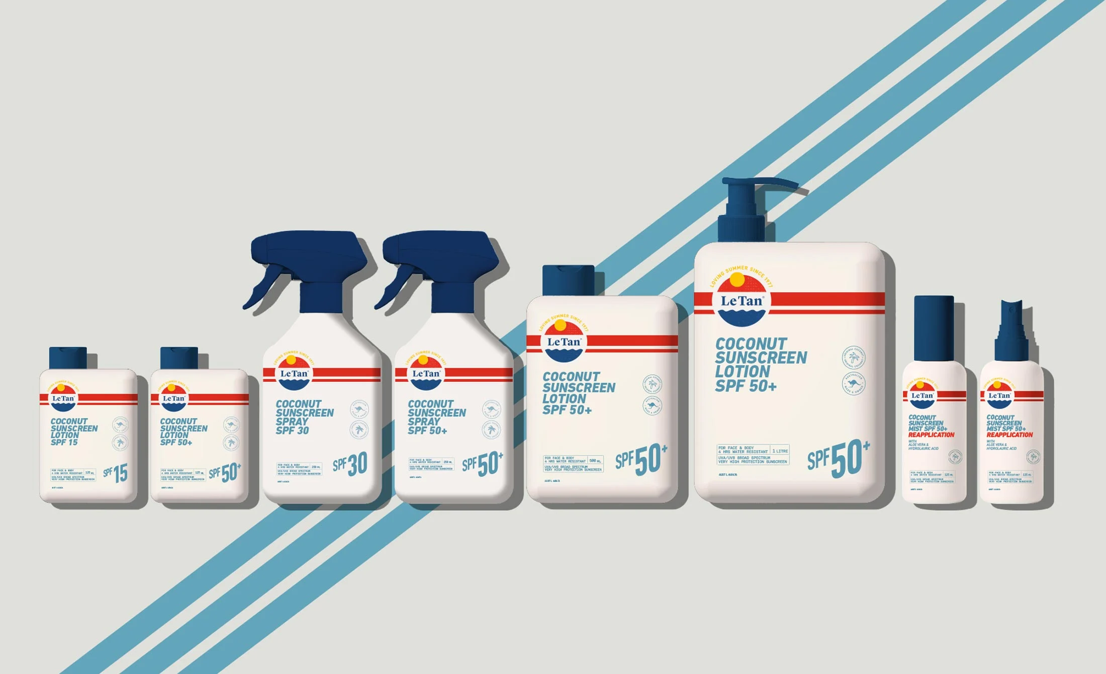
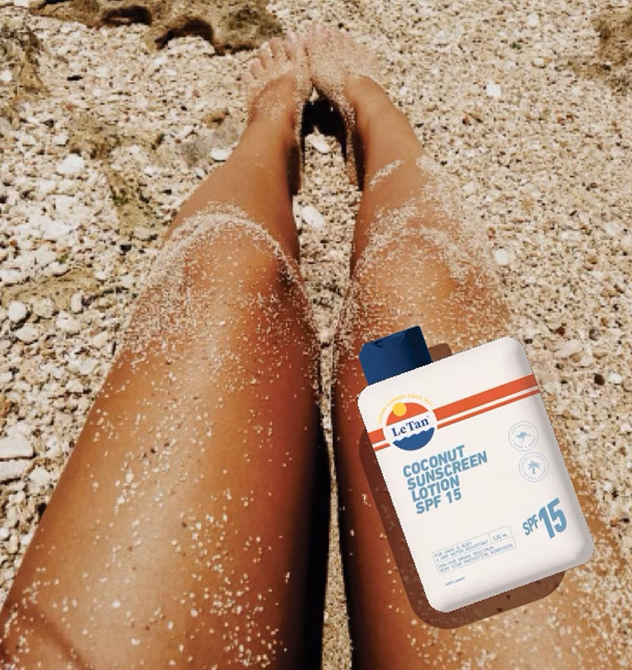
While the broader rebrand has not yet been fully rolled out, the new direction has been applied across selected product ranges, including Le Tan’s skincare-led face tanning serums and coconut sunscreen products.
The work brings a more refined, benefit-led and beauty-focused expression to the brand, while retaining the accessibility and familiarity that have made Le Tan a household name.
Scope
Brand Strategy
Brand Identity
Brand Guidelines
Retail POS Display
Packaging Design
Marketing Collateral
The Challenge:
The challenge was to reposition a well-known Australian brand without losing its familiarity.
Le Tan already had strong recognition in the SPF suncare and sunless tanning categories, but the visual identity needed to evolve for a more competitive beauty environment. The brand needed to feel cleaner, more modern and more premium, while still remaining approachable and easy to understand at retail.
The selected product ranges also had different category requirements. The serum range needed to communicate skincare efficacy and facial beauty cues, while the coconut sunscreen products needed to retain the warmth, ease and summer appeal expected of SPF suncare.
The rebrand therefore needed to create a flexible identity system — one that could elevate the brand as a whole, while adapting clearly across product lines.
BRAND STRATEGY & POSITIONING
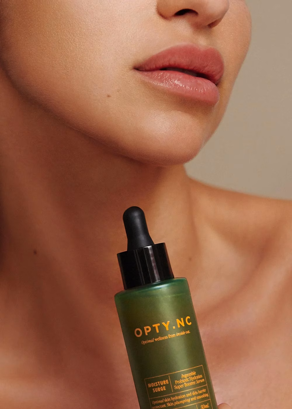
We created the “Optimiser” brandmark to visually represent the healthy glow achieved by improved immune function through product use for skin, gut, hair and nail health.
The use of foils and metallic textures on product packaging elucidates the concept of inner glow, as do the use of fluoro orange artwork printed directly onto the frosted forest green serum bottles.
Positioned as an inclusive and accessible brand, we created an extensive photograph library showing age, race and gender diversity.
VISUAL IDENTITY
The visual identity was evolved to give Le Tan a more refined and future-facing brand expression.
Across the packaging, the design approach focused on clarity, hierarchy and shelf impact. Product benefits were made easier to navigate, while the overall presentation became more polished and beauty-led.
For the face tanning serums, the refreshed identity introduced a more skincare-focused sensibility, helping the products feel treatment-oriented and aligned with contemporary facial care. For the coconut sunscreen range, the design retained a bright, summery suncare character while refining the visual language to feel cleaner and more considered.
Together, these applications show how the new brand direction can stretch across Le Tan’s core categories, from SPF suncare to sunless tanning and skincare-led innovation.