OPTY.NC BEAUTY SUPPLEMENT
Brand Strategy, Identity & Product Architecture for a Next-Generation Ingestible Beauty Brand.
Services Provided
Services Provided
Brand Positioning Strategy
Brand Identity
Verbal & Verbal Identity
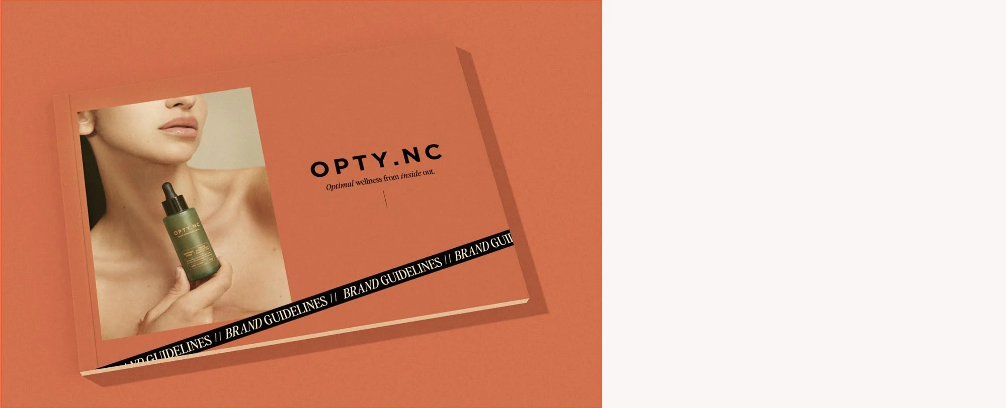
Brand Guidelines
Visual Identity Design
Packaging Design
Campaign Photography
OPTY.NC is an award-winning ingestible beauty brand redefining skincare through a gut-first, science-led approach. Positioned at the intersection of wellness and premium beauty, the brand delivers multi-benefit formulations designed to support skin health from within.
With strong clinical foundations and proprietary formulations already in place, the opportunity was to elevate the brand into a more sophisticated, design-led space — one capable of competing within premium beauty, not just supplements. It is one of our most awarded health and wellness branding projects — a complete transformation from supplement packaging design through to campaign photography and brand architecture.
The Challenge:
ELEVATING THE IDENTITY FROM
SUPPLEMENT TO BEAUTY BRAND
Despite strong product efficacy, OPTY.NC was being perceived as a supplement brand—limiting its ability to command a premium position within the beauty and wellness market.
The category itself is highly fragmented: dominated either by overly clinical brands lacking emotional resonance, or lifestyle-led brands without scientific credibility. OPTY.NC sat between these two extremes, without a clearly defined identity.
The challenge was to reposition the brand as a desirable, credible beauty brand grounded in science —one that could sit confidently alongside premium skincare while maintaining trust and authority. At the same time, the brief called for a vibrant and distinctive visual identity that would stand out in a highly competitive, social-first landscape.
This required a complete rethinking of how the brand was structured, expressed and experienced across every touchpoint. It is the kind of brief that sits at the heart of our wellness branding practice — where science, design, and commercial strategy must work as one.
Brand Strategy:
OPTIMAL WELLNESS FROM INSIDE OUT
Following a collaborative workshop with key stakeholders, we established a clear strategic foundation centred on a simple but powerful idea: skin health starts within. From this, we defined OPTY.NC not as a supplement brand, but as a complete ingestible clinical skincare system—a shift that reframed both perception and category positioning.
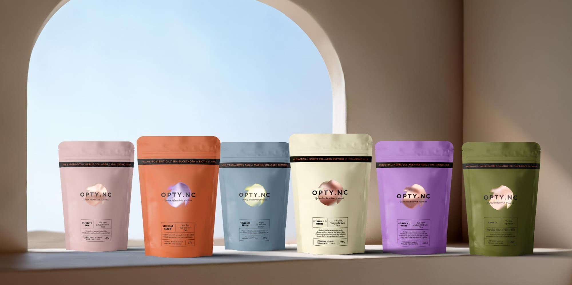
A key part of this was restructuring the product range into a clear, scalable architecture—designed around life stages and evolving biological needs.
Each product functions as an all-in-one solution, simplifying daily routines, improving compliance, and supporting consistent use. All formulations are built on clinically studied ingredients, delivered at proven effective dosages.
The result is a brand system that transforms a complex offering into an intuitive journey—supporting both consumer understanding and professional recommendation, while creating a platform for long-term innovation and growth.
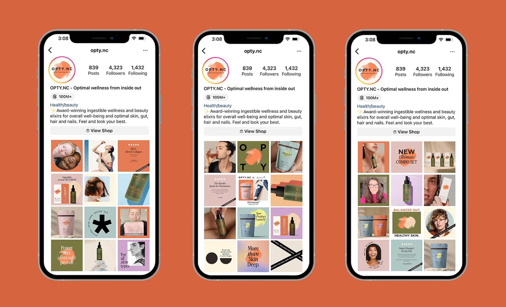
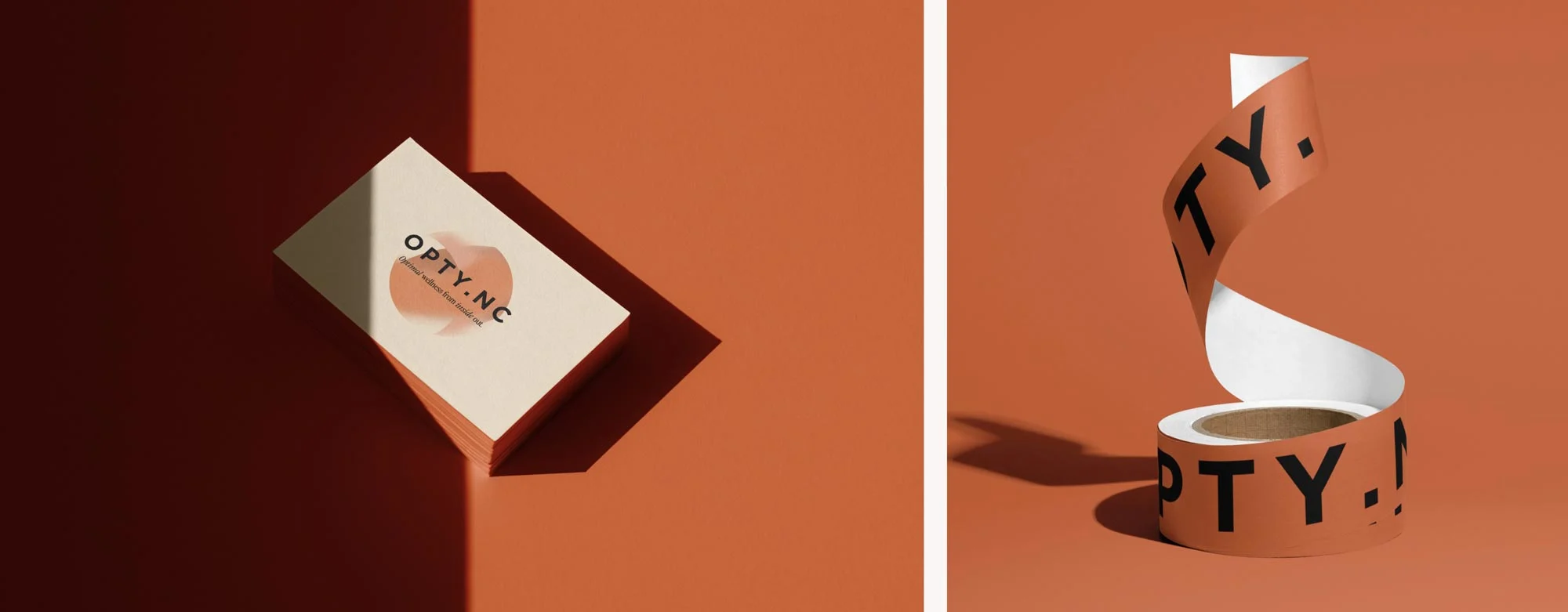
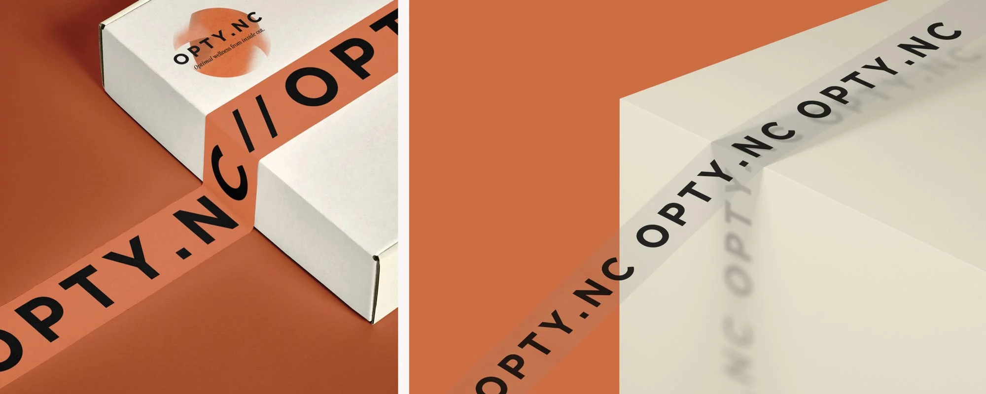
The OPTY.NC master logo was designed for distinctiveness across both retail and digital environments. The logotype introduces a refined, European sensibility, while the Optimiser brandmark creates a soft, organic counterpoint—referencing the visible glow achieved through inner health.
Verbal Identity & Messaging:
Making Science Easy to Digest
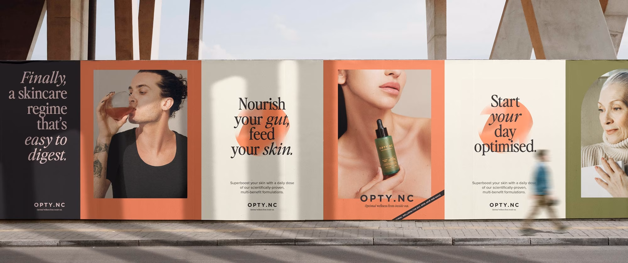
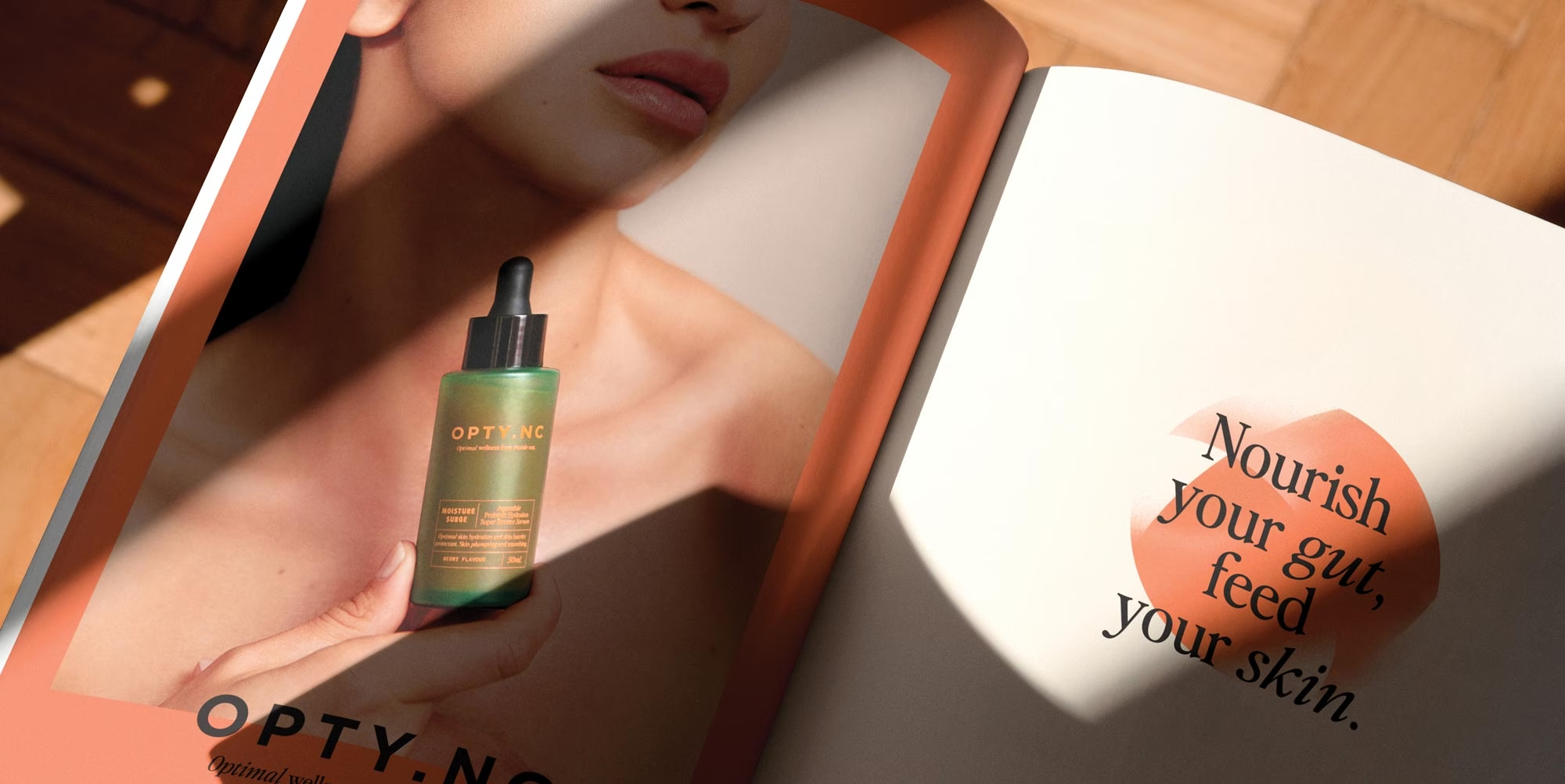
A core part of the transformation was defining how the brand speaks. OPTY.NC communicates complex science with clarity—distilling it into language that feels intuitive, human and easy to act on.
Built around the idea of wellness from the inside out, the messaging system reduces complexity into a set of clear, repeatable statements.
Confident, conversational and precise, the voice balances authority with approachability—ensuring the brand is as easy to understand as it is to trust.
Visual Identity System:
A Contemporary, Ownable Brand World
The visual identity was designed to elevate OPTY.NC into a premium, design-led beauty space while retaining a sense of clarity and function.
A distinctive colour palette—balancing ochres, botanicals and mineral tones—draws from both nature and science, reinforcing the brand’s inside-out philosophy. Typography combines expressive character with clinical precision, allowing the brand to move fluidly between editorial storytelling and product communication.
At the centre of the system is the “Optimiser” device—a fluid, organic brandmark used to differentiate products and create a cohesive visual language across the range.
Imagery direction balances clean beauty—dewy “skin-first” photography, editorial, expressive compositions, with clear, functional product presentation.
Positioned as an inclusive and accessible brand, we created an extensive photograph library showing age, race and gender diversity.
The result is a brand world that feels modern, confident and distinctive, while remaining grounded in performance and credibility.
We developed comprehensive brand guidelines to ensure consistency across every touchpoint, including: brand positioning, verbal identity, logo usage and typography system, colour palette, packaging, photography and video direction, social media visual guidelines, and retail point of sale applications.
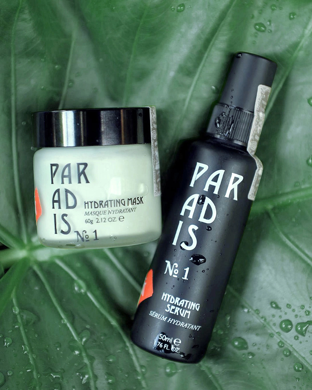
PACKAGING:
CREATING A TACTILE, SENSORY FIRST IMPRESSION THAT LASTS
Packaging was approached as a critical brand touchpoint-designed not only to communicate, but to be physically experienced. Tactile finishes were used deliberately to enhance perception, with material contrast and surface detail creating a more memorable and engaging interaction at first touch.
Foils and metallic substrates were introduced to express the idea of inner glow—a visual cue grounded in the brand’s inside-out philosophy.
For the stand-up pouches, selected for their ability to preserve product integrity, we developed a custom print technique to reveal the metallic aluminium substrate in controlled areas.
By printing a white base layer and knocking back the Optimiser graphic, the foil subtly emerges through the surface—creating a soft, luminous effect that shifts with light.
The result is a finish that feels refined and considered—elevating the product beyond conventional supplement packaging.
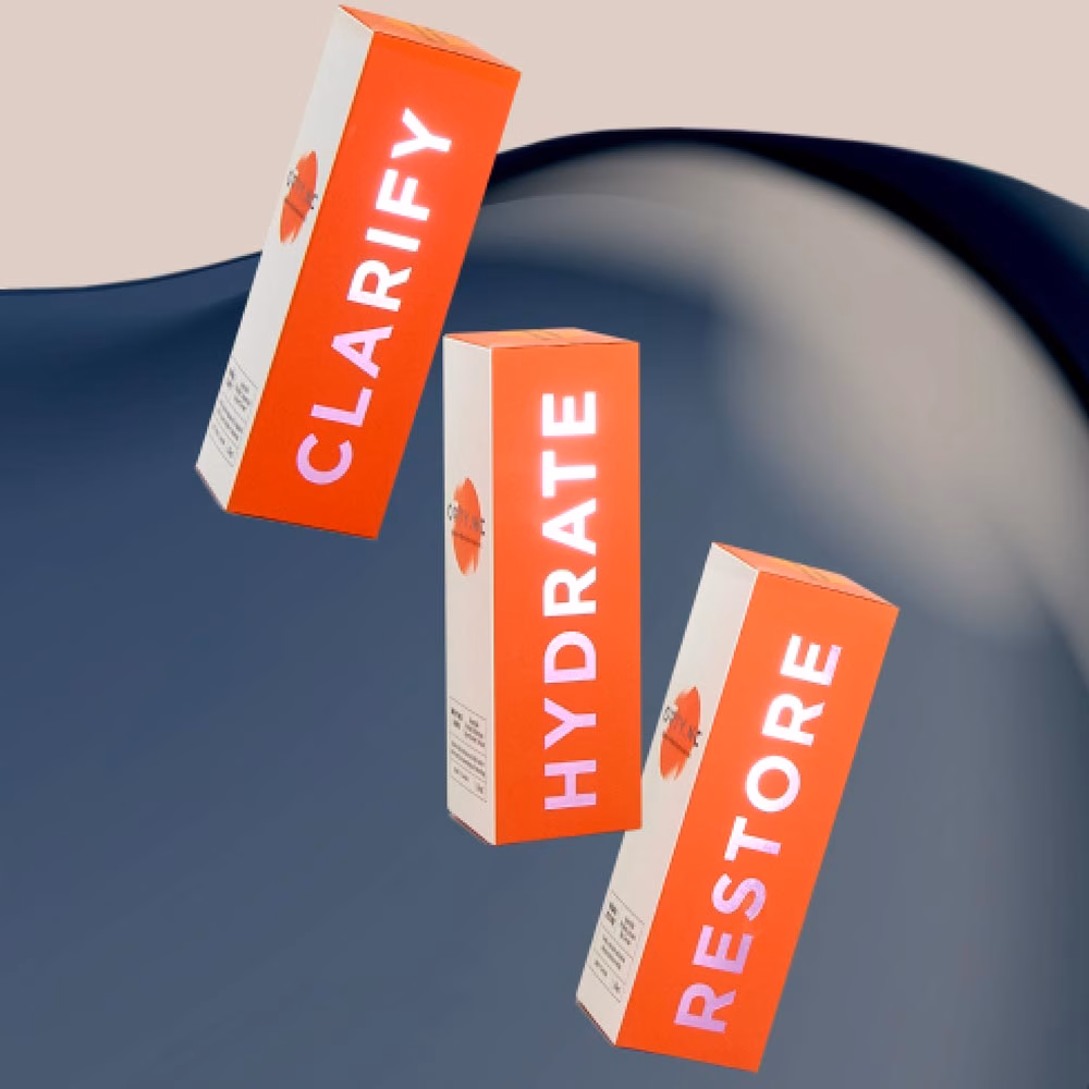
Carton packaging was designed to amplify both visibility and tactility in a retail environment.
High-build colour foils were applied to key panels, contrasted against a soft-touch base to create a layered material experience. The raised logotype introduces a subtle physicality—encouraging interaction while reinforcing brand presence on shelf.
This interplay of matte and reflective surfaces increases engagement, while continuing the visual language of glow from within.
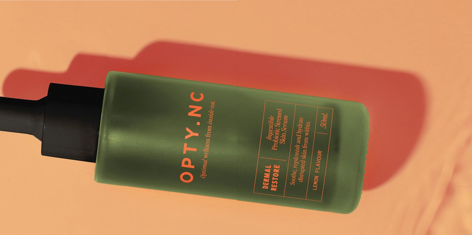
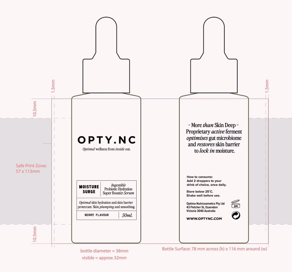
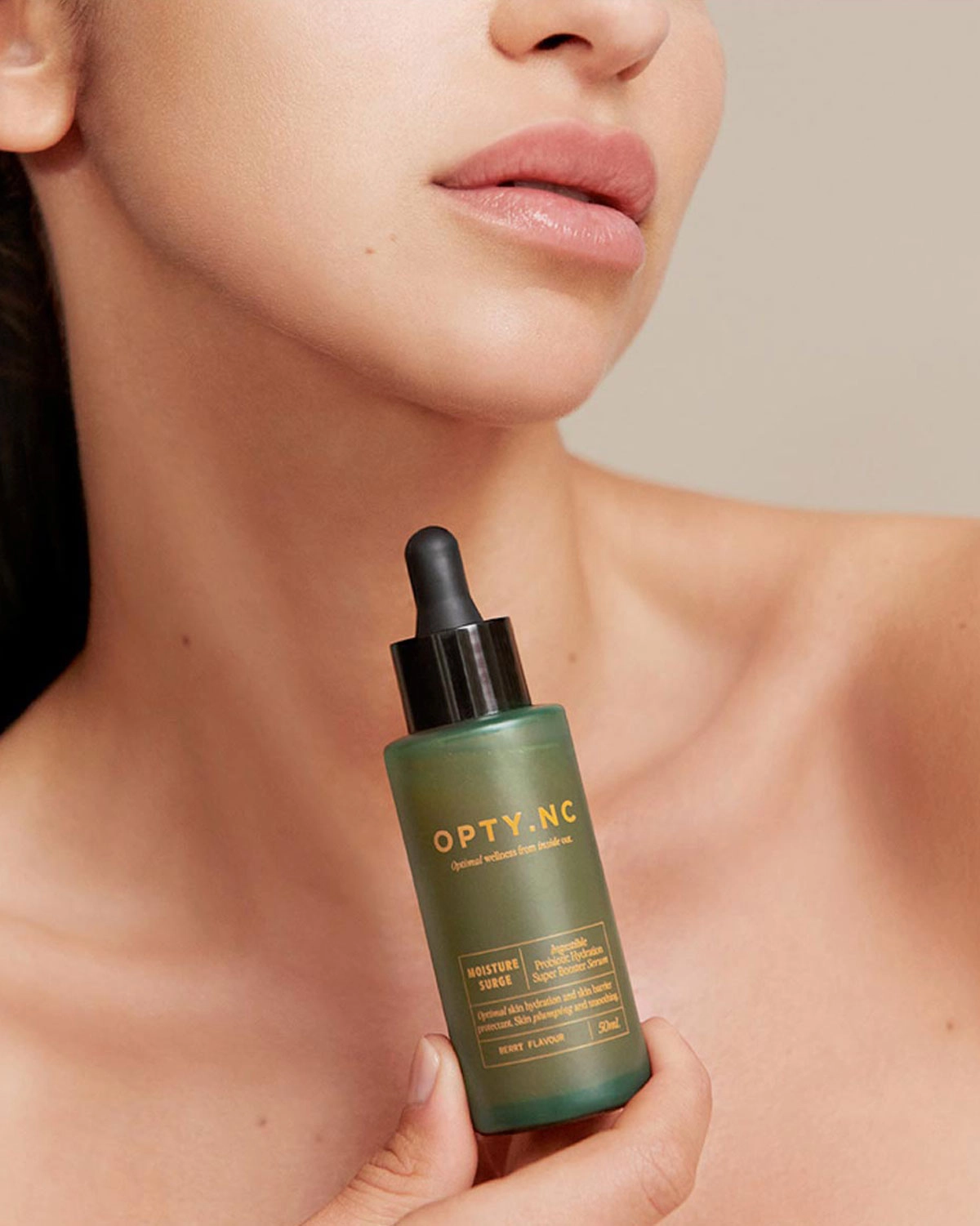
Serum bottles were developed as a more refined, clinical counterpoint within the range.
Custom-finished frosted glass in a deep forest green provides a sense of depth and efficacy, while high-build fluoro orange typography is applied directly to the surface—introducing both colour intensity and tactile contrast.
The combination of restraint and precision ensures the product feels both premium and purposeful.
Brand Experience:
A CONNECTED SYSTEM, FROM SCREEN TO SHELF TO CLINIC
OPTY.NC was designed as a unified brand experience—operating seamlessly across advertising, social media, retail and professional environments.
From campaign messaging and social content to packaging and practitioner training, each touchpoint reinforces the same core idea: wellness from the inside out.
The system enables the brand to move fluidly between contexts—maintaining clarity for consumers, while supporting credibility and confidence within clinical settings.
A scalable brand and product architecture now supports ongoing NPD, category expansion, and international growth. The OPTY.NC rebrand stands as a benchmark for what supplement packaging design and wellness branding can achieve when strategy and craft are developed in equal measure.
TESTIMONIAL
“The Ludbrook Agency consistently displays an unwavering commitment to delivering designs of the highest calibre; always exceeding our expectations. The rebranding of OPTYNC has been so positively received it has positioned us for success as a global brand.”
— Karissa Mather, Director, OPTY.NC
Results & Impact
The rebrand and repositioning of OPTY.NC delivered measurable commercial and brand outcomes:
Retail & Distribution Growth
OPTY.NC expanded significantly post-rebrand, securing +244 new retail outlets and an additional 75 professional clinics and spas through new distribution partnerships.
Category Recognition & Awards
The brand achieved multiple industry accolades, including Best Internal Beauty Product, Best Beauty Drink, and Best Product for Skin Health, reinforcing its credibility within the category.
Product Performance & Market Validation
Hero products became category leaders, with Ultimate 2.0 Marine and Ultimate 3.0 Marine achieving #1 and #2 best-seller positions within the range.
Clinically Substantiated Results
The brand’s claims are supported by measurable outcomes, including:
- Up to 49% reduction in wrinkle volume
- Up to 40% increase in skin elasticity
- Up to 28% improvement in skin hydration
- 72% reduction in breakouts linked to microbiome-supporting ingredients
Proof of Concept in Challenging Conditions
The business demonstrated strong growth through pandemic and post-pandemic conditions, validating both product efficacy and brand positioning in a highly competitive market.
Brand Platform for Growth
A scalable brand and product architecture now supports ongoing NPD, category expansion, and international growth.
THE NINE SENSES AT WORK
A multi-sensory brand system designed to build trust, drive clarity and deliver measurable results.
Together, these elements create a brand experience that is not only seen, but trusted—supporting both commercial growth and long-term brand authority.
Connection
A clear, gut-first philosophy reframed skincare as a holistic, internal process—creating a deeper, more meaningful connection between product, body and long-term wellbeing.
Uniqueness
By introducing a life-stage-based product architecture, OPTY.NC moved away from generic supplement positioning to establish a distinct, ownable space within ingestible beauty.
Sight
A refined, clinical-meets-contemporary visual identity elevated perception and improved shelf impact, ensuring immediate clarity across a complex product range.
Touch
Powdered elixirs and ingestible serums introduce a tactile, ritual-based interaction—transforming daily consumption into a considered wellness routine.
Smell
Natural flavour profiles and ingredient integrity reinforce the perception of purity and quality, avoiding the artificial cues often associated with supplements.
Sound
Clear, structured naming and language create a confident, authoritative tone—supporting both practitioner recommendation and consumer understanding.
Taste
Carefully developed flavour profiles ensure daily use is both enjoyable and sustainable—critical for compliance and long-term product efficacy.
Harmony
The Formation, Foundation and Focus system creates a cohesive ecosystem—aligning product, messaging and user journey into a unified brand experience.
Integrity
Clinically proven ingredients, transparent sourcing and evidence-based claims underpin the entire brand—ensuring that design is supported by genuine performance.
Explore more of our health and wellness branding projects or discover the multi-sensory philosophy behind our work in SENSORIAL.