JERVIS BAY DISTILLING
Branding for a premium craft gin.
Jervis Bay Distilling Co. is a premium craft spirits brand inspired by the pristine waters, native botanicals and relaxed rhythm of Australia’s South Coast.
We were approached to create a brand identity and bottle design for a range of small-batch spirits that would feel natural, honest and unmistakably connected to place. The brand needed to capture the feeling of endless summer — fresh, vibrant and distinctly Australian — while still carrying the refinement expected of a premium craft gin.
The result is a relaxed but elevated identity designed for long lunches, sunset sessions and easy afternoons by the bay. The project is a strong example of our work as an alcohol branding agency, bringing together spirits branding, bottle label design, packaging and campaign imagery for a premium Australian distillery.
Scope
Alcohol branding
Bottle design
Brand identity
Packaging design
Digital design
Photography
AI image generation

THE CHALLENGE
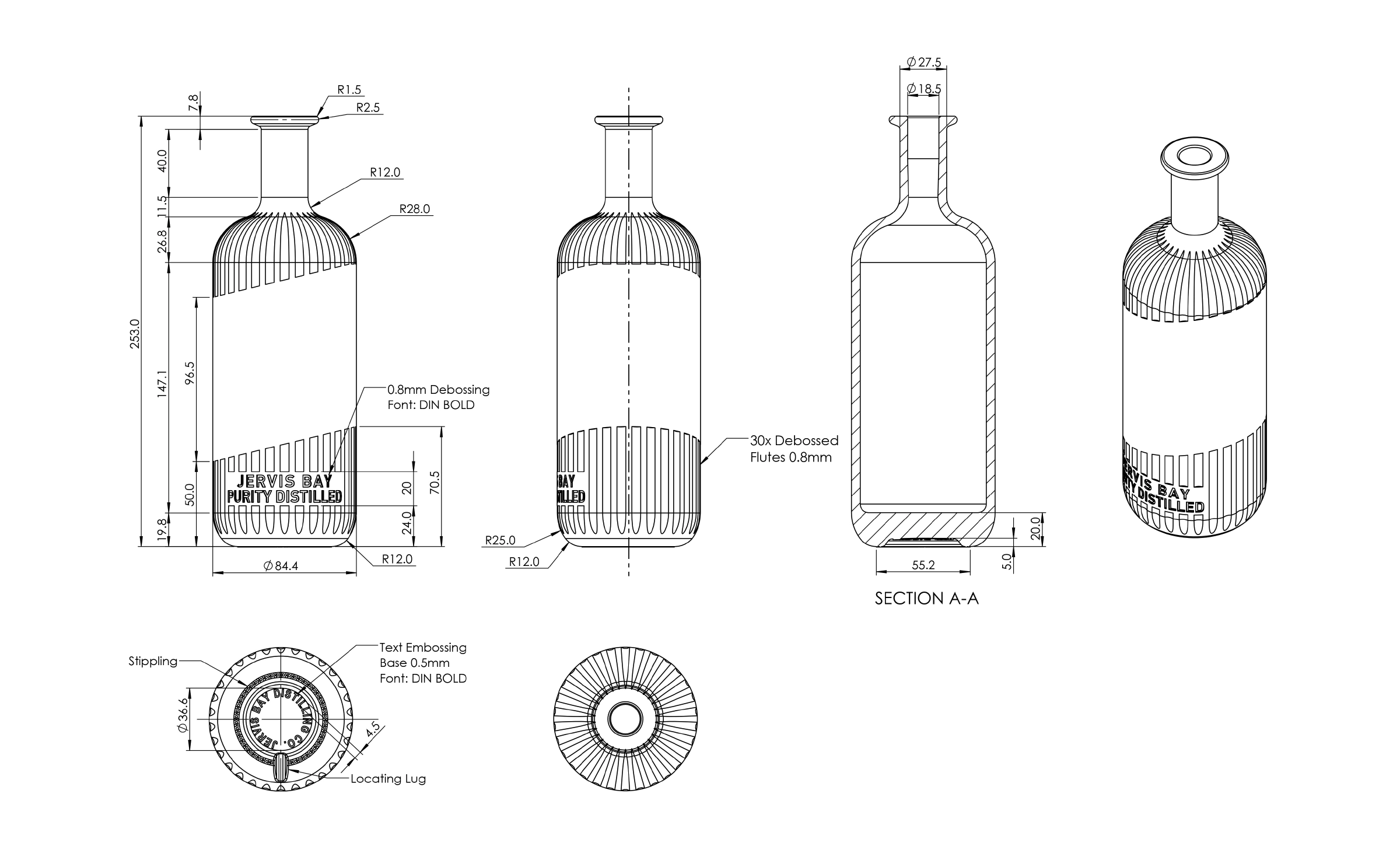
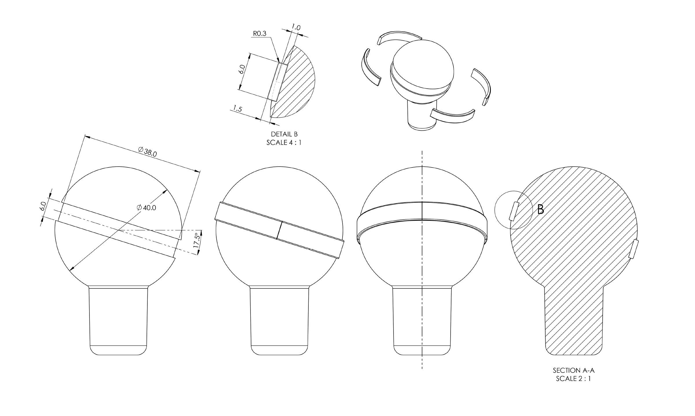
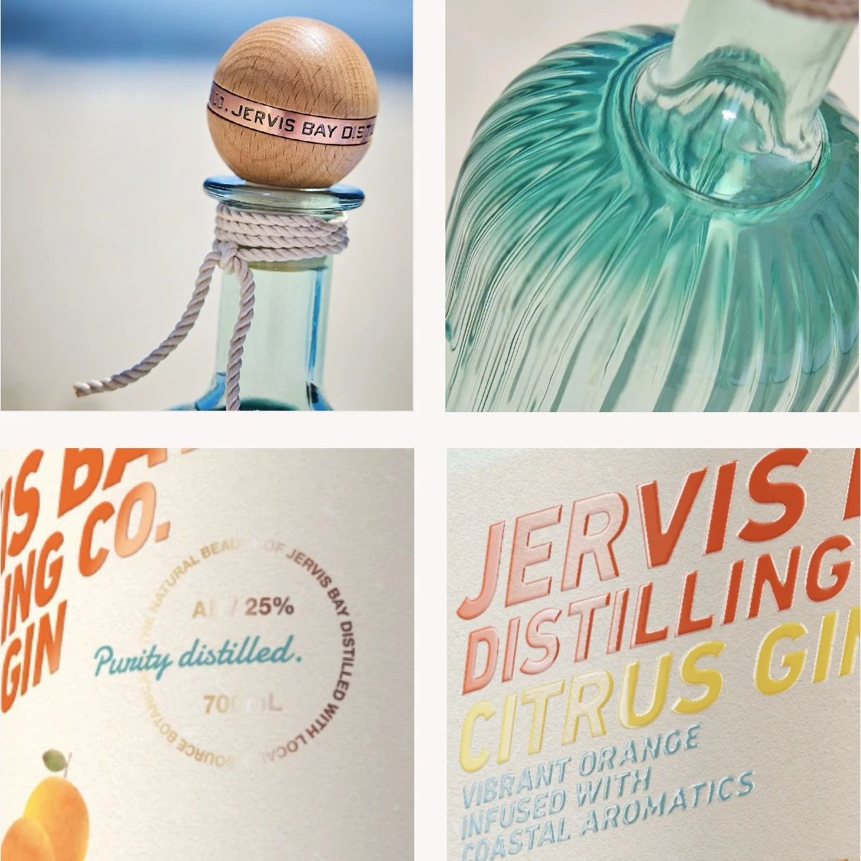
CUSTOM BOTTLE DESIGN
The craft spirits category is highly competitive, with many brands drawing on similar cues of provenance, botanicals and small-batch production. Jervis Bay Distilling Co. needed an identity that could stand apart on shelf while remaining authentic to its coastal origins.
The challenge was to create a brand that felt premium without becoming overly formal, and coastal without relying on predictable beach clichés. It needed to communicate quality, freshness and craft, while capturing the easy, sun-drenched character of Jervis Bay.
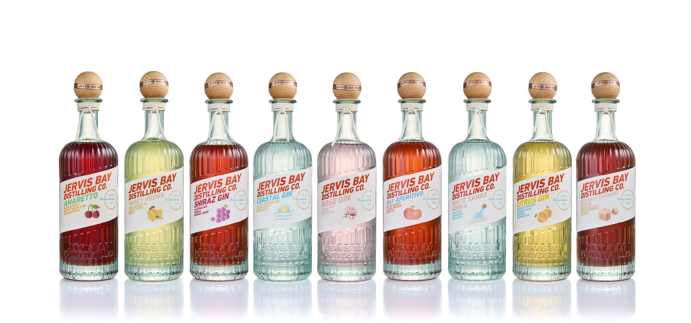
The packaging also needed to work across an expanding product range, giving each bottle its own personality while maintaining a cohesive brand system.
BRAND STRATEGY & POSITIONING
We worked closely with the founders to shape a brand direction grounded in place, clarity and relaxed sophistication.
Drawing inspiration from the crystal waters of Jervis Bay, the native botanicals used in the distillation process and the effortless rhythm of coastal living, the positioning created a clear foundation for the identity.
The brand was designed to feel contemporary, generous and approachable – a premium craft gin with a distinctly Australian point of view.
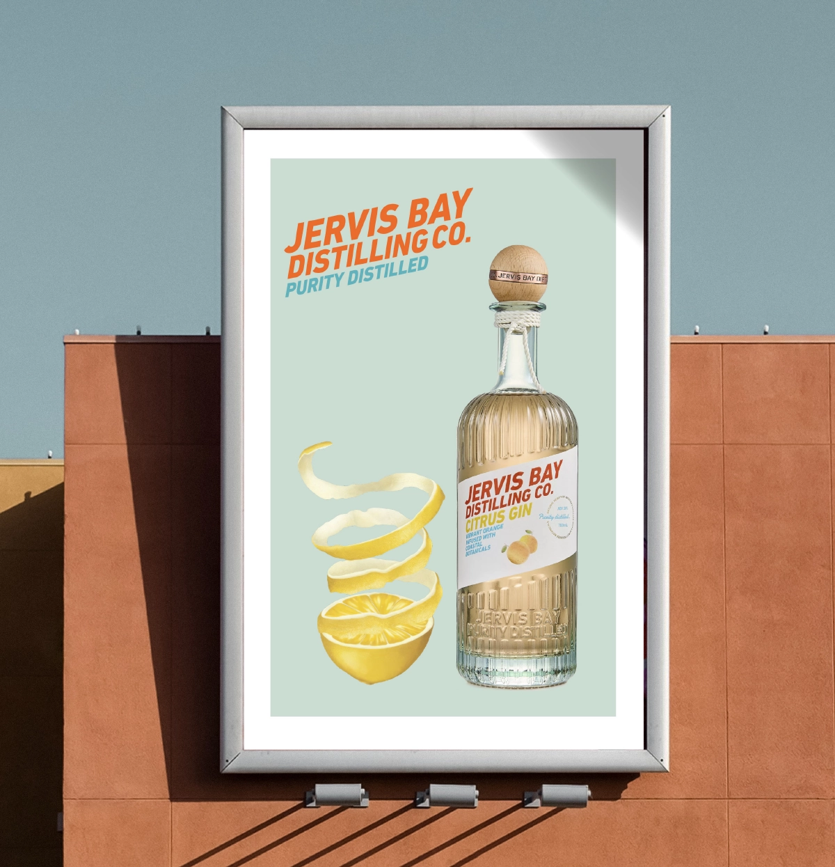
VISUAL IDENTITY & PACKAGING
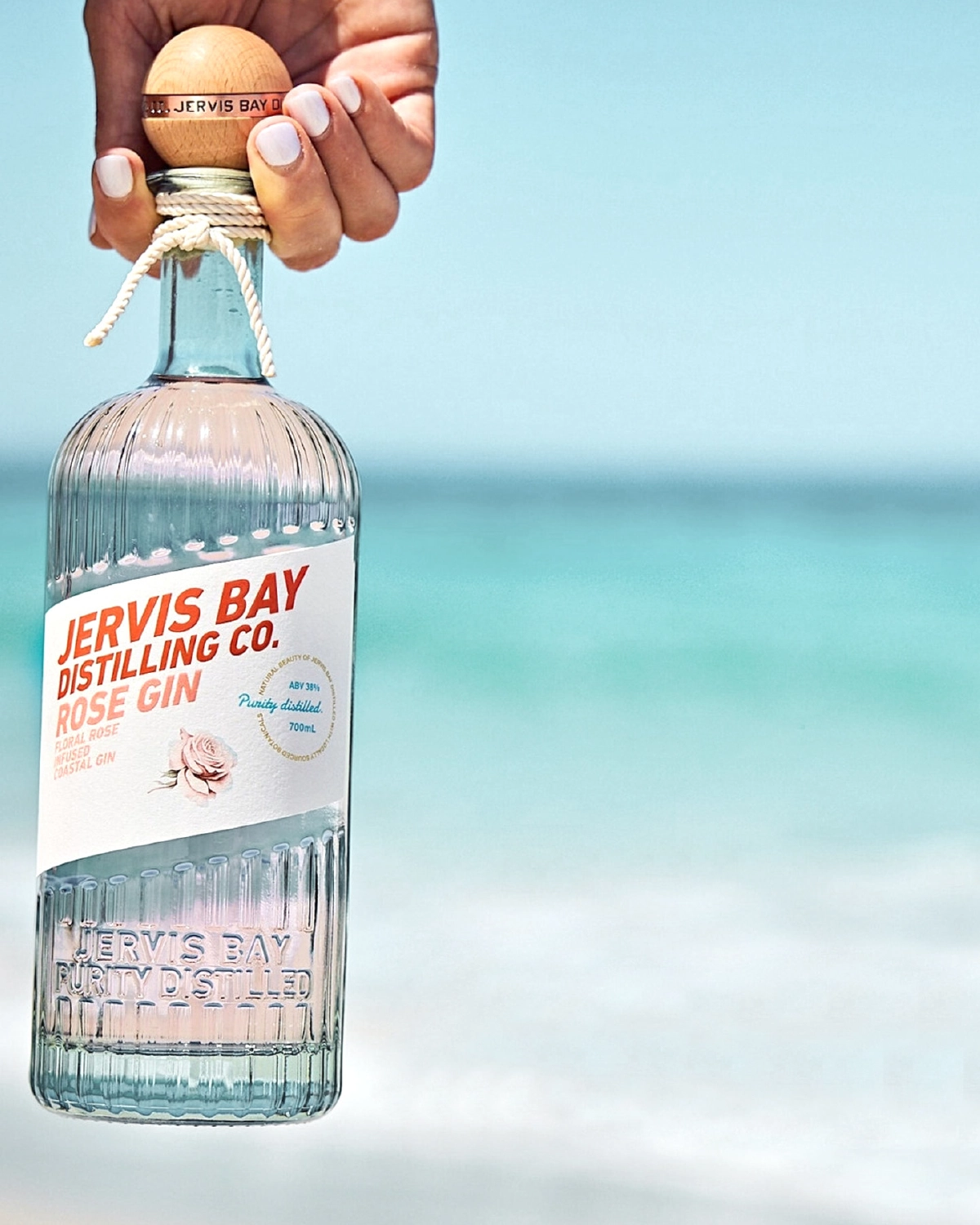
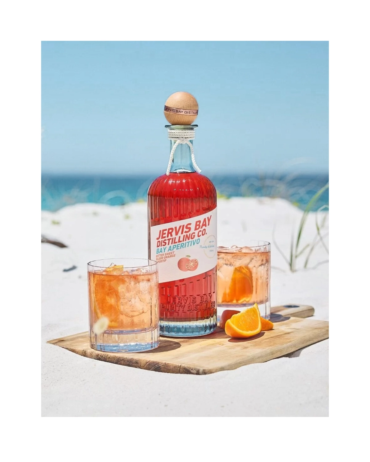
The visual identity and packaging system was developed to balance freshness, craft and shelf impact. Clean typography, coastal colour references and subtle botanical cues create a brand world that feels refined but unpretentious.
The bottle design was central to the project. For a craft gin and spirits range, the packaging needed to work both as a retail object and as a brand asset across venues, events, digital campaigns and social content. Each label needed to feel distinctive within the range while still belonging to a unified family. Colour, layout and typographic hierarchy were used to differentiate flavours and expressions, while maintaining a consistent premium presence across the range.
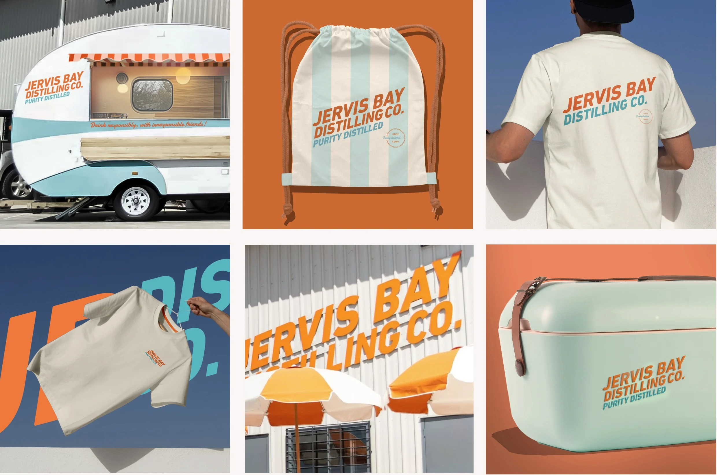
We also extended the identity into supporting brand touchpoints, including digital assets, marketing collateral, signage, merchandise and photography. This created a flexible visual system that could move easily from bottle to retail environment, from beachside imagery to online communication.
The result is a complete alcohol branding and packaging design project for a premium Australian spirits brand — natural, vibrant, relaxed and refined.