
Re>Pal Industrial Branding & Corporate Communications
Brand strategy, naming, identities, websites and investor communications for Re>Pal and parent company Range International.
Plastic recycling becomes commercially meaningful when recovered material can perform a useful job. For a manufacturer supplying the logistics industry, explaining that transformation requires more than an environmental message. Customers need to understand the product; investors need to understand the business behind it.
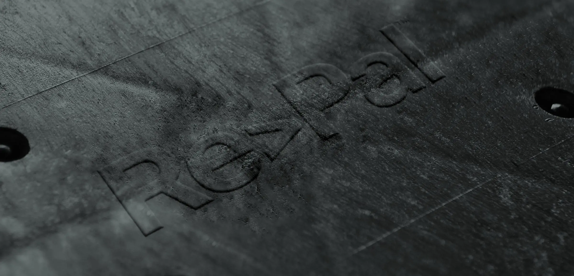
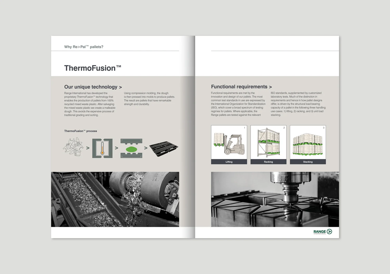
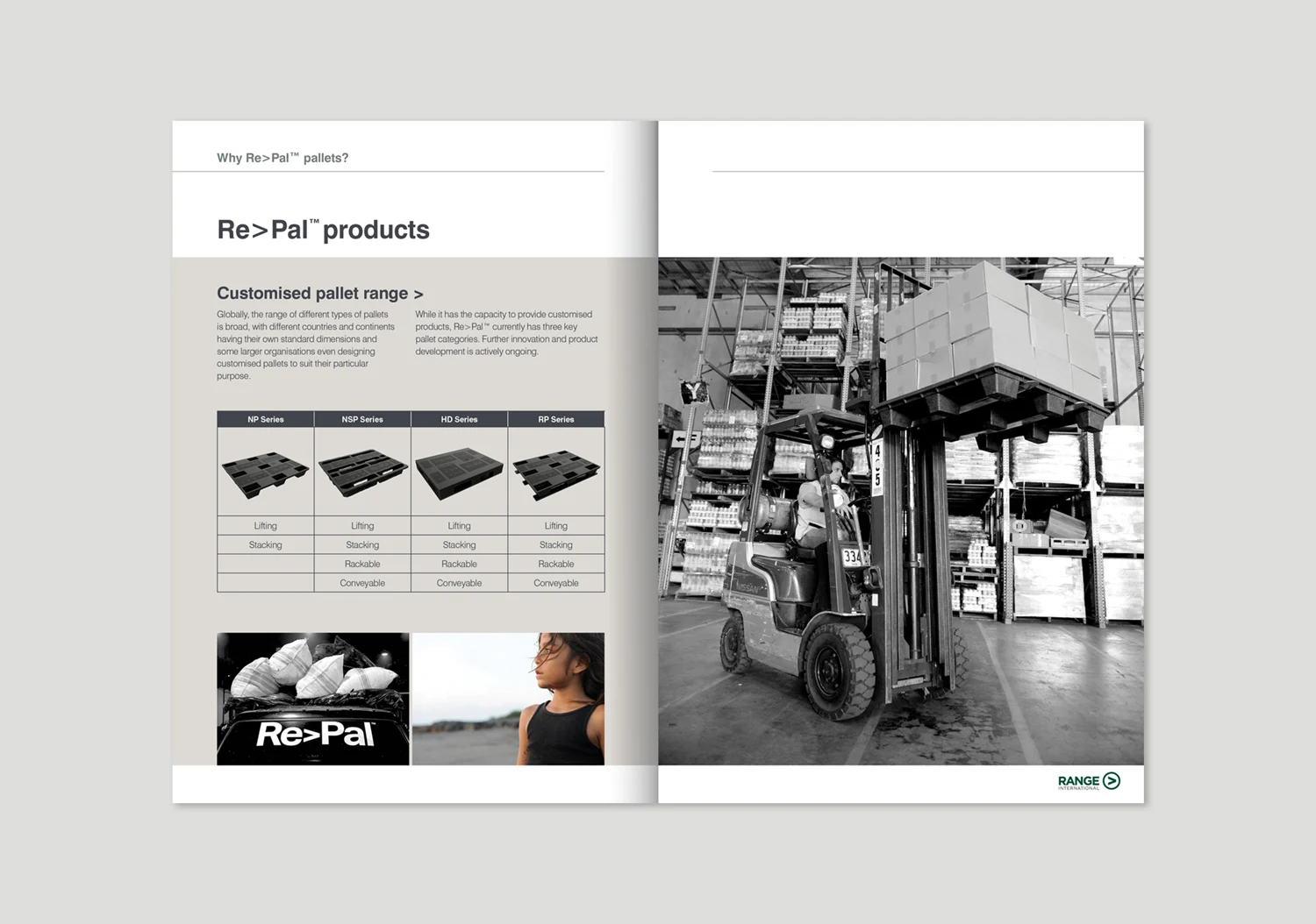
Re>Pal manufactures shipping pallets from 100% recycled waste plastic. Its ThermoFusion™ process uses mixed plastics that can be difficult to recycle, turning discarded material into products for supply chains.
Ahead of its parent company’s ASX listing, the business needed a presentation capable of connecting its manufacturing proposition with its commercial ambitions. Our engagement encompassed two brands: the customer-facing product business, previously known as EcoPallets, and its parent company, Range International.
Scope
Brand Workshop
Brand Strategy
Brand Identity
Gap analysis
User Journey Mapping
Customer Personas
Naming
Websites
Photography + Video
Prospectus
Annual reports
Ongoing Marketing
Print + Digital
The Challenge
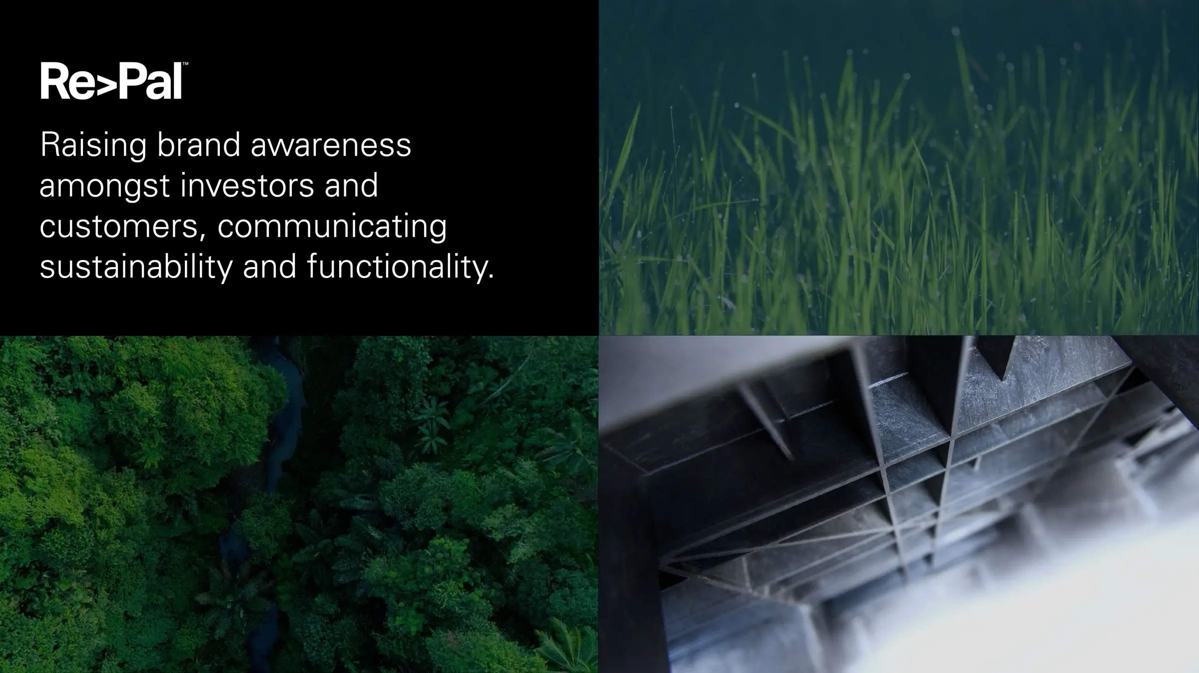
Communicating an investment opportunity and a practical industrial product.
The project brought together two audiences with different priorities.
Investors needed a clear account of the company, its technology and the opportunity it was pursuing. Logistics managers needed to assess whether the pallets were appropriate for their operations. An environmental proposition could attract attention, but it could not replace the information required to make a purchasing decision.
The communications needed to accommodate both perspectives. They had to explain the wider significance of recovering waste plastic while remaining direct about the product and its use.
Preparing for a public listing added another demand: the company and product brands needed to work together across a substantial body of material, within a fixed timetable.
The Discovery & Brand Strategy
Grounding the positioning in the factory, the customer and the commercial context.
Our team travelled to Indonesia to meet the executives at the factory and headquarters. A positioning workshop examined customer needs, existing perceptions and the competitive context.
The work included gap analysis, customer personas and user journey mapping. These helped establish where the business’s presentation needed to change and which information mattered to its different audiences.
For this project, the value of brand strategy and positioning lay in setting priorities. A manufacturing business can have a detailed technical story, but its audiences need an accessible point of entry. The communications had to establish what the company did, why its approach mattered and how that related to a customer or investor.
That strategic framework provided a basis for decisions across naming, design and content.
The Naming & Brand Architecture
Defining distinct roles for the product business and its parent company.
Re>Pal addressed the market for the pallets. Range International provided the corporate identity for the parent business and its investor communications. Separating these roles allowed each brand to lead with the information most relevant to its audience.
This is a practical question of brand architecture: how the parts of a business relate, and how those relationships are communicated. A customer researching a product and an investor researching a company may arrive with different questions, even when they are examining the same underlying operation.
The two-brand approach gave the communications room to address those questions without asking a single identity to carry every message.

The Creative Direction & Visual Identity
Giving the industrial proposition a recognisable and consistent expression.
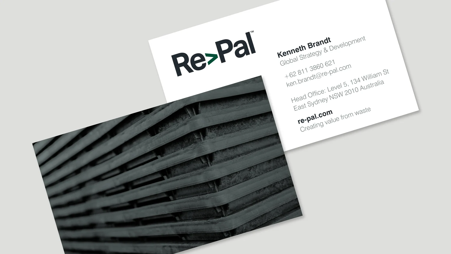
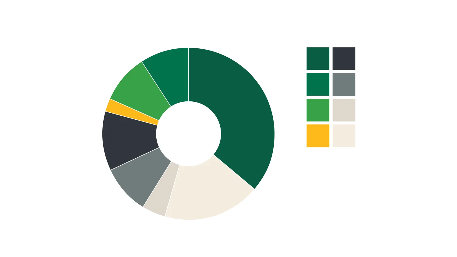
We developed visual identities for both brands, carrying the strategic direction into their public presentation.
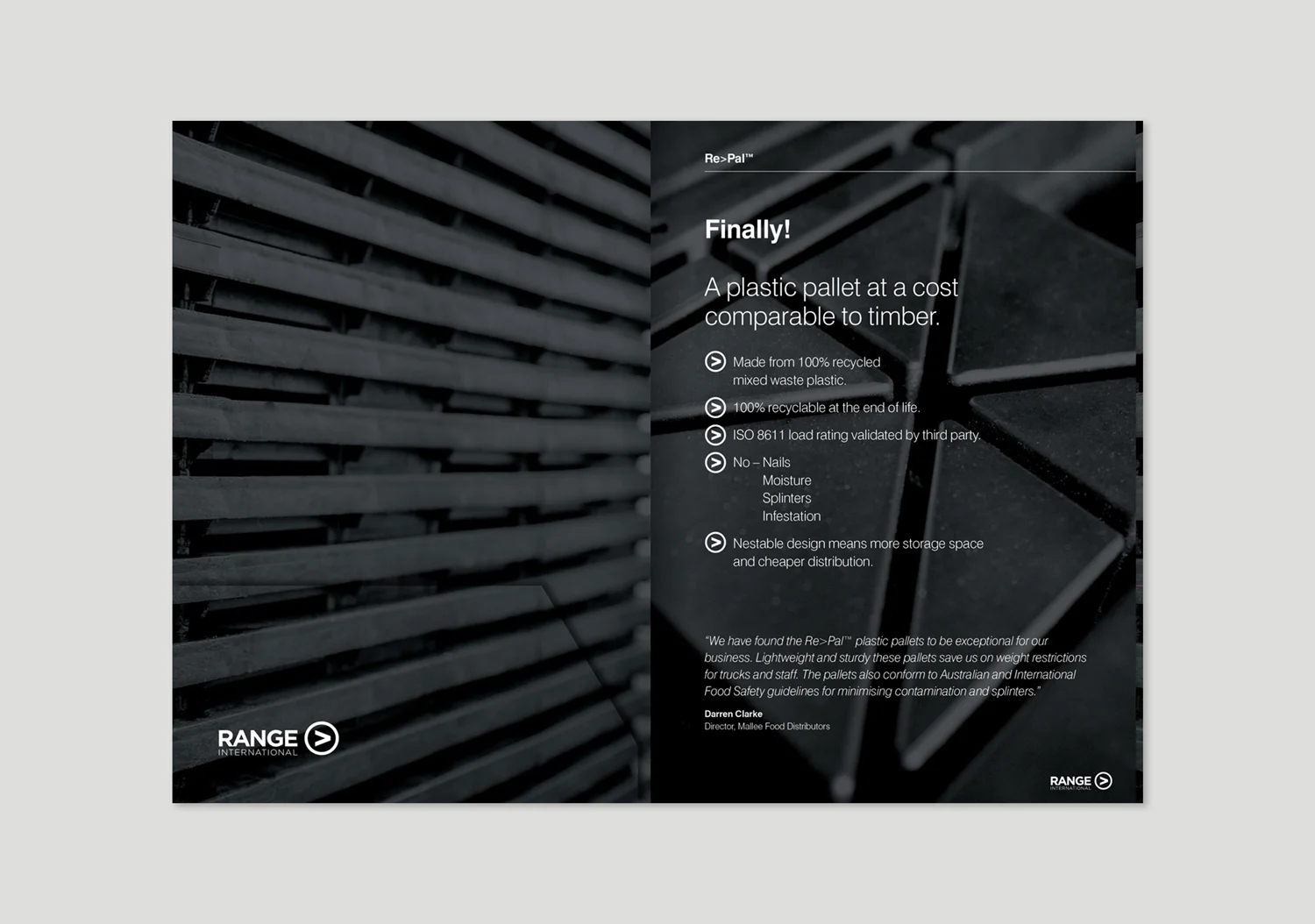
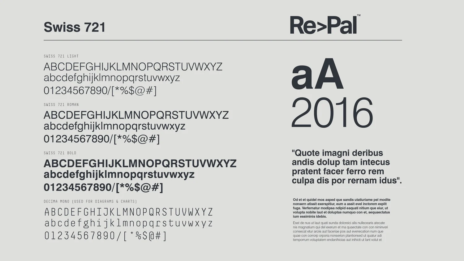
The design needed to support clarity across very different formats. A product communication must establish its subject quickly. A corporate document needs a hierarchy that can sustain longer reading. Both require consistency, but they place different demands on the identity.
Our brand identity work provided a foundation for these applications. The aim was to make the business recognisable while allowing technical, commercial and environmental information to take appropriate emphasis.
For industrial branding, this relationship between identity and information is essential. Design earns its place by helping people understand what they are looking at and why it is relevant.
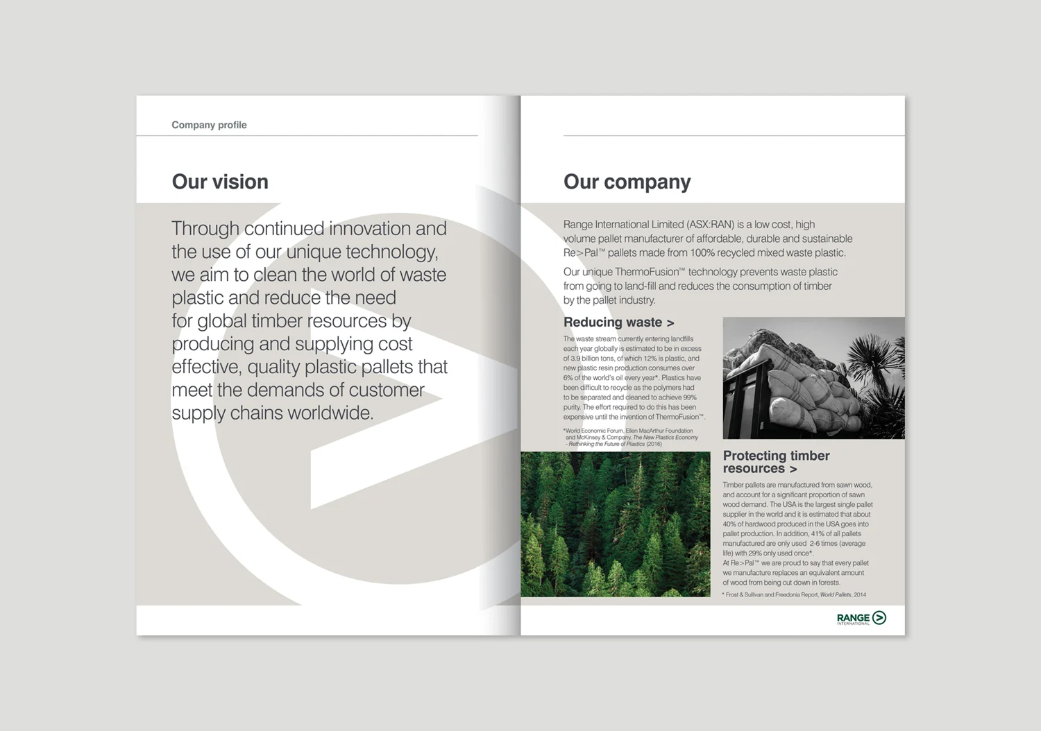
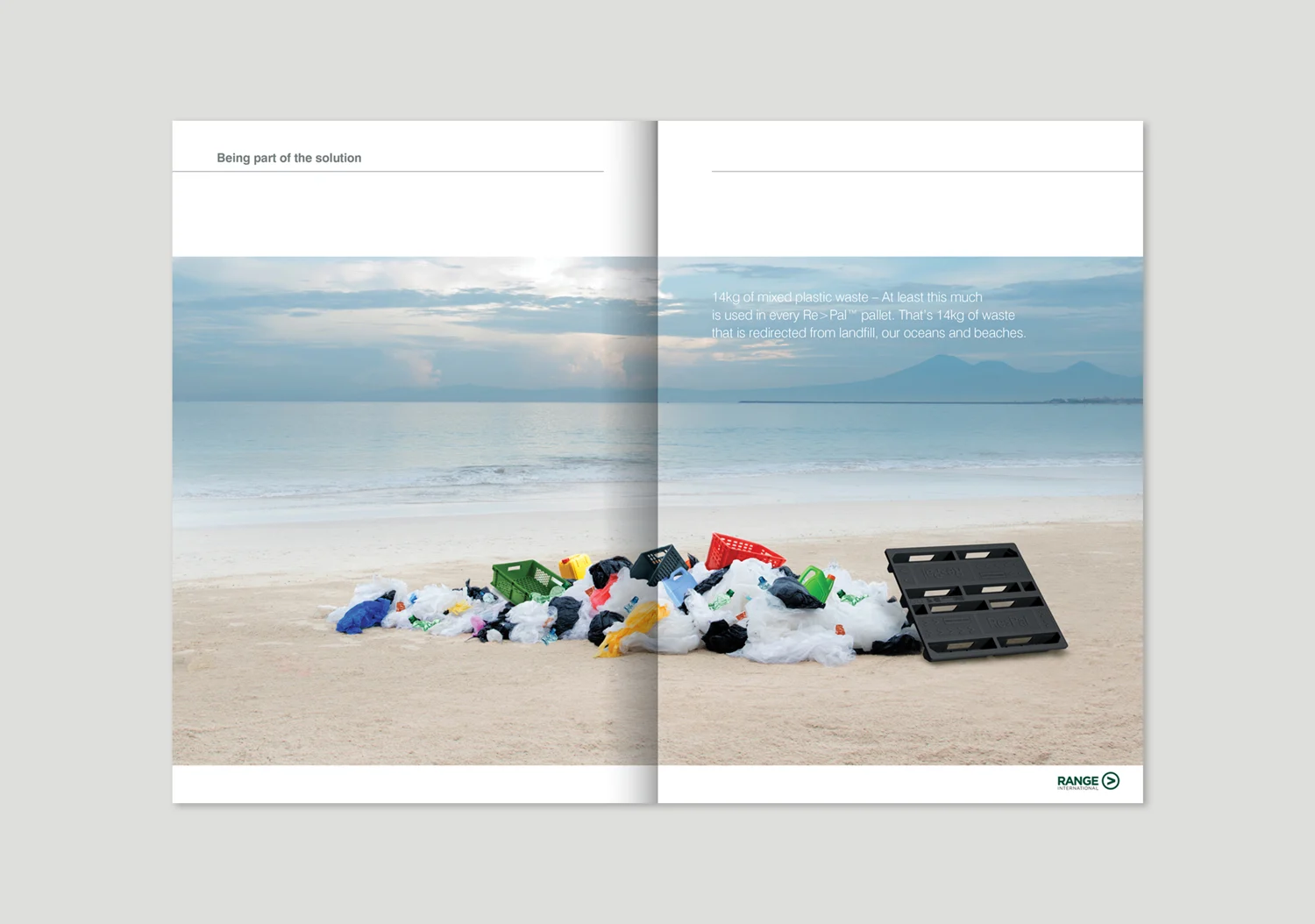
The Websites, Photography & Video
Connecting the manufacturing story with the product and corporate presentations.
The rollout included two websites, alongside photography and video.
The websites gave the product and parent company separate digital platforms. Their roles reflected the brand architecture: one addressing the customer-facing offer, the other supporting the corporate story.
Our website design and development formed part of the wider communications programme. The digital presentation needed to remain connected to the identities and messages being developed for printed and investor materials.
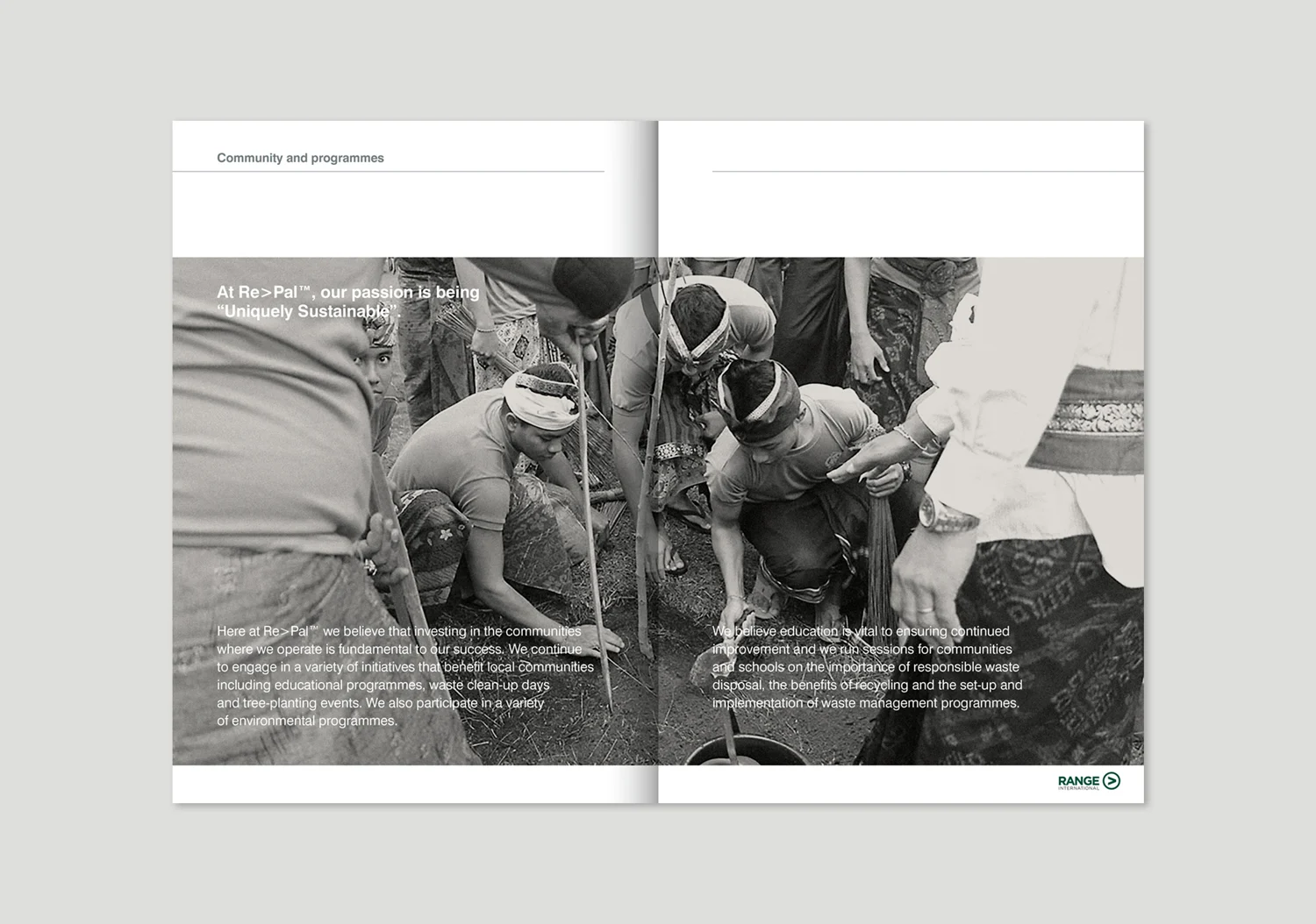
Photography and video added another means of explaining the business. For a company turning waste material into an industrial product, visual content can make the subject more concrete than descriptive language alone.
This relationship between explanation and imagery also informed our campaign creative and content creation. The content had a defined purpose within the wider brand programme.
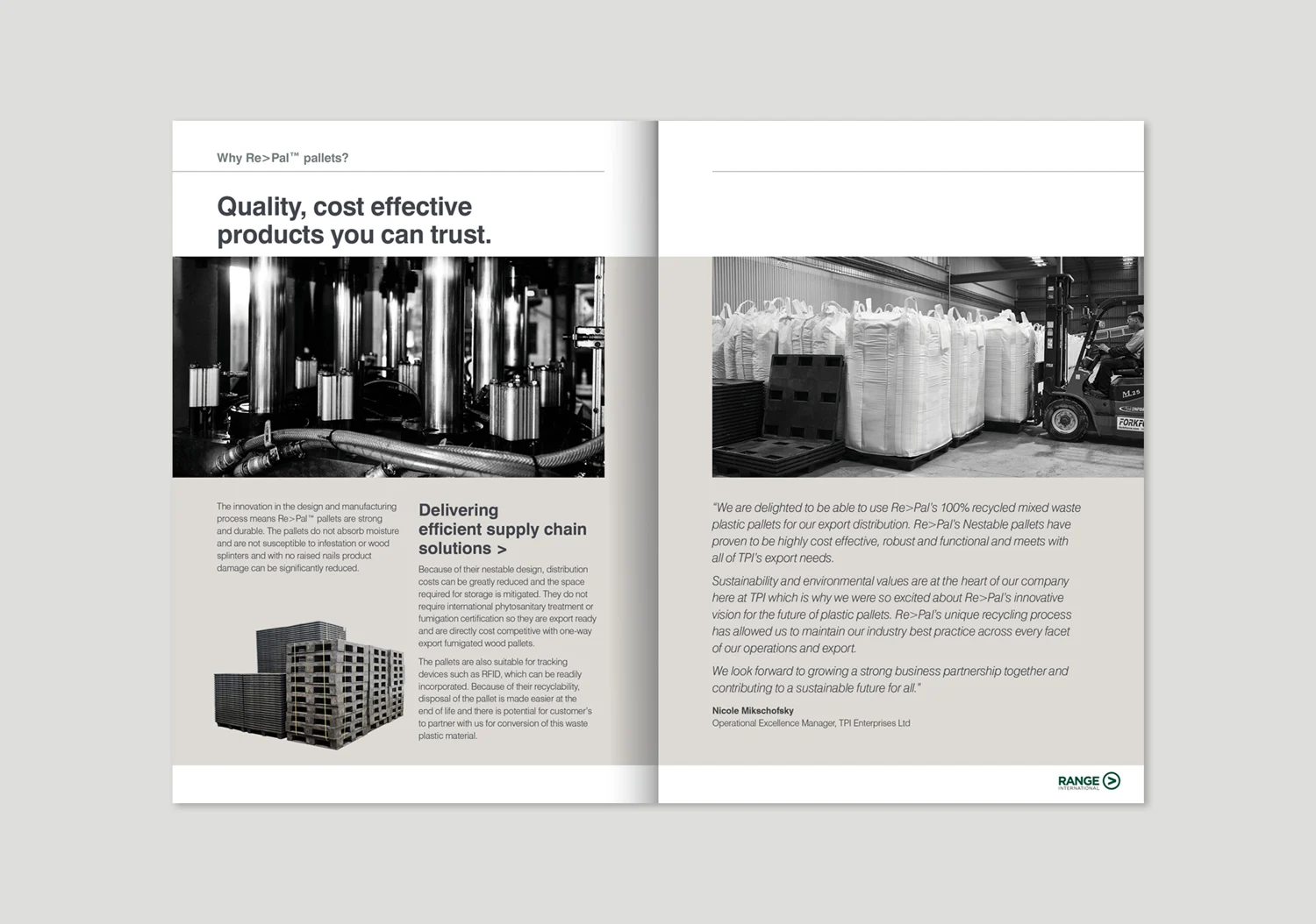
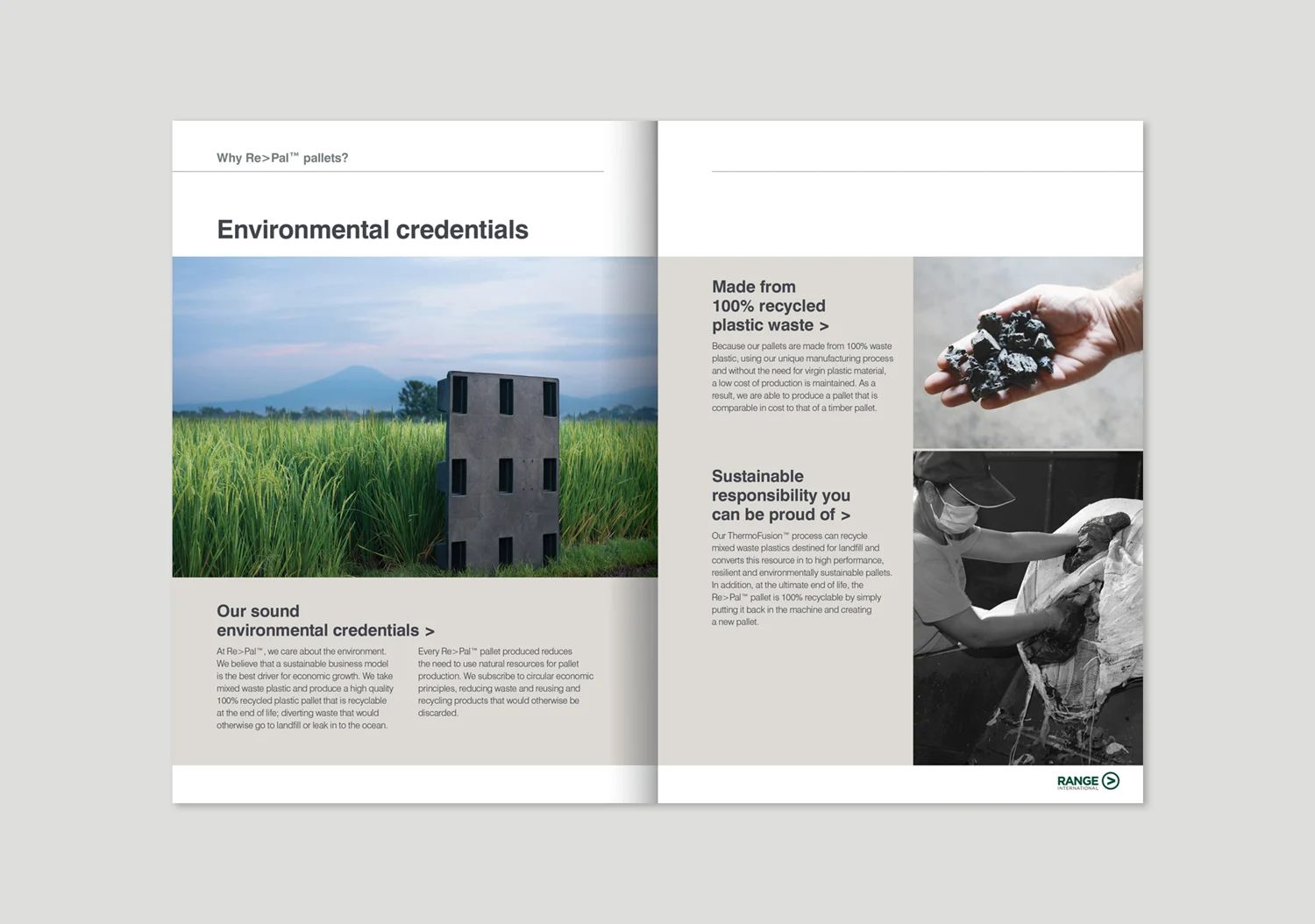
The Prospectus & Corporate Reporting
Organising detailed information for a public-market audience.
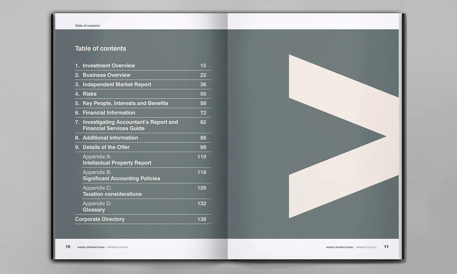
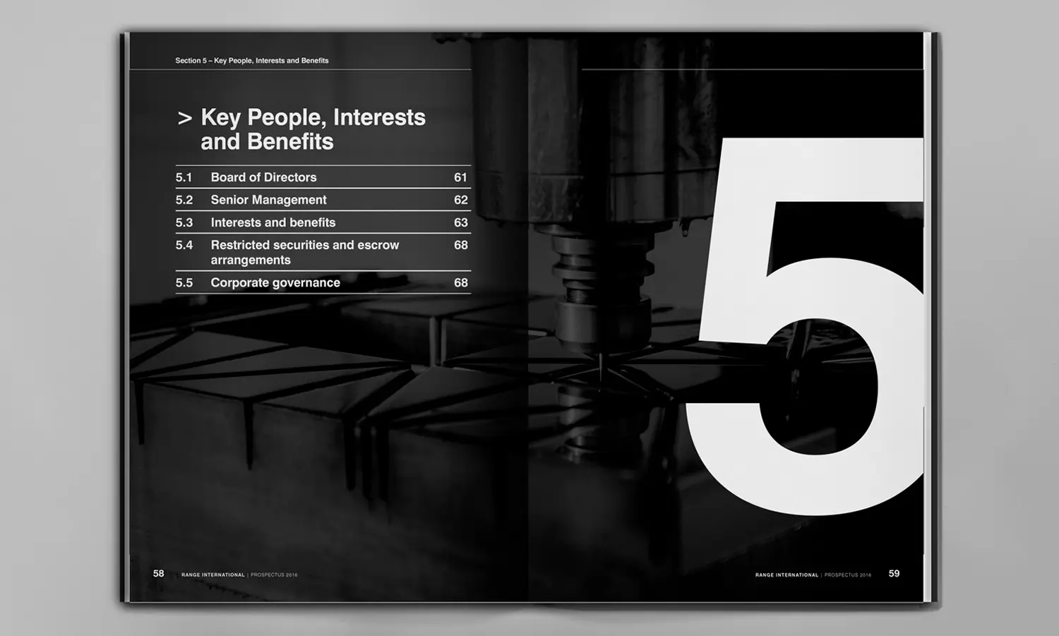
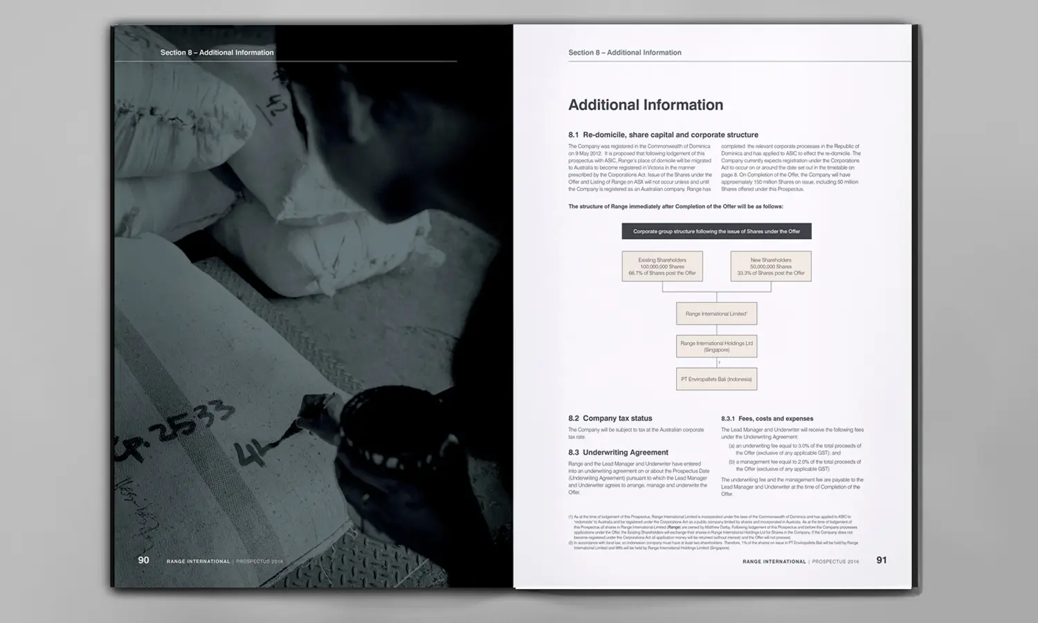
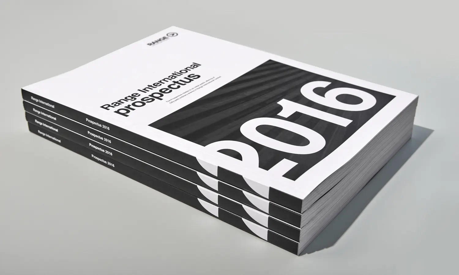
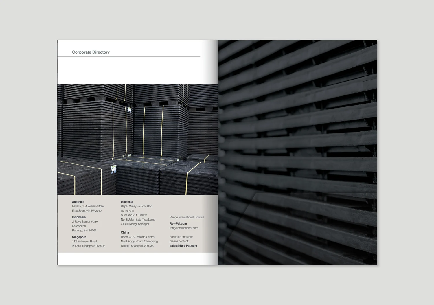
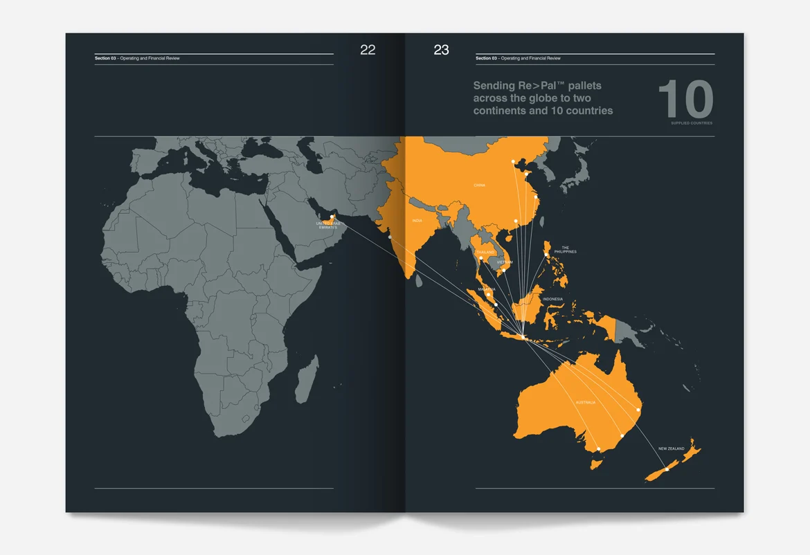
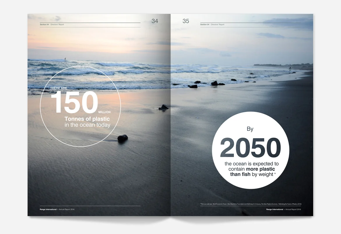
The engagement extended to the design and printing of the company prospectus, followed by annual reports.
These documents required a different reading experience from marketing materials. Readers needed to locate information, understand its hierarchy and move between the company narrative and detailed disclosures.
The design task was to support that reading without allowing presentation to compete with substance. Consistency with the corporate identity helped connect the documents with the wider business, while the page structure needed to accommodate the demands of formal reporting.
The work continued into digital and printed marketing, extending the identities beyond the listing materials into ongoing communications.
The Result
Two brands and a coordinated communications programme delivered for a major business milestone.
The project brought strategy, naming, visual identity, digital platforms, image creation and corporate publishing into one programme.
Range International’s 2016 IPO raised A$50 million. The agency’s contribution was the brand and communications work supporting the company’s presentation at that milestone, followed by further reporting and marketing materials.
Managing director Lars Amstrup’s testimonial highlights the breadth of the engagement and the delivery of the rebranding, websites and prospectus under considerable time pressure.
The significance of the project lay in its connected scope. The product identity, corporate brand and investor documents needed to express a consistent account of the business while serving different purposes. Establishing that relationship gave Re>Pal and Range International a foundation for communicating with customers, investors and other business audiences.




TESTIMONIAL
“It is with great pleasure that we recommend the Ludbrook Agency for the work they carried out for us in connection with the listing of our company on the ASX.
Working under considerable time pressure, L/A successfully delivered a complete re-branding and re-naming of our company and products, built two new websites, handled the design and printing of our prospectus, and provided very valuable support and oversight through the whole process.
Awesome job! Few would have been able to deliver on time and with the quality that you did.”