


Packaging
Design &
Retail
POS Design
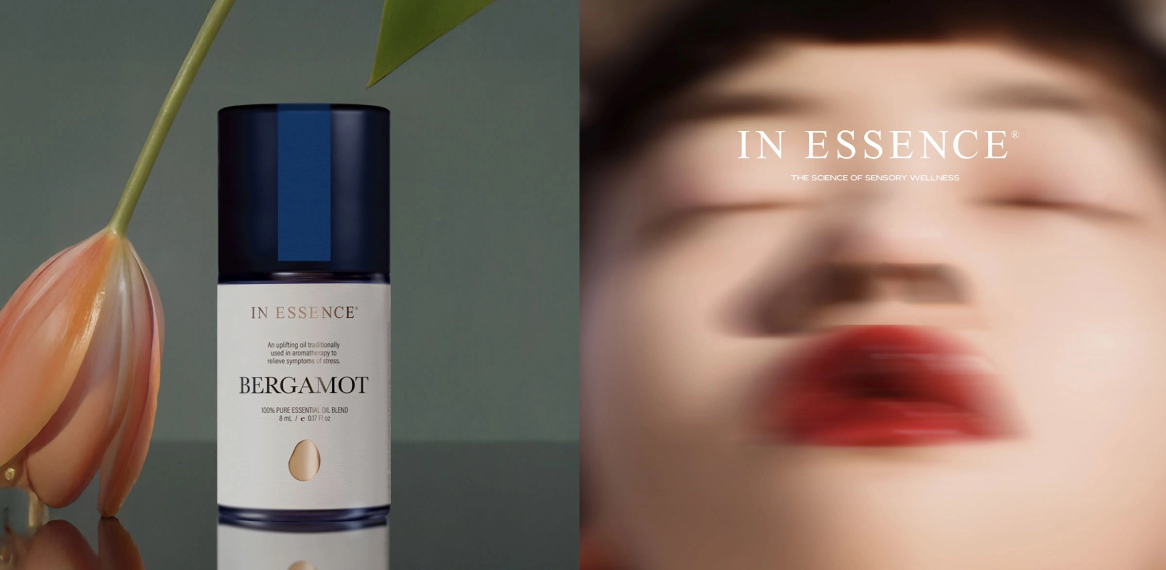
Packaging, retail point-of-sale, print and physical brand applications for beauty, wellness, hospitality, lifestyle, food and beverage brands.
Packaging Design
Packaging Innovation
Retail POS Display Design
Print Marketing Collateral
Stationery Suite
Editorial Design
Hotel Collateral
Restaurant Collateral
Minibar, Turndown
Merchandise Design
Packaging is often the most tangible expression of a brand—the moment an identity becomes something a customer can hold, open, use, display or take home.
Ludbrook Agency is a Sydney-based branding and design studio creating packaging, retail point-of-sale, print and physical brand applications. Our work spans wellness and beauty, hotels and hospitality, lifestyle brands, food and beverage.
We work across packaging strategy, visual design, range architecture, materials, print finishes, production and retail presentation. Each project considers how a product communicates on its own and as part of a wider brand identity—on a shelf, online, in a restaurant or hotel, within a retail environment or in the customer’s hands.
Our packaging experience includes established Australian brands and new ventures such as In Essence, Le Tan, OPTY.NC, Aura Rosé, Barons Brewing and Jervis Bay Distilling.
The purpose is not simply to make a package look considered. Good packaging helps people identify the product, understand the range and recognise the brand before they begin reading the detail.
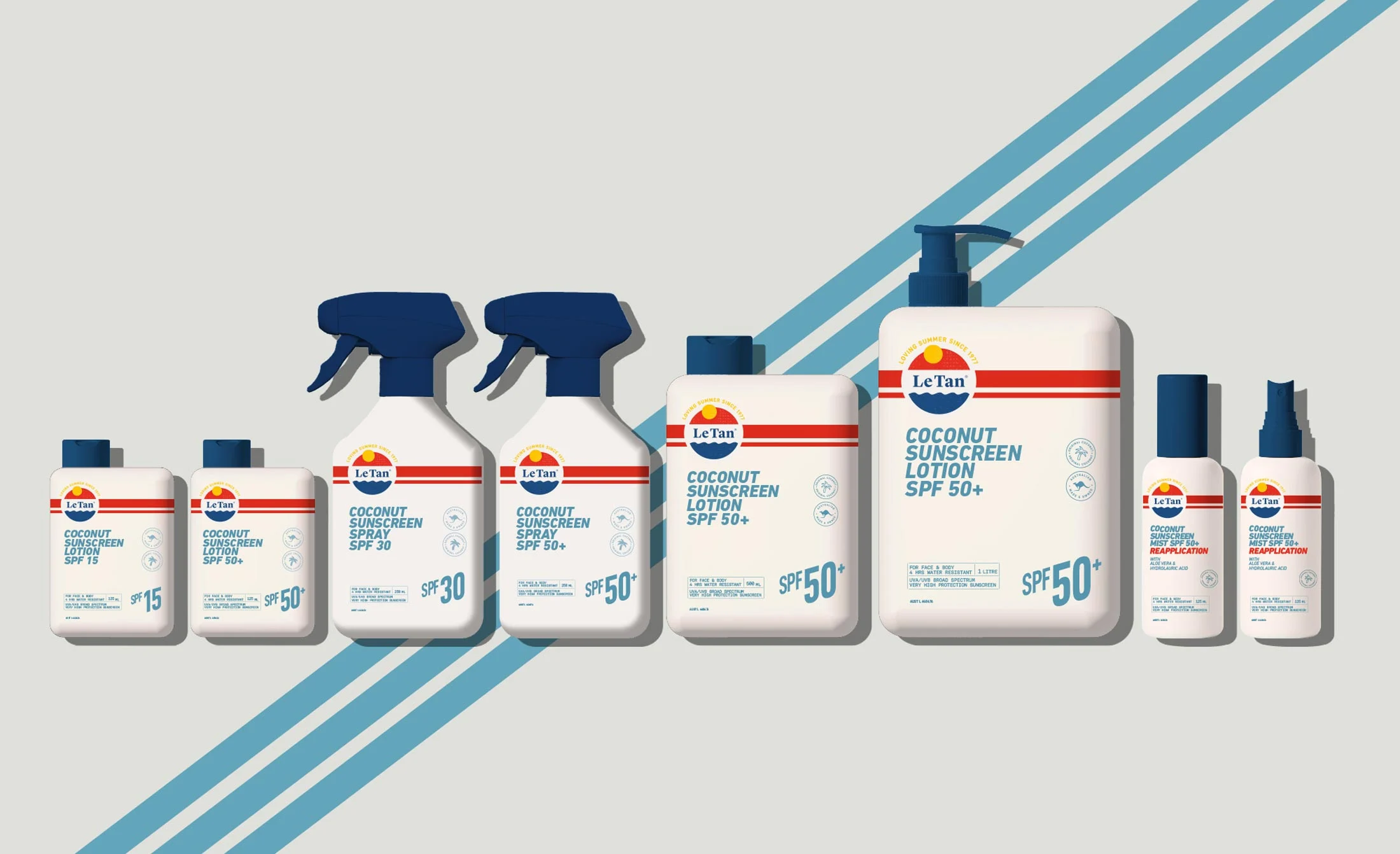
Le Tan — skincare and suncare packaging redesign
Packaging Design
Making the product clear, recognisable and credible at every point of sale.
Packaging has several jobs to do at once. It must identify the product, communicate its purpose, express the brand’s position and work within the practical constraints of production, transport, display and use.
We design primary and secondary packaging for beauty, skincare, wellness, supplements, food, beverage, wine, spirits and lifestyle products. A project may involve one hero product or an extensive range requiring a clear hierarchy across variants, formats and product families.
Typography, colour, imagery and material choices establish character, but information architecture is equally important. Customers need to distinguish product types, benefits, sizes or flavours quickly. Regulatory content must remain legible without taking control of the design. The package must also work in photography, ecommerce, social content and retail display, where it may be viewed at a very different scale.
For established brands such as Le Tan and In Essence, the task was to evolve the packaging without discarding recognition built over many years. For a new product, packaging may be developed alongside brand strategy and positioning, naming, identity, photography and launch communications from the beginning.
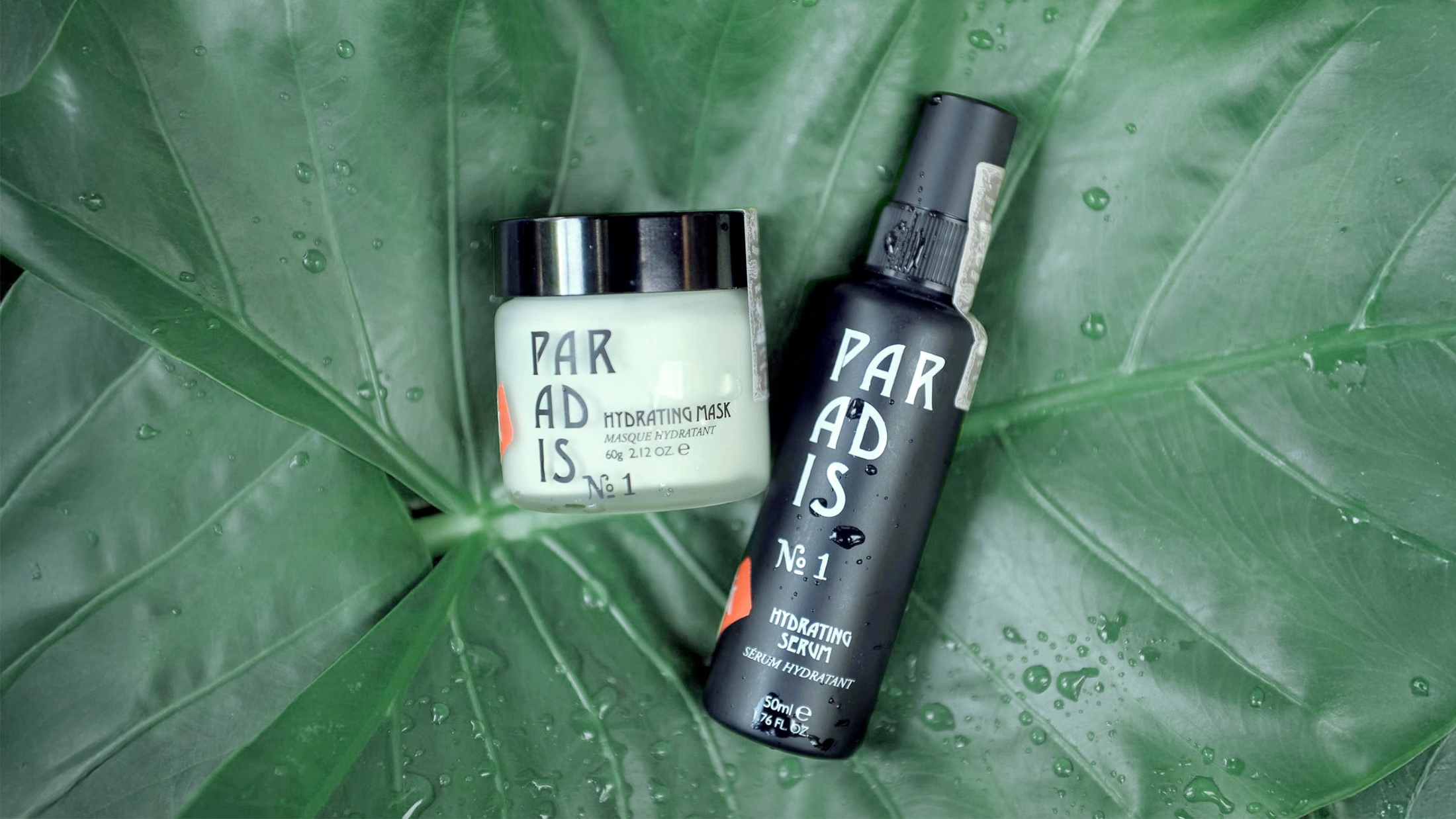
Enfants Paradis — botanical skincare packaging and retail design
Packaging Innovation, Materials & Production
Balancing creative ambition with manufacture, transport, display and use.
A packaging idea is only successful if it survives production and performs in the customer’s hands.
Depending on the project, we work with clients, printers and specialist suppliers across structural packaging, material selection, prototypes, print processes, finishes and production artwork. We consider how a format will be filled, handled, transported, stored, opened and disposed of—not only how it appears in a presentation.
Material and finish choices can give a product character without relying on unnecessary decoration. For Aura Rosé, illustration, paper stock and gold foiling became part of the wine’s expression. For Barons Brewing, a flexible illustration and colour system allowed individual beers to be distinguished while remaining recognisable as one family.
Range architecture becomes particularly important when a brand has multiple products, benefits or formats. Our work for OPTY.NC included a scalable product system that could organise complex wellness information without losing the confidence and visual clarity expected within premium beauty.
Innovation does not always mean adding more. It can mean reducing material, simplifying a format, improving navigation or finding a production method that achieves a stronger result with fewer processes.
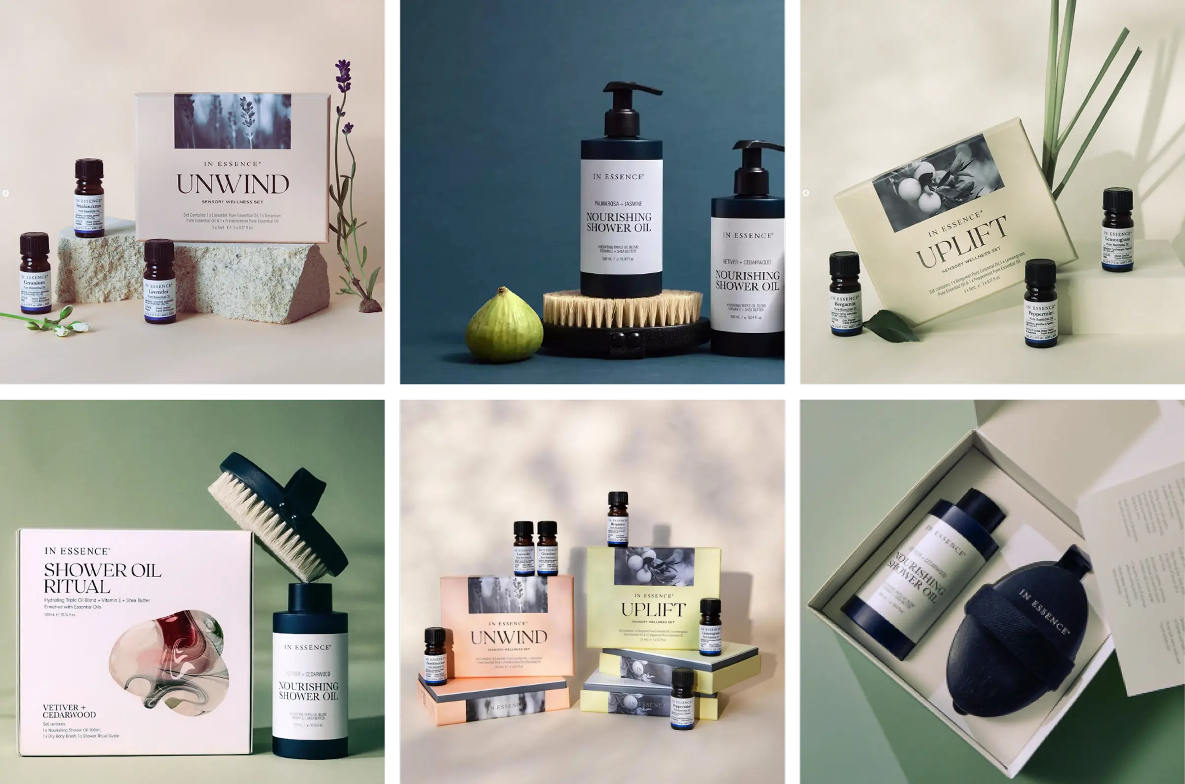
In Essence — packaging and retail point of sale
Retail POS & Display Design
Helping customers understand the product at the point of decision.
Once a product enters a retail environment, the packaging no longer works alone.
Retail point-of-sale needs to attract attention from a distance, explain the product at close range and help customers compare options without overwhelming the display. The appropriate response depends on the setting: a pharmacy, department store, specialist retailer, hotel boutique and temporary launch installation each create different patterns of movement and attention.
We design countertop units, product displays, promotional graphics, launch material, testers, signage, display cards and campaign applications. Packaging establishes recognition; POS provides the additional information or emphasis needed to support a decision.
For In Essence, packaging, photography and retail POS were developed as one connected system. The display environment reinforced the sensorial character of the aromatherapy brand while making a broad product range easier to understand. Le Tan similarly required the refreshed identity to work across packs, retail display and supporting marketing material.
Where a launch requires a wider set of campaign assets, our campaign creative and content creation work connects packaging and POS with photography, social content and advertising rather than treating each as a separate exercise.
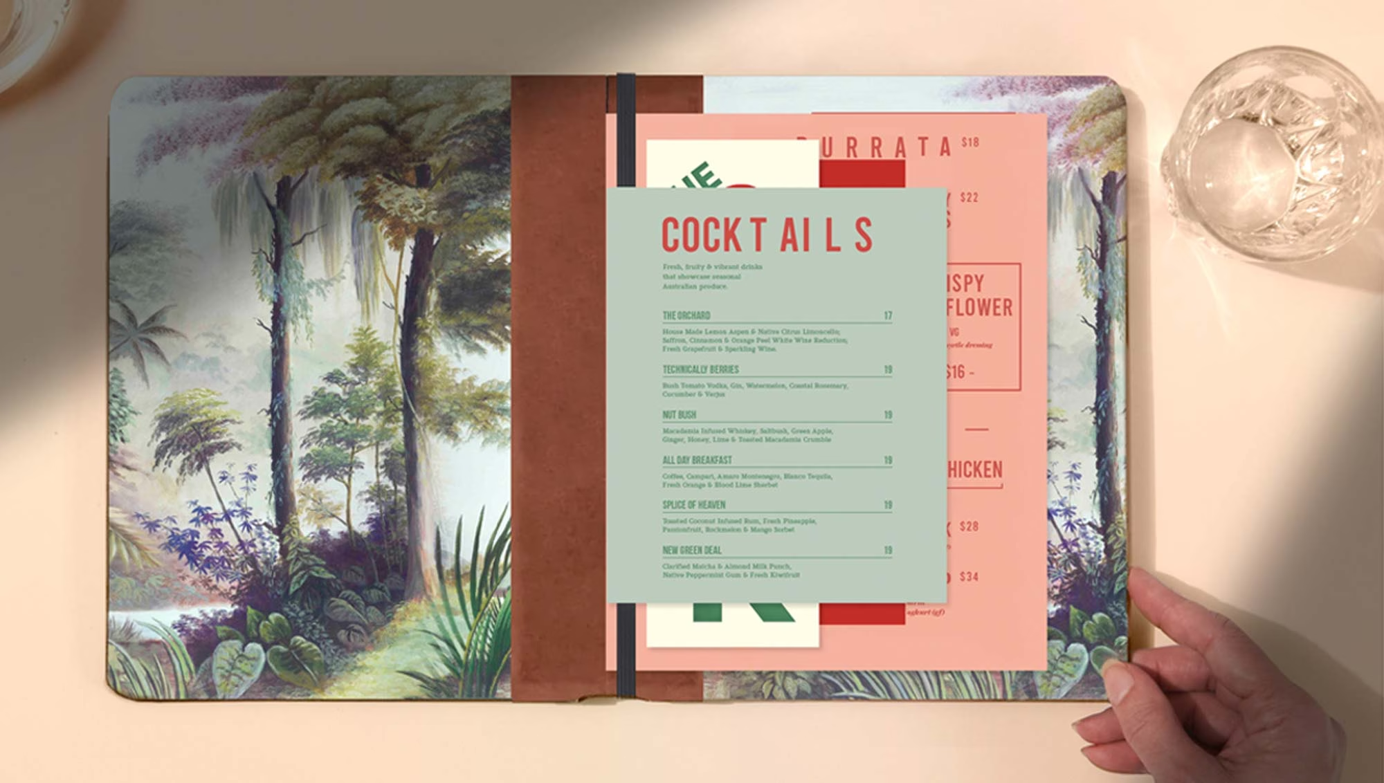
The Park Darlinghurst Restaurant Menu Design
Print, Editorial & Brand Collateral
Extending the identity into useful objects and everyday communications.
Not every physical brand touchpoint is packaging.
Stationery, brochures, presentations, invitations, menus, editorial publications and promotional material all contribute to recognition. Their value comes from consistency of thinking rather than identical laeyouts.
Our experience across brand identity, typography, editorial design, photography and production allows these pieces to be developed as parts of one system. A sales document has a different purpose from an invitation. A restaurant menu needs a different rhythm from a corporate presentation. The identity should remain recognisable while the structure responds to how each item is read and used.
For brands with many customer and staff touchpoints, a considered collateral system can be as important as the logo. Templates and production rules also make recurring material easier to prepare without gradually losing consistency.
Tatler Supper Club demonstrates how print can contribute to the character of a venue. Menus, coasters, event invitations, signage and smaller branded details supported the same confident, slightly theatrical identity without every item repeating the same composition.
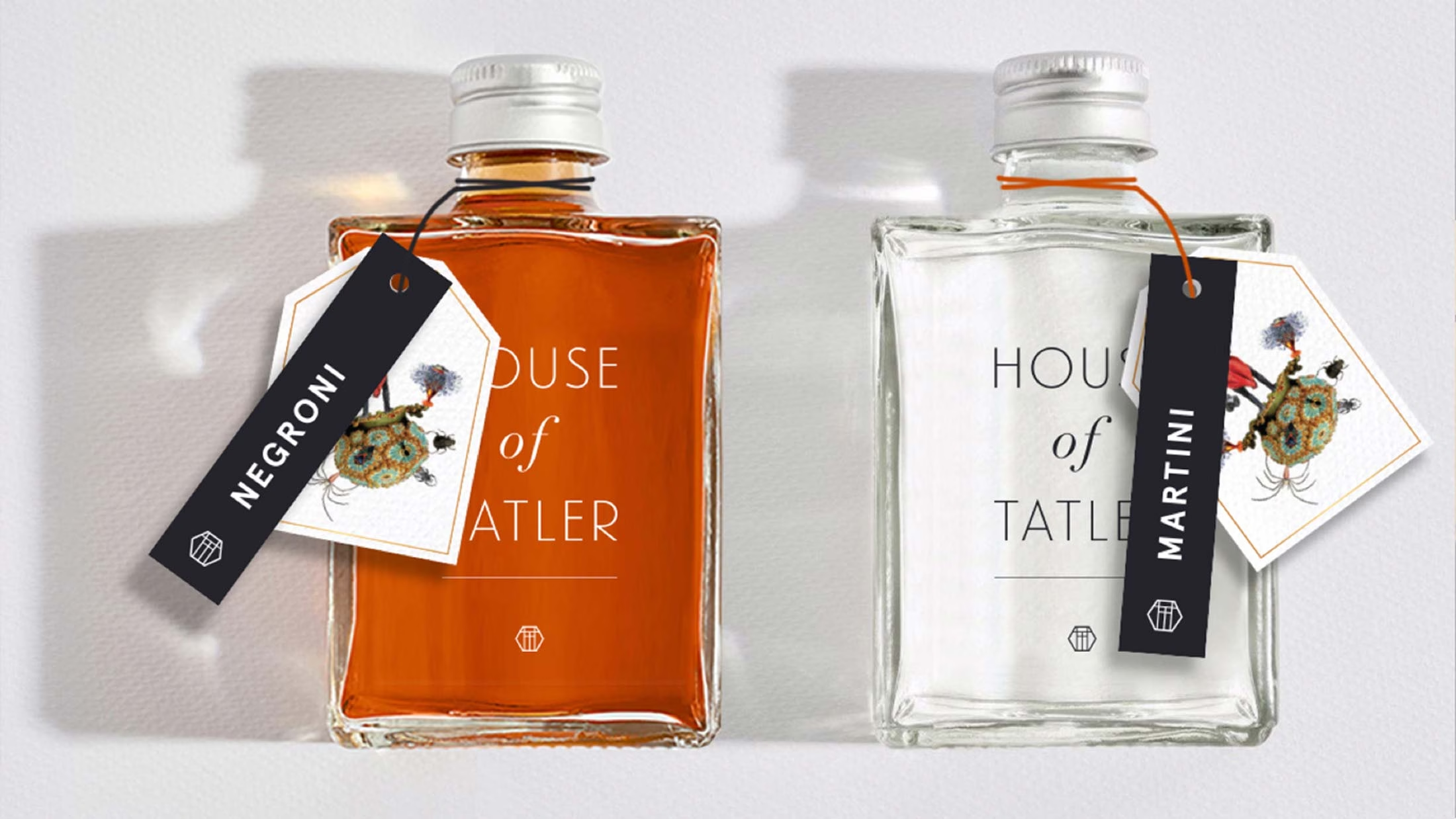
Tatler Supper Club — hospitality collateral, signage and packaging
Hospitality Collateral
Connecting the identity with the experience of a visit, meal or stay.
Guests encounter a hospitality brand repeatedly—before arrival, at the entrance, at the table, in their room and sometimes through an object they take away.
We design menus, spa menus, in-room collateral, minibar material, turndown pieces, guest information, takeaway packaging, gifting and other branded details for hotels, restaurants, bars, spas and wellness destinations. Each item has a practical purpose, but together they influence how considered and coherent the experience feels.
Consistency does not require repetition. A room card, dinner menu and gift box should belong to the same place, but each needs to respond to its setting, material and use. This is where packaging and collateral connect naturally with our work in hospitality branding and brand environments, signage and wayfinding.
For Saigon Street, the identity extended across menus, takeaway packaging, signage, wayfinding and restaurant collateral. These applications allowed the brand to become part of the colour and energy of the venue rather than remaining confined to the logo.
Tatler Supper Club required a different response. Its menus, coasters, invitations and event material drew on the established personality of a late-night Darlinghurst venue with its own history and loyal audience.
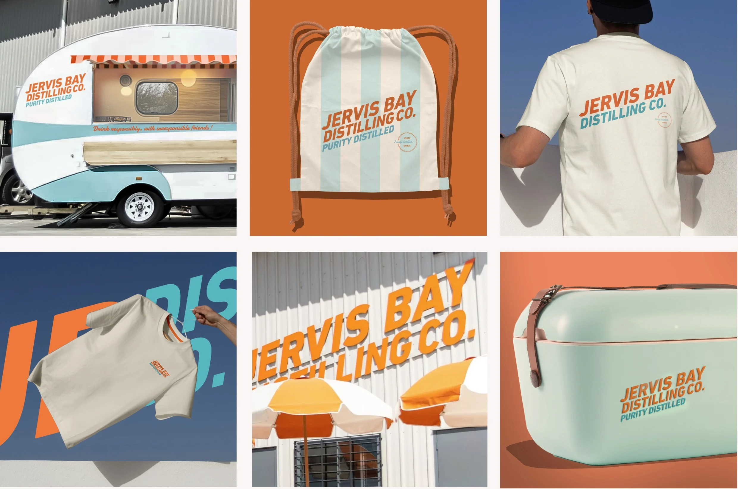
Jervis Bay Distilling merchandise and branded objects
Merchandise & Branded Objects
Creating objects people choose to keep, wear or use.
Merchandise can carry a brand beyond the immediate transaction or visit.
We develop uniforms, gifting, bags, accessories, branded objects and retail products for hospitality, wellness, lifestyle and consumer brands. The strongest examples have a reason to exist beyond displaying a logo. They may be useful, collectable, connected to a place or capable of expressing an aspect of the brand that conventional communications cannot.
Material, colour, form, packaging and context all affect how the object is perceived. A hotel gift, staff uniform and spirits accessory each requires a different balance between visibility and restraint.
For Jervis Bay Distilling, bottle design, merchandise, signage and campaign imagery were conceived as parts of one coastal brand world. The identity could move from the bottle to a venue, event or object without losing its relaxed Australian character.
This approach is particularly relevant to lifestyle brands, where the object itself may become an important way for customers to participate in and share the brand.
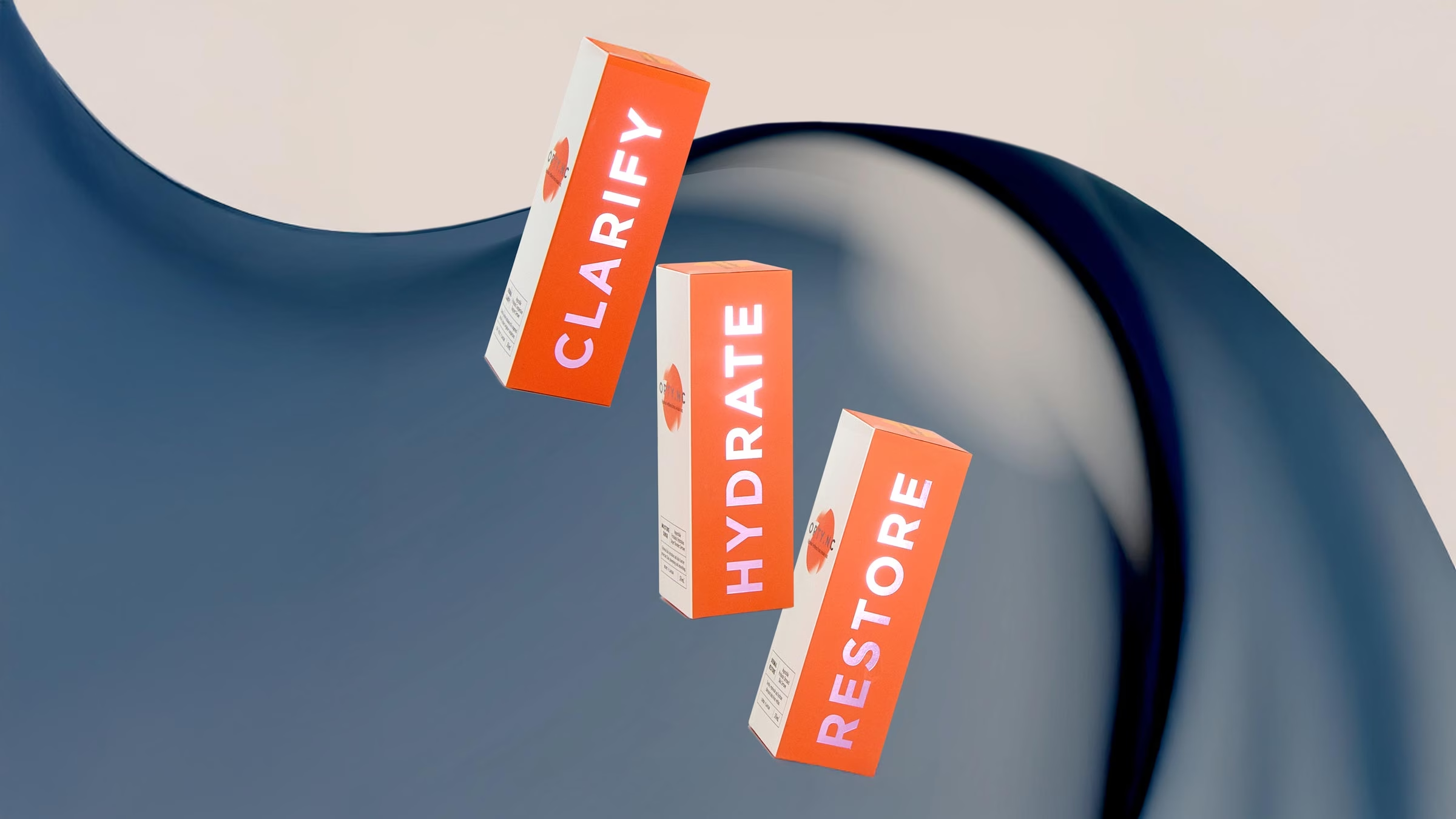
OPTY.NC — supplement packaging and beauty brand identity
Beauty & Wellness Packaging
Organising complex information while building recognition and trust.
Beauty and wellness products often need to communicate purpose, ingredients, efficacy and product difference within a very limited area.
The packaging must establish trust without becoming clinical, and express character without making important information difficult to find. In larger ranges, customers should be able to recognise the brand, distinguish one product from another and understand how the products relate.
Our wellness branding work includes aromatherapy packaging and retail POS for In Essence, ingestible beauty supplement packaging for OPTY.NC, suncare and skincare packaging for Le Tan, and the development of a botanical skincare and retail brand for Enfants Paradis.
Each project required a different balance. In Essence needed to retain the trust attached to more than 40 years of heritage while developing a more contemporary expression of sensory wellness. OPTY.NC needed the authority of a science-led supplement and the refinement of a premium beauty brand. Enfants Paradis required packaging to connect botanical skincare with travel and lifestyle.
In each case, packaging was treated as part of the complete brand experience—connected to positioning, identity, photography, ecommerce and retail presentation.

Packaging and branding for Aura Rosé a premium Australian wine
Food, Beverage, Wine & Spirits Packaging
Building recognition in categories where decisions are often made quickly.
Food and beverage packaging frequently has only a few seconds to communicate from a shelf, bar, table or takeaway counter.
It must identify the product quickly, create recognition at a distance and reward closer inspection. It also needs to remain legible under very different conditions: chilled cabinets, bottle-shop shelves, hospitality venues, event settings, ecommerce pages and social photography.
Our work includes wine branding and label design for Aura Rosé, craft beer packaging for Barons Brewing, bottle design and spirits packaging for Jervis Bay Distilling, and restaurant takeaway packaging for Saigon Street.
These projects operate in different categories, but each required a clear relationship between product and place. Aura Rosé used illustration and finish to create a more distinctive presence within Australian wine. Barons Brewing used a flexible visual system to bring character to individual beers while holding the range together. Jervis Bay Distilling drew on the landscape and pace of the NSW South Coast without relying on predictable coastal imagery.
For hospitality businesses, packaging can also extend the guest experience beyond the venue. Takeaway packs, bottled products, gifting and retail lines allow a restaurant, hotel or bar to enter the customer’s home while remaining recognisably connected to the original experience.
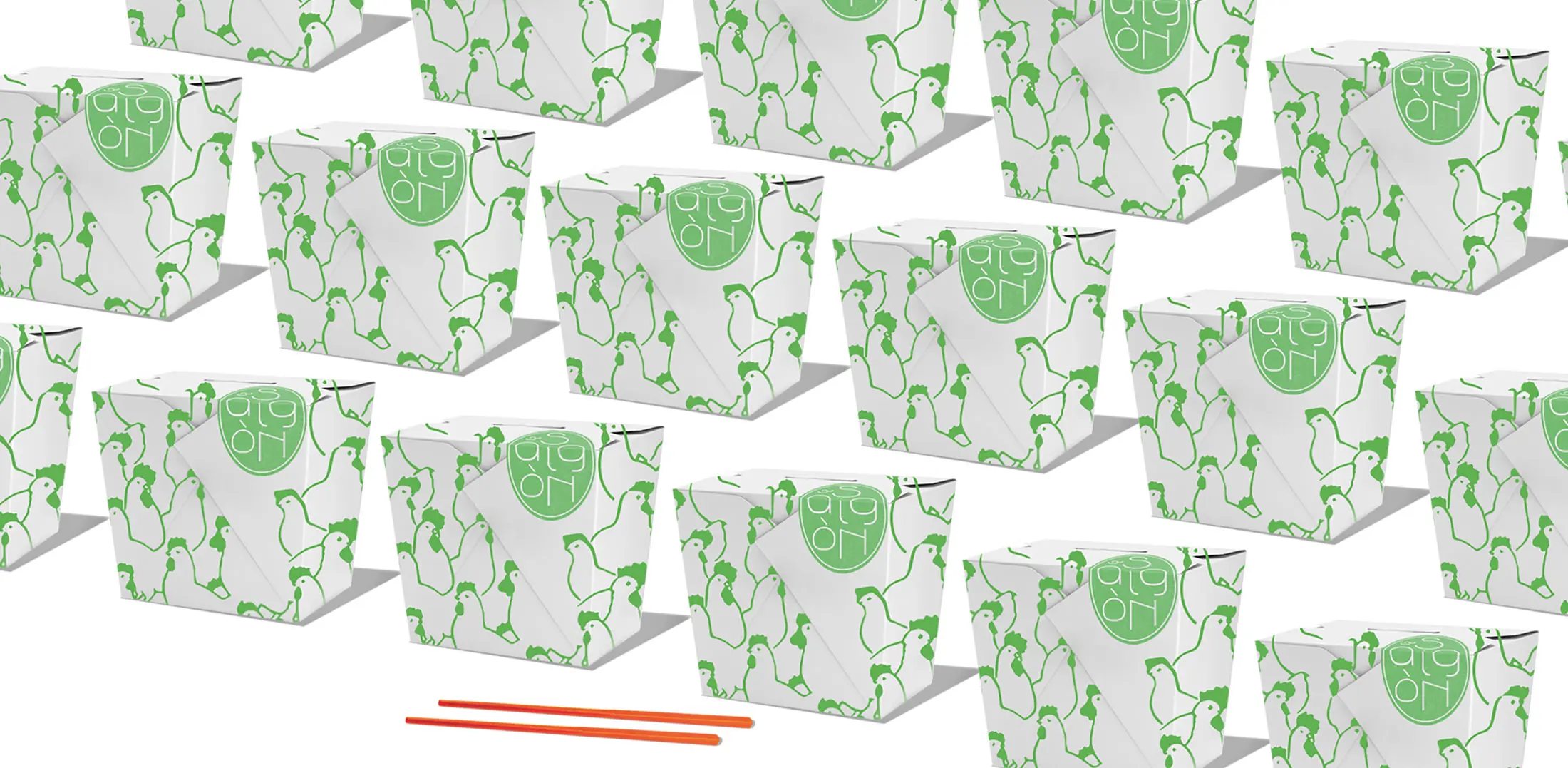
Saigon Street — restaurant branding, packaging and printed collateral for a Bali hospitality venue.
How We Approach Packaging Design
Beginning with the brand, the customer and the commercial conditions in which the product must compete.
Every packaging project begins with context rather than decoration.
We consider the audience, competitive category, price position, retail environment, product range and production requirements before design begins. For an established brand, this includes identifying which assets hold recognition and which parts of the current system create confusion. For a new product, packaging may be developed alongside brand strategy, naming and visual identity.
The next stage establishes the principles that need to work across the complete range: information hierarchy, typography, colour, imagery, materials, regulatory content and product differentiation. Concepts are tested across relevant formats rather than judged as isolated front panels.
Production is considered throughout. We prepare artwork, review specifications and proofs, and work with printers, packaging manufacturers or specialist suppliers as required. Where structural engineering or manufacturing expertise sits outside our role, we collaborate with the appropriate production partner while retaining oversight of the identity and graphic outcome.
A useful packaging system should accommodate change. New products, sizes, variants and markets should be able to enter the range without forcing the brand to start again. That capacity to grow is one of the clearest differences between designing an individual package and building a packaging system.
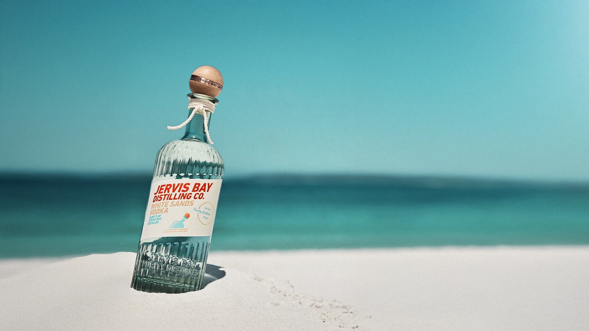
Jervis Bay Distilling — bottle design and spirits packaging
FAQs
A packaging design agency develops the visual and physical system through which a product is presented to customers. This can include packaging strategy, range architecture, graphic design, structural considerations, materials, print finishes, regulatory information, production artwork and support during manufacture.
At Ludbrook Agency, packaging design and retail POS are considered as part of the broader brand experience. We look at how the packaging works with the brand identity, photography, ecommerce, retail display and campaign material so that each customer touchpoint feels connected and recognisable.
No. Ludbrook Agency is based in Sydney, but we work with clients throughout Australia and internationally.
Packaging and branding projects can be managed remotely, with research, presentations and approvals handled online where appropriate. We can also work directly with a client’s existing printers, packaging manufacturers and production partners wherever they are located.
Our international work includes the restaurant identity, menus and takeaway packaging for Saigon Street in Bali, alongside Australian packaging projects across hospitality, beauty, wellness, lifestyle, wine and spirits.
Yes. We work with printers, packaging manufacturers and specialist production partners to carry a design from approved concept through to finished packaging.
Our role can include preparing production artwork, reviewing specifications, checking proofs, coordinating colour and finishes, and resolving practical issues before manufacture. Where structural packaging or specialist engineering is required, we collaborate with the appropriate manufacturer rather than attempting to duplicate that expertise in-house.
Projects such as In Essence demonstrate how packaging design, materials, print production, photography and retail presentation need to be considered together. We can work with a client’s existing supplier or help identify the type of production partner a project requires.
Yes. An existing packaging range can often be redesigned without discarding the recognition the brand has already built.
We begin by identifying what is working, what is creating confusion and where the existing system is restricting the business. This may involve reviewing hierarchy, typography, colour, product naming, variant recognition, materials or the relationship between products across the range.
The appropriate response may be an evolutionary redesign rather than a complete replacement. Our work for Le Tan shows how an established Australian brand can retain familiarity while improving product navigation, shelf presence and relevance within a changing beauty market.
Sustainability can be considered as part of the packaging design process, but the appropriate response depends on the product, manufacturing method, transport requirements, shelf life and what happens to the packaging after use.
We look for practical opportunities to reduce unnecessary material, simplify packaging formats and consider recyclable, lower-impact, reusable or refillable options where appropriate. These decisions must also account for durability, product safety, print processes, production quantities and cost.
For beauty and wellness branding, sustainability claims must be supported by genuine material and production decisions rather than being treated as packaging language. Where specialist advice is required, we work with packaging suppliers and manufacturers to identify options that are appropriate for the product and commercially realistic.
Yes. We can manage packaging production and printing as part of the wider design process, from preparing final artwork and specifications through to working with printers, packaging suppliers and specialist manufacturers.
The level of involvement depends on the project. We may manage production directly or work alongside a supplier appointed by the client. Our focus is maintaining the integrity of the approved design across materials, print techniques, colour matching, finishes, prototypes, proofs and final production.
For Aura Rosé, the relationship between illustration, paper stock, label production and gold foiling was fundamental to the finished result. This kind of project requires design and production decisions to be resolved together rather than in separate stages.
Yes. We design the creative and branded components of retail point-of-sale displays, including product presentation, promotional graphics, countertop displays, testers, signage and supporting retail collateral.
Retail POS needs to work with the packaging rather than compete with it. We consider how products are grouped, what information needs to be understood quickly, how the brand is recognised from a distance, and how the display connects with the wider identity across packaging, photography and campaign material.
Our work includes retail POS and related brand applications for In Essence, OPTY.NC and Le Tan. In each case, the retail environment forms part of a broader brand system rather than being treated as a separate promotional exercise.
Where specialist structural development or manufacturing is required, we can work with appropriate production and display partners while retaining creative direction over the brand, graphics and presentation.
Yes. Beauty and wellness packaging is a significant part of our work. Our experience includes skincare, aromatherapy, ingestible supplements, spa products and lifestyle ranges.
These categories often need to communicate product function, ingredients, efficacy, positioning and the relationship between individual products within a larger range. We consider how each pack works independently, how the complete range reads together and how the packaging connects with ecommerce, photography, retail POS and the wider identity.
Our wellness packaging and branding projects include In Essence, Le Tan, Enfants Paradis and OPTY.NC, where we developed the brand identity, product architecture, supplement packaging and campaign photography as one connected system.

