BARONS BREWING
Craft beer branding, packaging and illustration for the relaunch of an established Australian beer brand.
Barons Brewing already had history, recognition and a loyal following when entrepreneur Nick Armstrong acquired the brand and asked the Ludbrook Agency to bring it back to market.
Originally launched in the mid-2000s, Barons had built a strong reputation in Australian craft beer and won a number of industry awards before an ambitious move overseas contributed to the business falling dormant. The challenge was not to invent a new beer brand from scratch, but to work with something people already remembered.
At the same time, Nick was developing The Park in Darlinghurst, where Barons became the principal beer offer. The two projects were developed alongside one another, giving us the opportunity to think about the beer not only as a packaged product but as part of a broader hospitality experience.
Kirsty Ludbrook led the beer branding and rebrand, retaining the recognisable Baron character while giving the identity a sharper, more contemporary personality that could work across beer taps, cans, packaging, marketing and digital content.
Scope
Brand Identity
Custom Artwork
Packaging
Marketing Collateral
Website
Social Content
Illustration
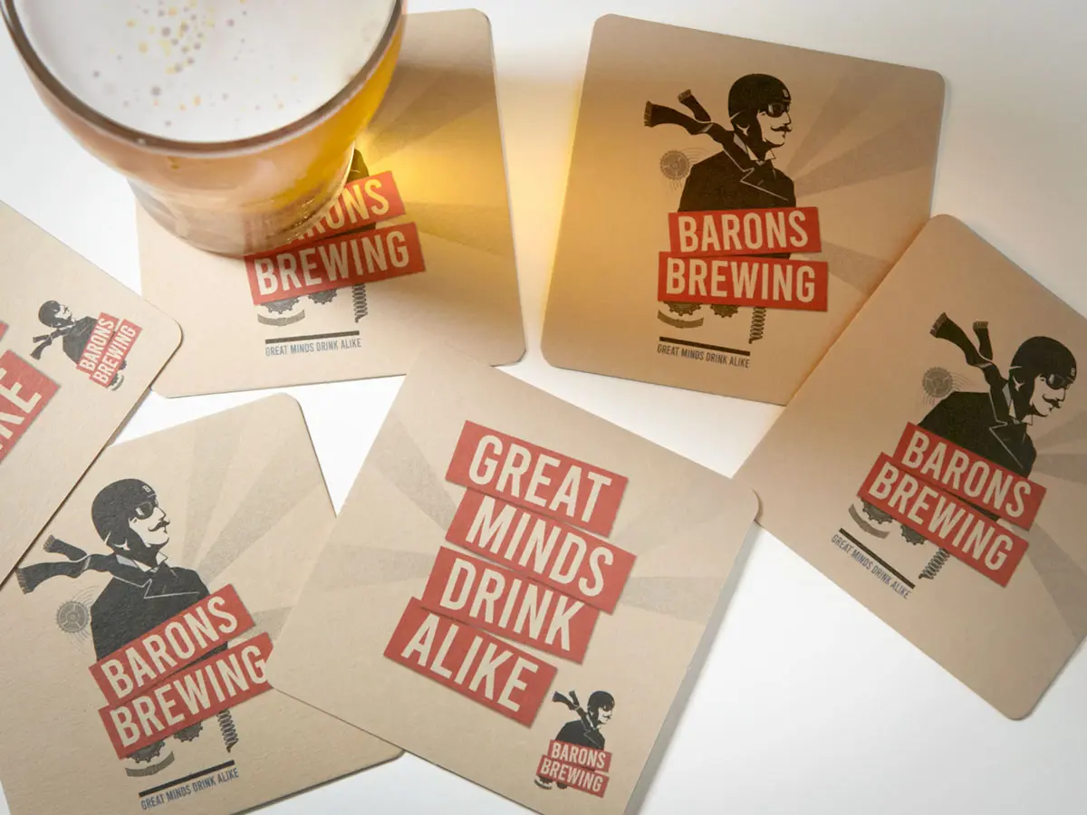

Reworking an Existing Beer Brand
The original Barons identity had equity, but it also carried the visual language of an earlier period in Australian craft beer.
Rather than discard that recognition, we redrew the Baron himself. The new character retained the spirit of the original but became more confident, more expressive and slightly cheekier. An aviation theme was pushed further through references to steampunk and constructivist graphics, creating a stronger visual system around the illustration rather than relying on the character alone.
The identity also needed to work across different beer varieties. Colour became an important organising device, allowing individual products to be distinguished while still presenting as one family when seen together on taps or on retail shelves.
This was particularly important for a craft beer branding project. Packaging has to work at several scales: from a distance in a bottle shop, at close range in the hand, and as a repeated system across multiple variants.
The aim was to make Barons recognisable as one brand while giving each beer enough visual character to stand on its own.


Packaging, Illustration & Rollout
The redrawn Baron became the centre of the new identity across packaging, custom illustration, marketing collateral, website and social content.
The visual system was designed to work equally well in hospitality and retail. At The Park, Barons had a direct on-premise presence as the venue’s main beer. Beyond the venue, the brand needed to compete in a much more crowded craft beer market where recognition on tap badges and cans was critical.
The colour-coded range helped create that distinction, while the consistent illustration style held the family together.
The Ludbrook Agency’s scope covered brand identity, custom artwork, beer packaging design, illustration, website, marketing collateral and social content. The result was a rebrand that respected the existing equity of Barons while giving it a more flexible identity for a new stage of the business.


The Result
Barons returned to market with an identity that was familiar enough to retain recognition but different enough to signal a new beginning.
The brand moved back into hospitality venues and retail, and the Barons name continues to trade in Australia today. A current Australian business registration exists for Barons Brewing and Barons Brewing Co under Love To Liquor Pty Ltd, and Barons Lager and Pale Ale remain listed through Dan Murphy’s.
The project is a useful example of a different kind of beverage branding problem: not how to create recognition from nothing, but how to decide what an existing brand is worth keeping.
For Barons, the answer was the character at the centre of the identity. By retaining and reworking the Baron rather than replacing him, the rebrand could acknowledge the beer’s history while giving the packaging, illustration and broader brand system a new life.