
LOFLY RESTAURANT BRANDING
LoFly Tuckshop was an Asian-inspired grill in Potts Point, created around fast food, bold flavour and the informal energy of the street. The concept needed a restaurant brand identity that felt distinctive and contemporary without becoming too polished or overly serious.
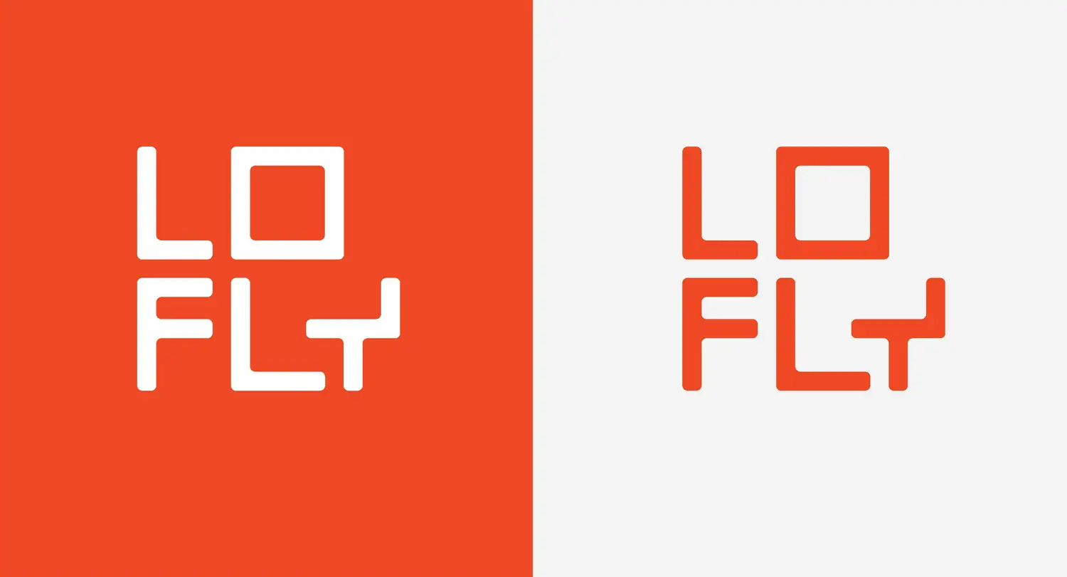
Ludbrook Agency developed a compact visual system built around a custom wordmark, a punchy colour palette and a cast of irreverent illustrated characters. Applied across menus, packaging, signage, uniforms and digital communications, the identity gave LoFly a recognisable presence that suited its casual, slightly unconventional personality.
Scope
Branding
Restaurant collateral
Menu design
Animation design
Digital assets

The Challenge
Creating a strong identity for a fast-moving hospitality concept.
Potts Point is crowded with restaurants, bars and takeaway venues competing for attention. LoFly needed to make an immediate impression while clearly communicating that it was relaxed, affordable and driven by flavour rather than formality.
The challenge was to create a hospitality brand that could work just as effectively on a shopfront as it did on a takeaway container or social media post. It needed enough personality to be memorable, but also a simple underlying structure that could be reproduced consistently across a busy restaurant environment.

The Idea
A low-flying bird with a character of its own.
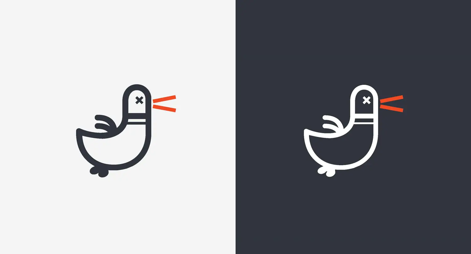
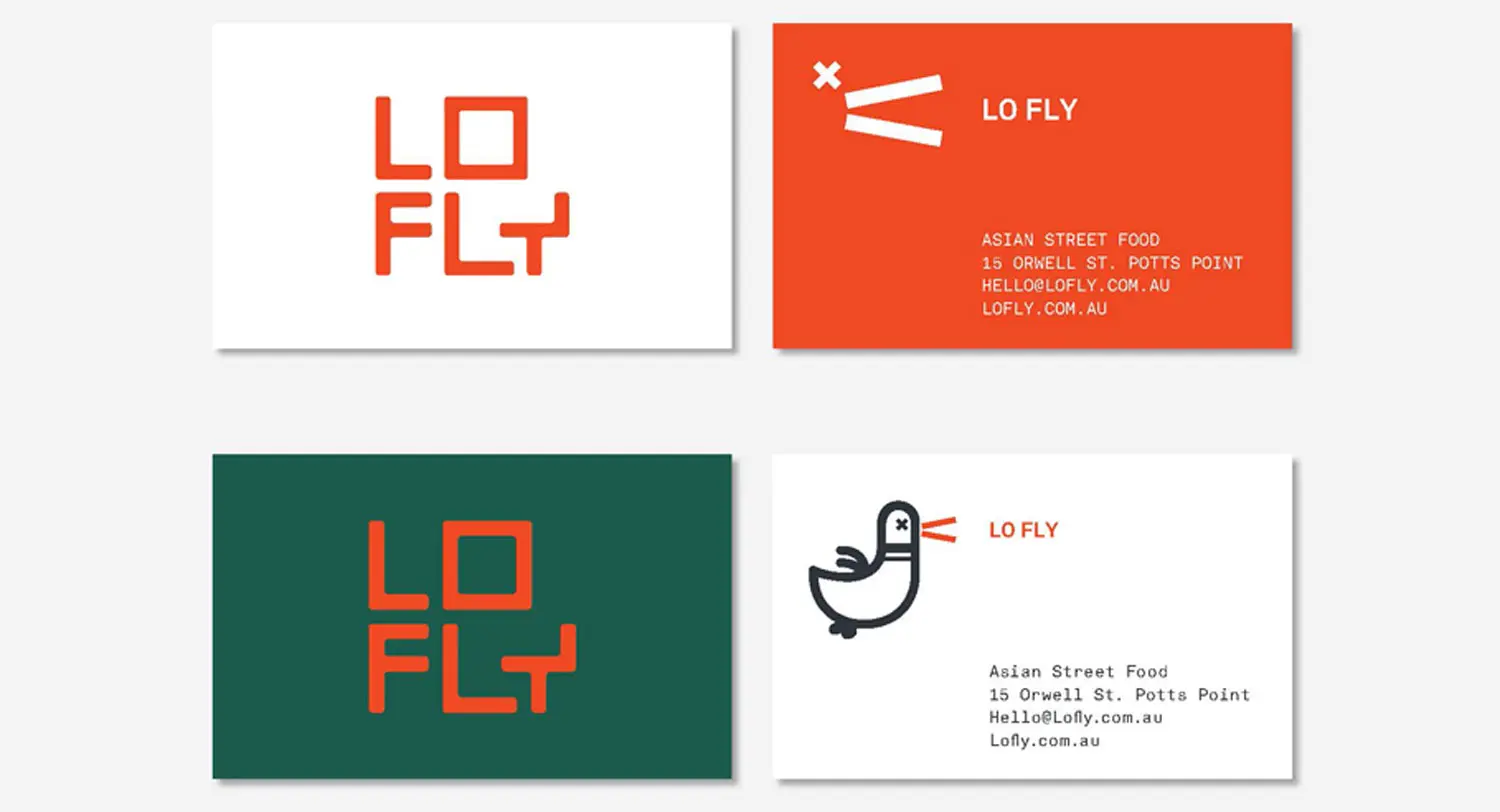
The name LoFly suggested something informal, energetic and close to the street. We developed that idea through a custom geometric wordmark and a deliberately awkward bird character that became an expressive part of the brand.
The logo’s rounded, modular lettering gave the identity a bold silhouette, while the illustration introduced humour and movement. Rather than relying on conventional Asian restaurant imagery, the system created its own visual world: direct, graphic and slightly offbeat.
The Identity
A flexible restaurant branding system.
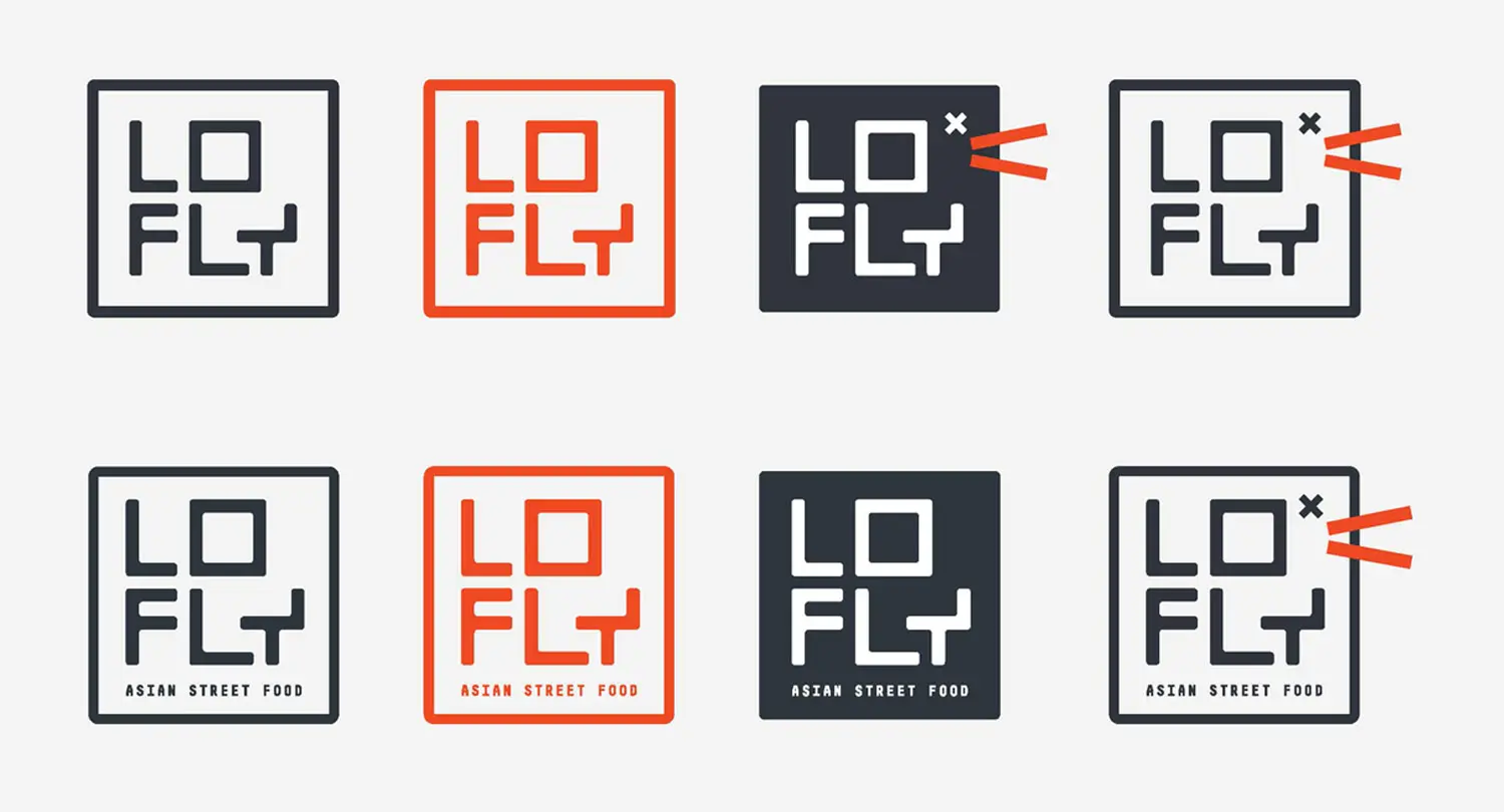
A tightly controlled palette of orange-red, charcoal and white gave the brand impact without making it complicated. The colours could be reversed and recombined across different applications, allowing the identity to remain recognisable in both print and digital formats.
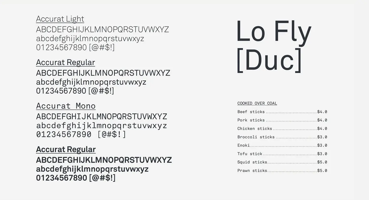
The wordmark, illustrations and typography were developed as a family of assets rather than a single logo treatment. This allowed the personality of the restaurant to extend across menus, restaurant collateral, packaging, animation and digital content while retaining a clear and consistent visual language.

A Brand in Action
Designed for every part of the customer experience.
For a casual restaurant, the brand is often encountered in fragments: a sign seen from the street, a menu at the table, a piece of takeaway packaging or an image online. Each of these touchpoints needed to feel connected.
We created a hospitality branding system that was easy to recognise and practical to apply across the venue. Strong blocks of colour helped signage and communications stand out, while the characters added wit and variety to functional items. The result was a brand with enough flexibility to remain lively without losing its identity.
The Outcome
A memorable identity with plenty of personality.
LoFly’s branding gave the restaurant a distinctive presence in a competitive hospitality neighbourhood. The visual identity felt informal and accessible, but still considered in its execution—balancing the energy of an Asian street-food concept with a sharp contemporary design sensibility.
Although the restaurant is no longer operating, the project remains a clear example of how a hospitality branding agency can turn a simple food concept into a complete and memorable brand experience. From the custom logo and illustration through to menus, packaging and digital assets, every element was designed to make LoFly easy to notice and difficult to confuse with anyone else.