LADY CHU
Hospitality branding and website design for Nahji Chu’s bold, personal return to Sydney dining.
Lady Chu is the restaurant of Nahji Chu, founder of the original Miss Chu brand and one of Sydney’s most recognisable independent restaurateurs. The Potts Point venue brings Vietnamese street food, French influence, contemporary art and Nahji’s unmistakable personality together under one roof.
Ludbrook Agency developed the brand narrative and identity, along with custom illustrations, signage, menus, restaurant collateral and the website design and build. The project called for the broad capabilities of a hospitality branding agency: one visual idea had to work across the restaurant, takeaway packaging, catering, digital ordering and a lively customer-facing website.
The result is colourful, direct and highly personal. It does not look or sound like a restaurant brand that could belong to anyone else.
Scope
Brand Identity
Brand Narrative
Signage
Custom Artwork
Menu Design
Restaurant Collateral
Website Design
Website Build
The Challenge
Creating a new restaurant without repeating Miss Chu.
Nahji Chu already had a strong public profile and a considerable history in Sydney hospitality. The original Miss Chu brand had become known for Vietnamese hawker food, bicycle delivery, candid language and an identity that challenged the conventions of restaurant marketing.
Lady Chu needed to carry some of that confidence forward without becoming a remake of the earlier business. The new restaurant had its own setting, audience and offer, spanning dine-in, takeaway, catering, group bookings and wholesale enquiries. The brand needed enough range to cover all of those functions while remaining unmistakably connected to Nahji.
The website faced the same test. Effective hospitality website design is not simply about presenting an attractive menu. Customers need to book, order, enquire about catering, buy gift cards and understand the venue quickly—often from a mobile phone and often while already deciding where to eat.
The Idea
Build the identity around Nahji’s world.
A conventional restaurant identity would have felt wrong for Lady Chu. Nahji’s family history, cultural references, humour, art collection and public personality are inseparable from the venue, so they became the raw material for the brand.
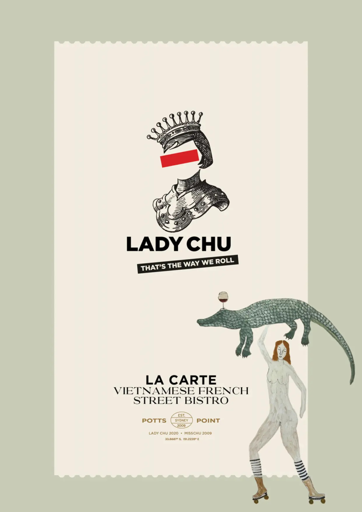
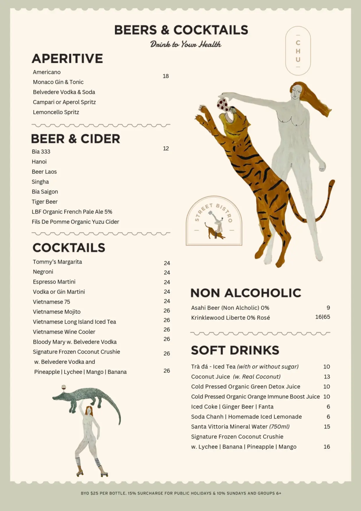
We created a layered visual language drawing from Vietnamese and Chinese motifs, portraiture, decorative pattern, street graphics and custom illustration. Leopards, crocodiles, elephants, crowned figures, dumplings and unexpected characters appear throughout the work. The pieces feel collected rather than uniformly applied, while typography and colour hold the system together.
The writing carries the same character. “That’s the Way We Roll”, “Drive-Chu” and “Disco Dumplings” give Nahji’s humour a visible role in the customer experience. These are not decorative additions. They help make the restaurant recognisable and give it a voice competitors cannot easily reproduce.
The Brand Experience
Transforming Roslyn Street into a buzzing dining destination.
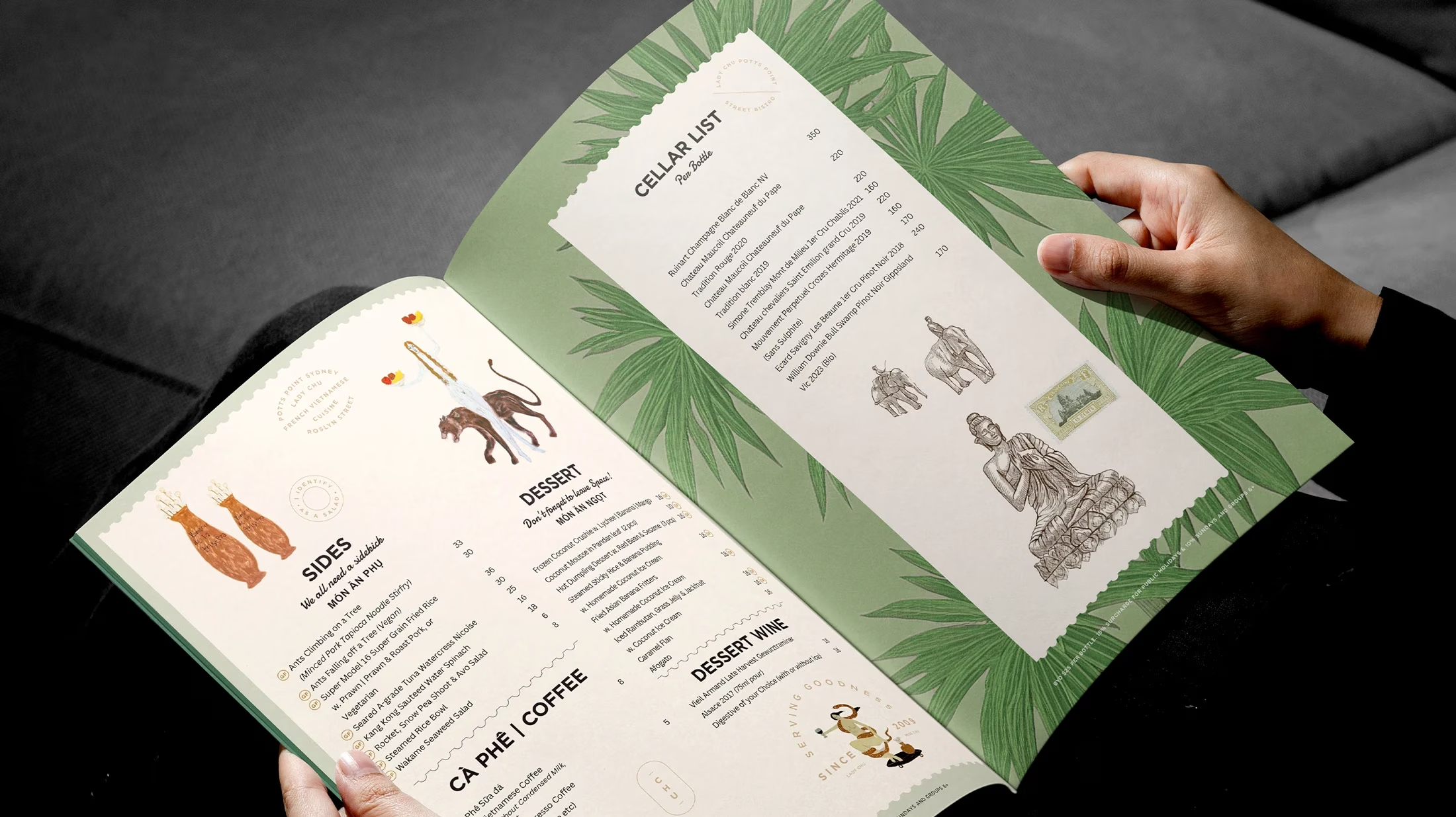
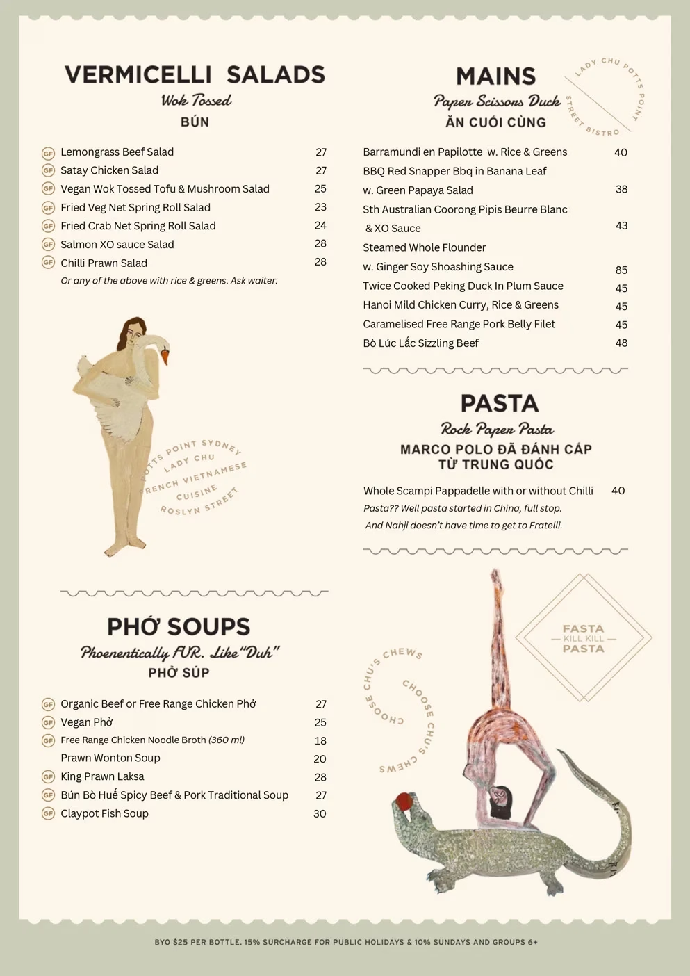
The identity extends across signage, menus, table cards, takeaway material, animated graphics, children’s menus and custom artwork. Each piece adds another part of the story while remaining recognisably Lady Chu.
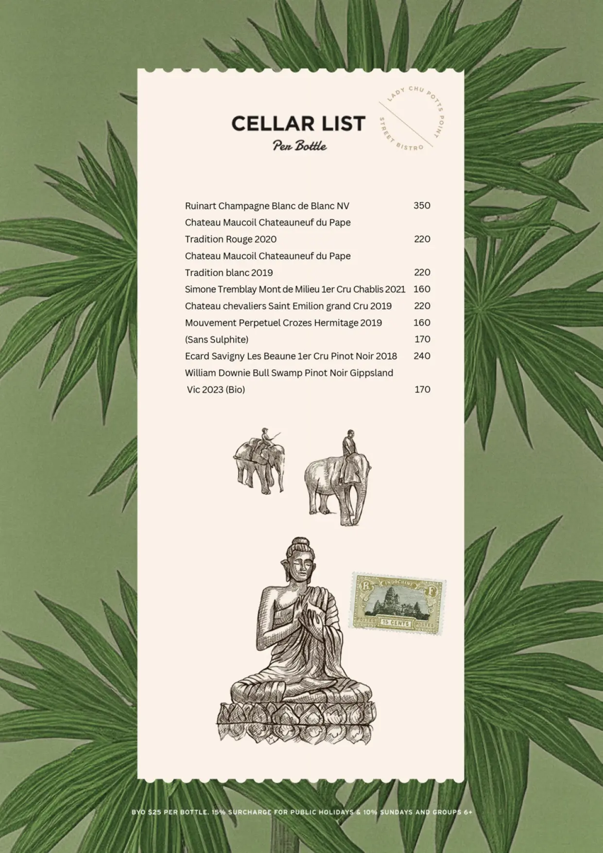
The menus became one of the fullest expressions of the brand. Illustrated spreads move between Vietnamese street-food references, French influence, personal commentary and deliberately unexpected imagery. This suits a restaurant serving rice paper rolls, phở, Peking duck pancakes, seasonal dishes and Vietnamese canapés without presenting them through a restrained fine-dining lens.
The visual identity also supports the broader business. Lady Chu operates dine-in and takeaway services, accommodates larger groups, provides catering and supplies wholesale customers. The physical and digital material needed to make those offers clear without dividing the brand into unrelated parts.
The Website
Hospitality web design with personality and purpose.
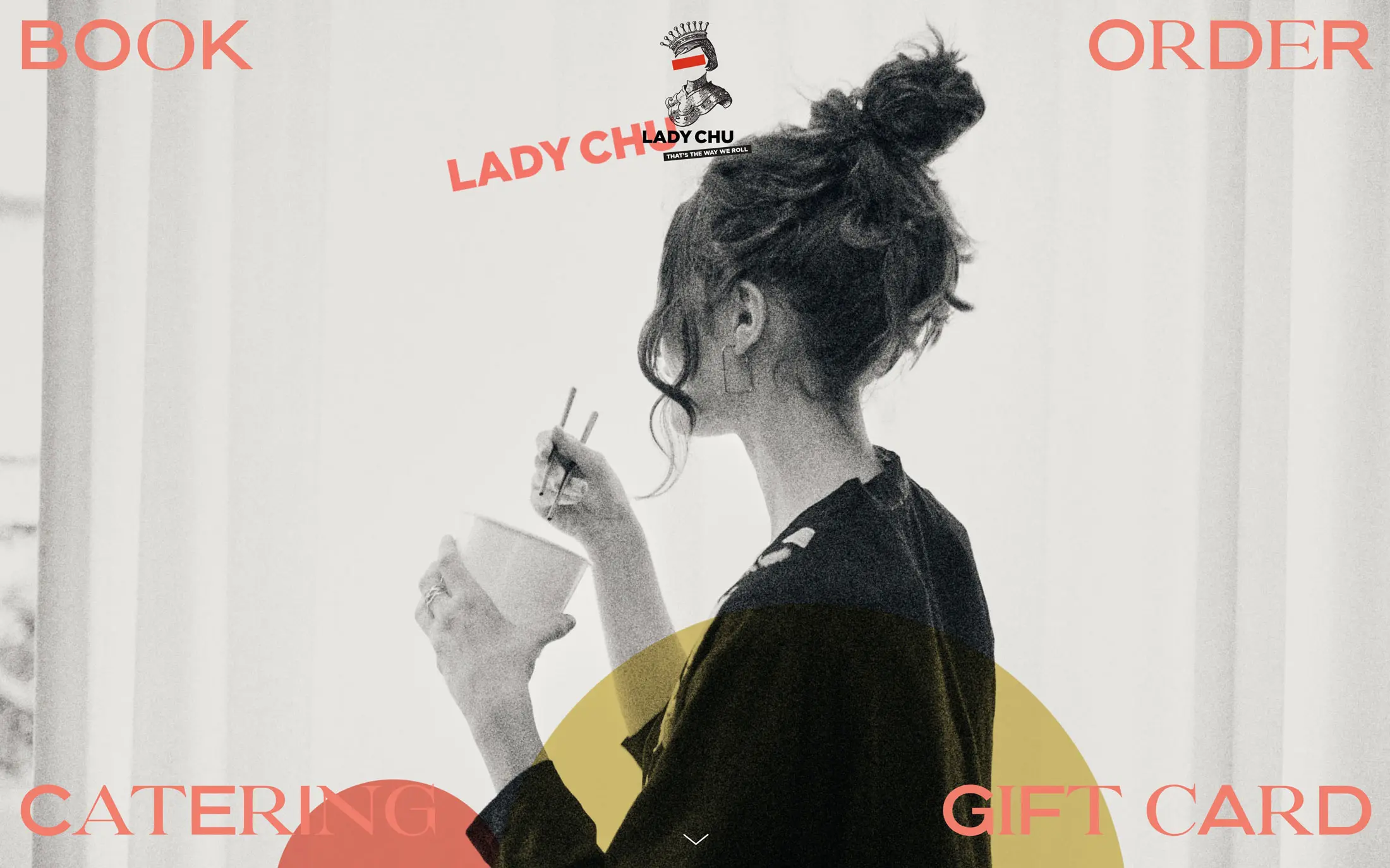
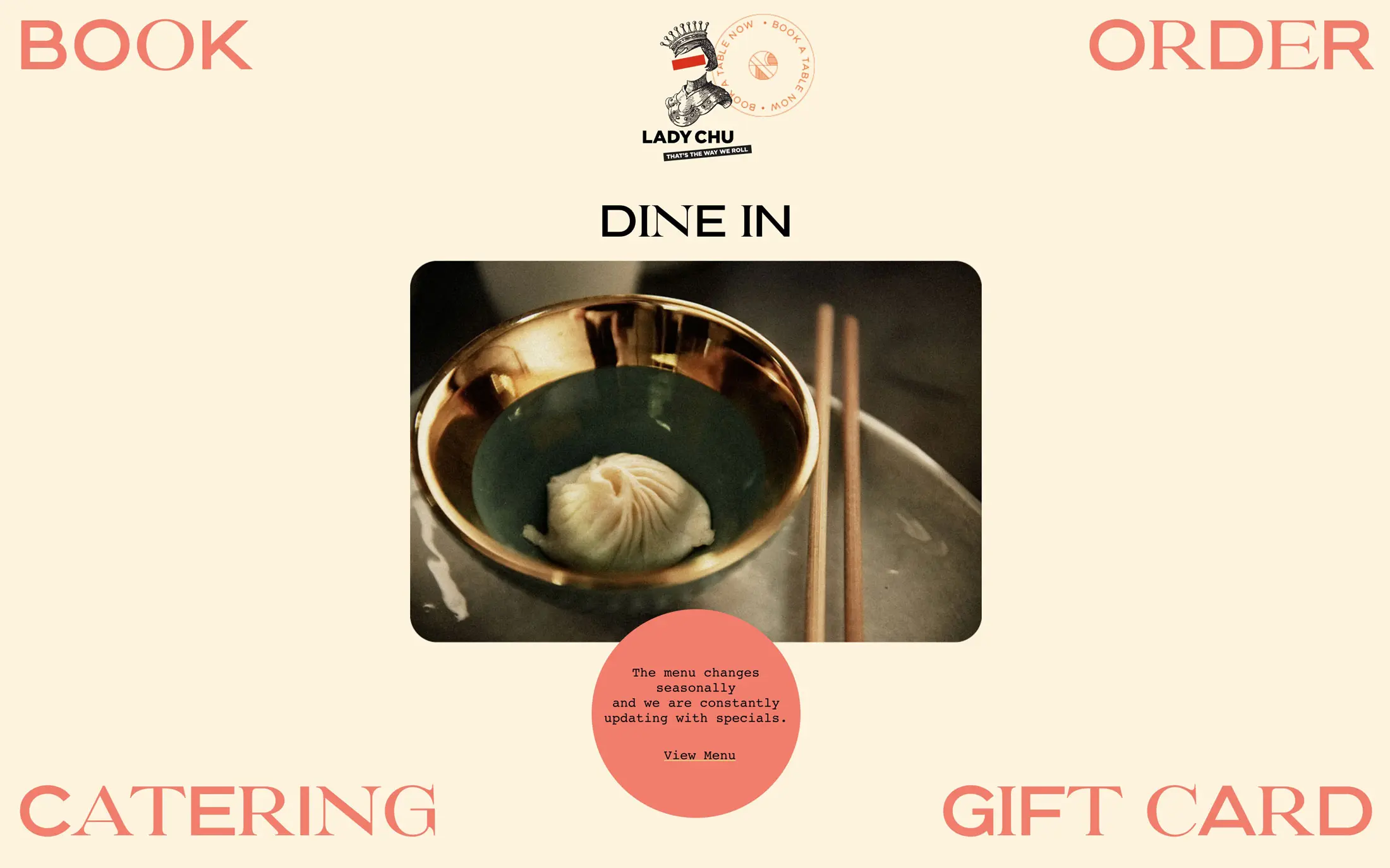
Ludbrook Agency designed and built the Lady Chu website as an extension of the restaurant rather than a neutral booking portal. Large imagery, changing typography, illustrated elements and animated text carry the energy of the brand onto the screen.
Underneath that expression is a direct commercial structure. Visitors can book a table, order takeaway, arrange catering or purchase a gift card immediately. They can also view seasonal menus, find delivery information, enquire about group bookings and access the restaurant’s catering offer.
This balance is central to good hospitality web design. The site has to feel specific to the venue, but it also has to help customers complete an action without searching for it. Lady Chu’s main services are visible from the beginning, while the language and visual treatment make the experience feel authored by Nahji rather than copied from a standard restaurant template.
The website forms part of a wider hospitality brand system covering identity, narrative, signage, menus, collateral and digital experience.
The Outcome
A restaurant brand inseparable from its founder.
Lady Chu has developed a strong presence in Potts Point because the restaurant, identity and founder all speak with the same voice. Nahji remains closely connected to the food, customers and public face of the business, giving the venue a level of personality that cannot be manufactured through advertising alone.
The brand gives that personality a coherent visual form. It can be theatrical, playful and occasionally provocative while still working across signage, menus, takeaway, catering and the website.