AURA ROSÉ
Wine branding, packaging and label design for an Australian rosé created to stand out on shelf and become part of the summer social scene.
Aura Rosé was created as a premium Australian wine with a distinctly contemporary attitude — sophisticated enough for boutique bottle shops and restaurants, but relaxed enough for rooftop bars, long lunches and summer afternoons.
Ludbrook Agency developed the brand identity and wine packaging from the ground up, including the logo, custom illustration, label design and production. The visual language was then extended across photography, digital, event material and signage to create a cohesive brand beyond the bottle.
The result was a rosé brand designed as much around lifestyle and experience as the wine itself.
Scope
Branding
Packaging
Photography
Website
Event Invitation
Signage

The Challenge
The Australian rosé category is highly visual and highly competitive. Aura needed to attract attention at retail while avoiding the familiar conventions of either traditional wine branding or overly feminine rosé packaging.
The brief was to create something immediately recognisable, premium but accessible, with a strong summer character and particular appeal to an inner-city audience.
For a new wine without established brand recognition, the bottle itself also had to do much of the marketing. Shelf presence, wine label design and packaging therefore became central to establishing the brand.
The Strategy
We positioned Aura as a lifestyle-led wine brand rather than treating the project simply as a label exercise.
The identity needed to communicate the relaxed optimism associated with rosé while retaining enough sophistication to work across premium retail and hospitality environments.
This informed every part of the brand — from naming and identity through to the illustration, materials, photography and wider rollout.
Rather than following established European wine cues, the approach was deliberately contemporary and Australian: light, distinctive and designed for a social setting.
Creative Direction & Visual Identity
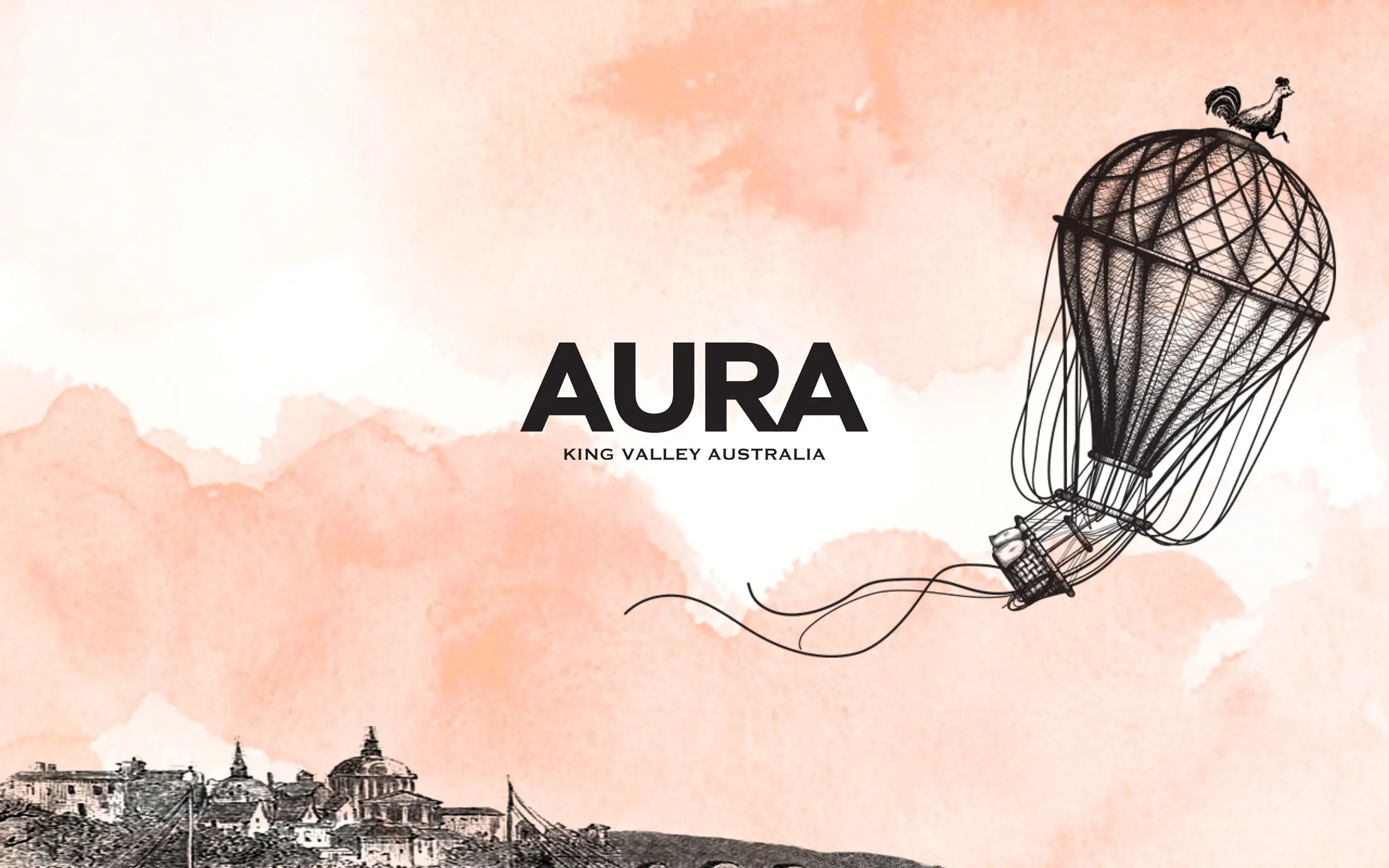
At the centre of the Aura Rosé brand identity was a custom illustration that gave the bottle its own recognisable visual character.
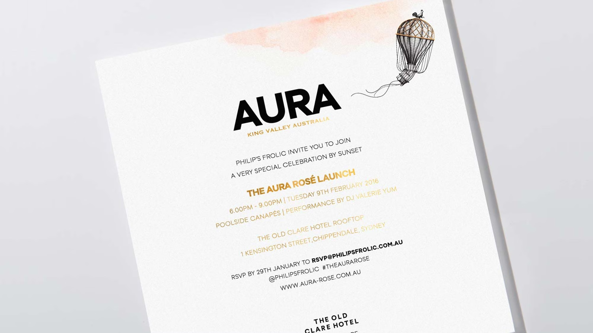
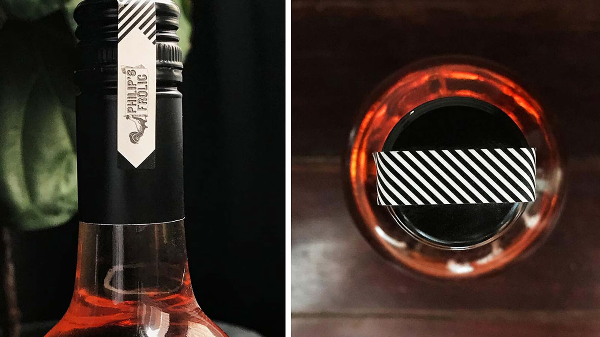
The illustration was paired with a restrained typographic treatment, considered paper selection and gold foil detailing. Together, these elements created contrast between informality and refinement: playful enough to be memorable, but with the material quality expected of a premium wine.
The tactile qualities of the label were an important part of the design. Paper stock, print finish and foil were considered alongside colour and illustration, allowing the packaging to work at close range as well as from across a retail shelf.
Rather than adding decorative elements for their own sake, each decision contributed to a clear and distinctive piece of wine packaging design.
Execution and Rollout
The identity was developed beyond the bottle into a broader suite of brand communications.
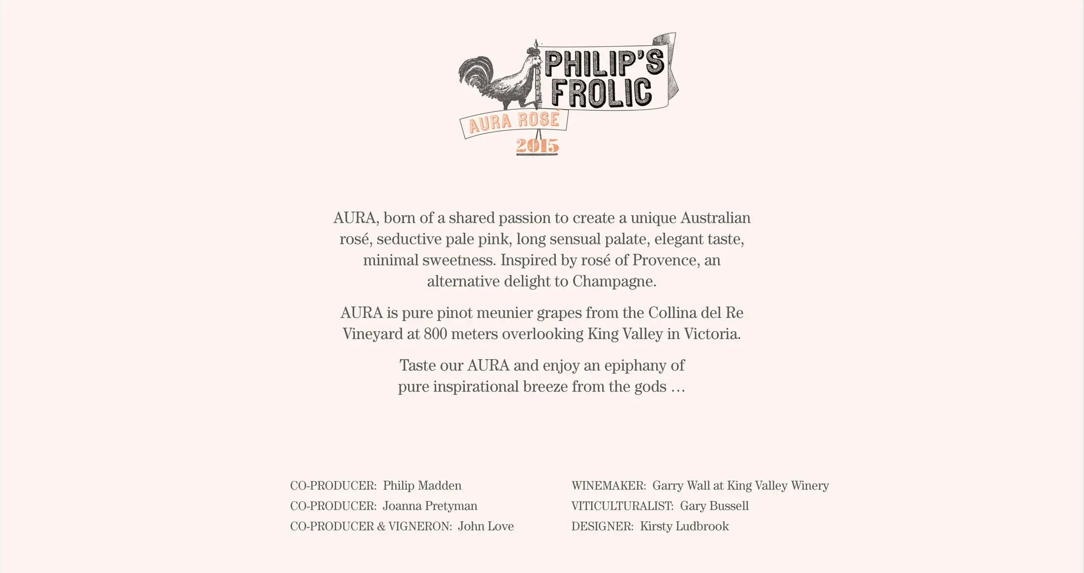
Ludbrook Agency created the wine label and packaging, photography, website, event invitation and signage, establishing a consistent visual language across retail, digital and hospitality touchpoints.
Photography helped place Aura within the world the brand was designed for — social, relaxed and summer-focused — while digital and event applications gave the new label a presence beyond traditional wine retail.
This broader rollout allowed the packaging, brand identity and campaign imagery to work together rather than treating the bottle as an isolated design object.
The Result
Aura entered the market with a distinctive identity and a bottle designed to command attention in a crowded category.
Its combination of illustration, premium paper and gold foil gave the rosé strong recognition on shelf while establishing a visual language that could extend naturally into hospitality, events and digital communications.
The project remains a good example of how brand identity, packaging design and physical production can work together to establish a new beverage brand — creating something that is recognisable not only on the shelf, but wherever the brand is encountered.