TATLER SUPPER CLUB
Brand identity, environmental design and hospitality collateral for one of Darlinghurst’s most enduring late-night venues.
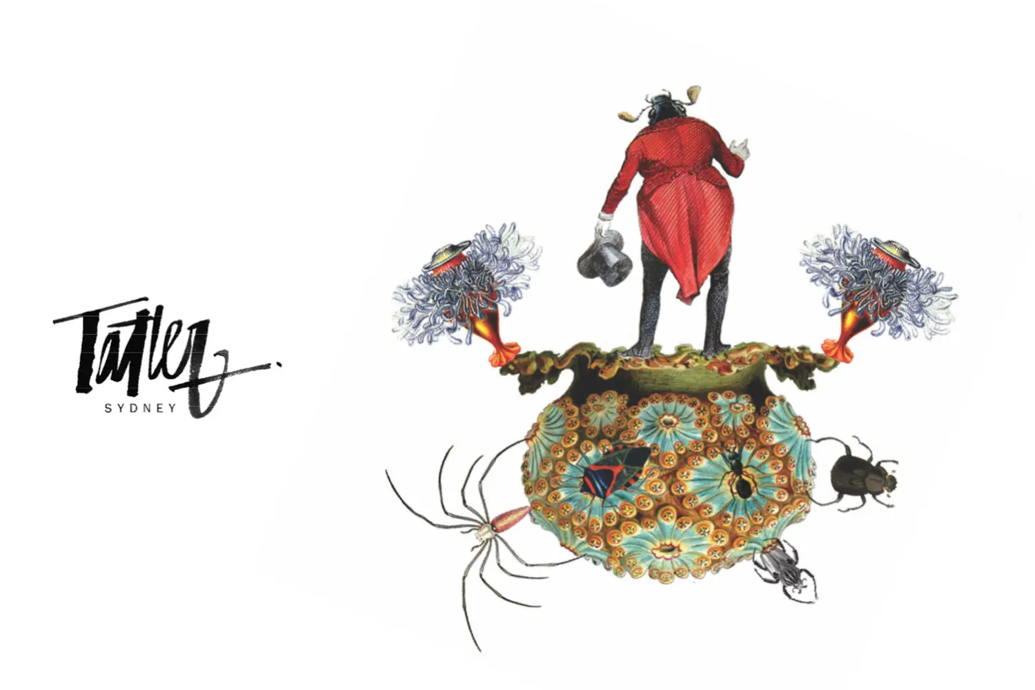
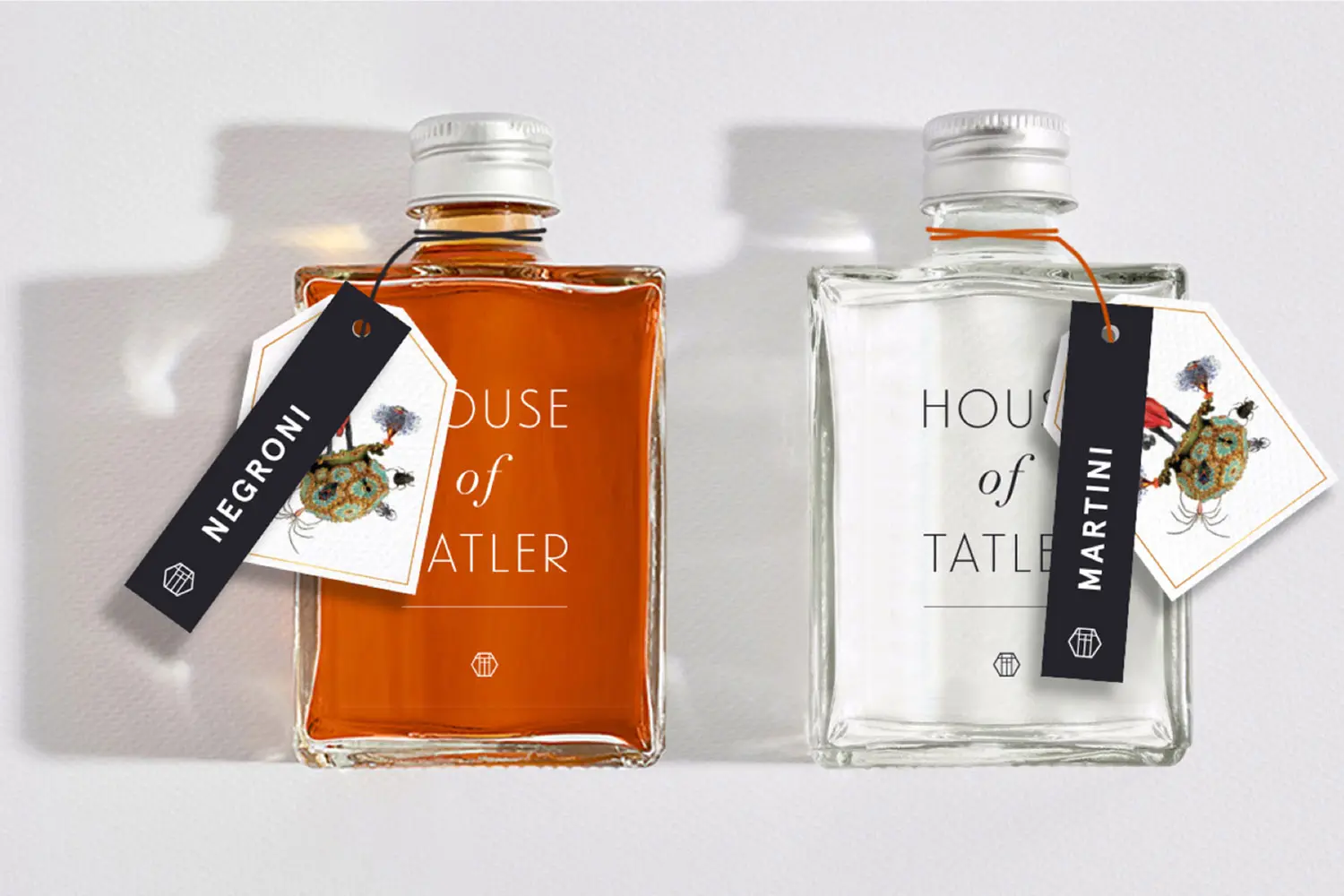
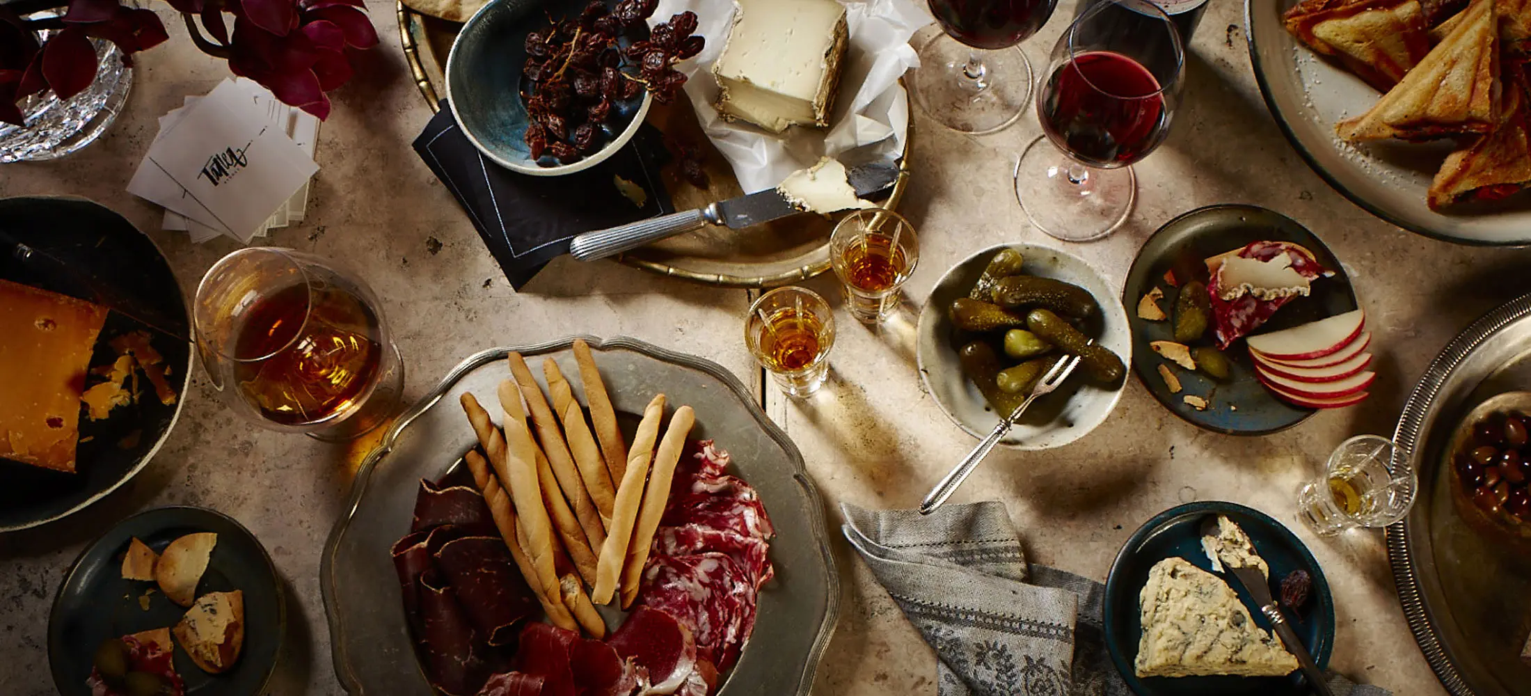
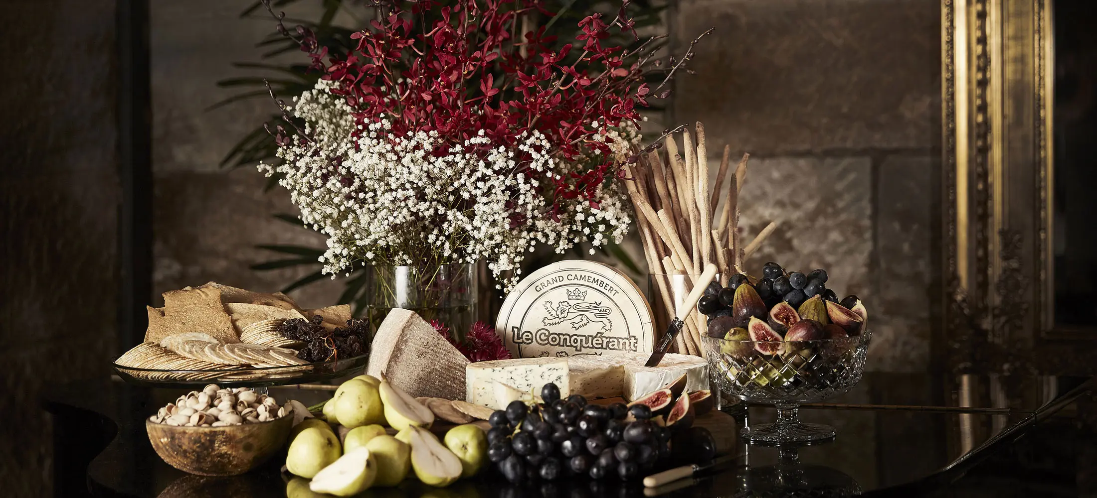
Tatler has never been just another Sydney bar. Tucked into Darlinghurst, it has lived through decades of late nights, private parties, disco, cocktails and a very particular kind of Sydney glamour. The brief was to build a brand identity that felt true to that history: bold, a little theatrical, and ready to work across menus, signage, print, interiors and digital touchpoints. The result was a hospitality identity with character — designed for a venue with stories in the walls, not a new concept trying to invent atmosphere from scratch.
Scope
Brand Strategy
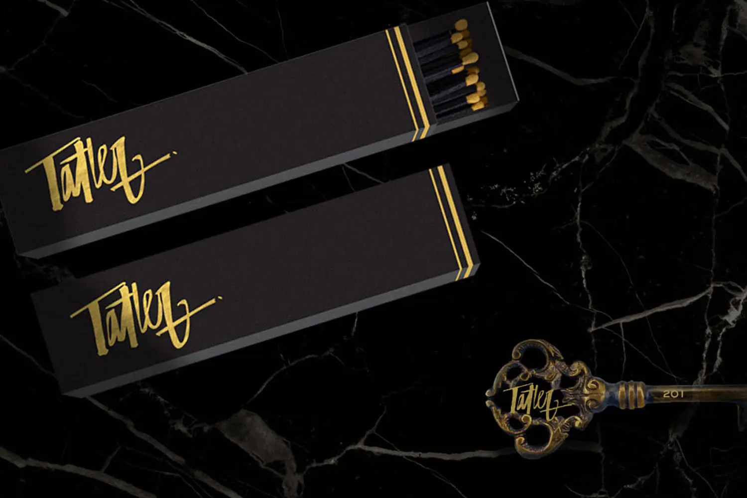
Brand Identity
Packaging Design
Signage
Wayfinding
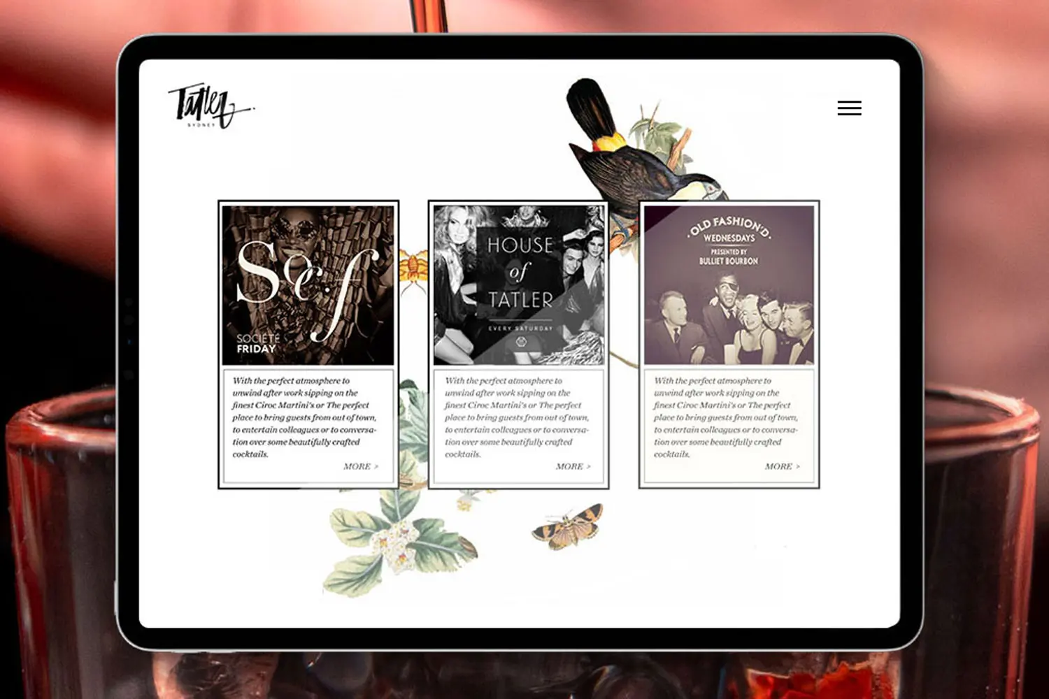
Digital Design
Art Direction
Photography
The Challenge
Giving a Sydney institution a visual language.
Hospitality branding is often built around novelty. Tatler needed the opposite.
The venue already had history, reputation and a loyal audience. The challenge was to create an identity that could carry that legacy without feeling nostalgic or dated. It needed to work for a supper club, a bar, a private event space and a late-night destination — all within one recognisable brand world. That meant developing a visual identity with enough confidence to sit across the full venue experience: exterior presence, menus, printed collateral, event material and the smaller moments that shape how a guest remembers a night.

The Approach
Branding the mood, not just the logo.
Our approach was to treat Tatler as a hospitality environment first, and a graphic identity second.
The brand needed to feel social, intimate and slightly mischievous. It had to sit comfortably with cocktails, champagne, music, private dining and late-night energy. We developed a bold identity system that could move across print, signage, menus and environmental applications without losing its personality.
Rather than creating a polished restaurant brand with a neutral design language, the identity leaned into the venue’s character. Strong typography, graphic detailing and a confident visual system gave Tatler a brand that felt established, expressive and unmistakably tied to place.
The Outcome
A hospitality brand with atmosphere built in.
The completed identity gave Tatler a clearer and more confident brand presence across the venue experience.
For a place with this much history, the brand could not feel generic. It needed to feel like it belonged to the room — to the lighting, the music, the garden, the private parties, the late nights and the people who already had their own memories of the venue.
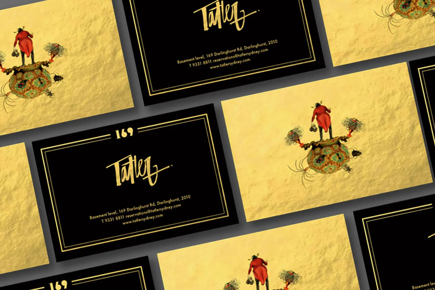
The new identity helped bring those elements into a more coherent visual system. Menus, signage, printed collateral and environmental details worked together rather than feeling like separate pieces. The brand gave Tatler a stronger point of view, while still leaving room for the venue’s natural character to lead.
This is the value of good hospitality branding. It does not simply make a venue look more polished. It helps shape how people understand the place before they arrive, how they move through it once they are there, and how they remember it afterwards.
For Ludbrook Agency, Tatler remains a strong example of brand identity for a Sydney hospitality venue with genuine history — a project where the design work had to respect what was already there, then give it a more distinctive and usable visual language.
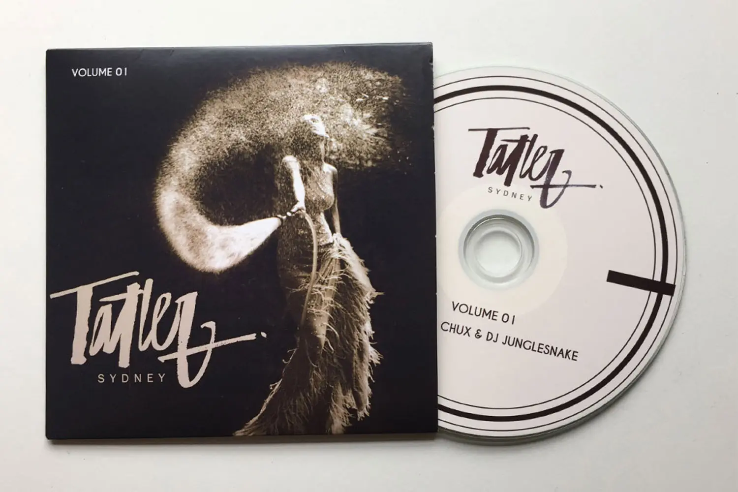
CD COVER DESIGN
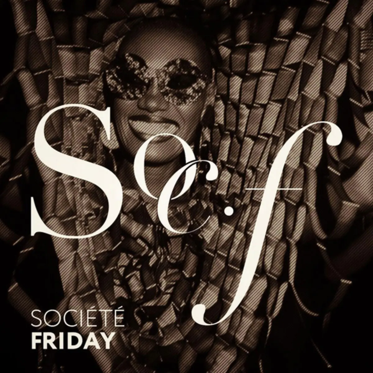
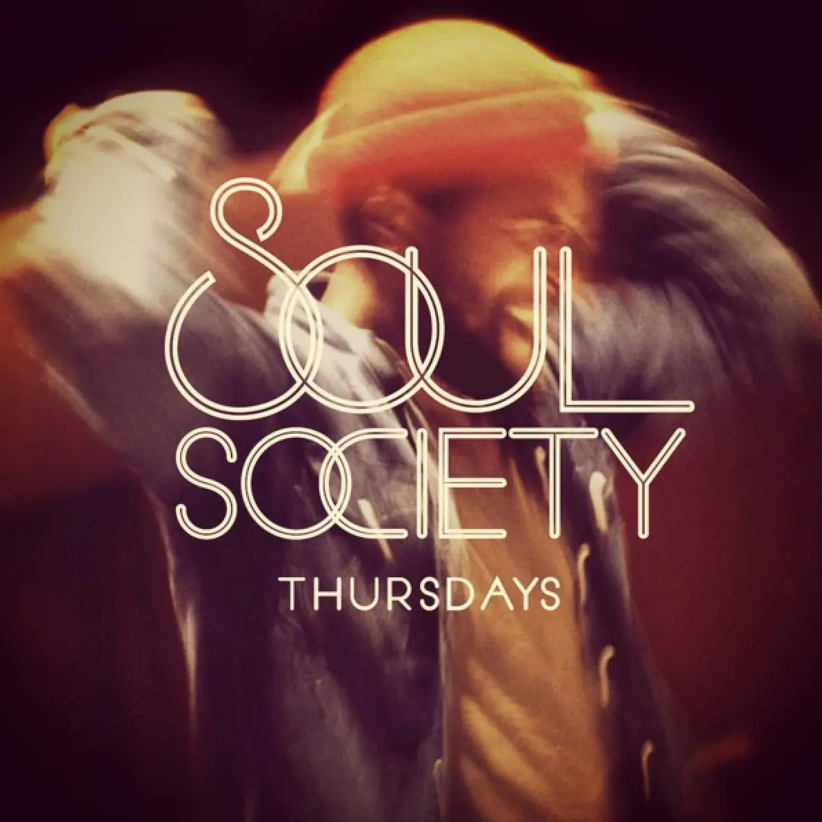
Social media content framework and posting guidelines

COASTER DESIGN