Ewabi Electric Bike Branding
Brand strategy, naming and visual identity for a Bali-based electric bamboo bicycle business.
A bicycle can express an idea about how people want to live. For Ewabi, the ambition was to connect enjoyable everyday transport with greater consideration for the environment and the people involved in the business.
The Bali-based venture brought together bamboo bicycle construction and electric assistance. Its founder, Mark Donovan, also envisaged a business guided by an Earth Corporation, or E-CORP, philosophy, placing environmental and social responsibility at the centre of its purpose.
Our electric bike branding project began with these intentions. The task was to give the venture a name, narrative and visual identity that could introduce the product while communicating the thinking behind it.
Scope
Brand Workshop
Brand Narrative
Brand Identity
Brand Guidelines
Creative Direction
Marketing Suite
Website


The Challenge
Brand strategy, naming and visual identity for a Bali-based electric bamboo bicycle business.
Ewabi’s proposition encompassed several ideas: electric transport, bamboo as a material, an enjoyable riding experience and a commitment to fairness.
Each mattered to the business, but the identity needed a clear point of entry. A prospective rider should be able to recognise a bicycle brand before being introduced to its wider philosophy.
The challenge was to bring purpose and product together. Sustainability needed to inform the character of the brand, while the pleasure and practicality of cycling remained visible.
A brand workshop helped articulate these priorities. Our brand strategy and positioning work established a foundation for the naming and creative direction, connecting the company’s values with the experience it wanted to offer riders.

The Strategy & Creative Direction
A name and identity linking electric mobility with simplicity and the natural world.
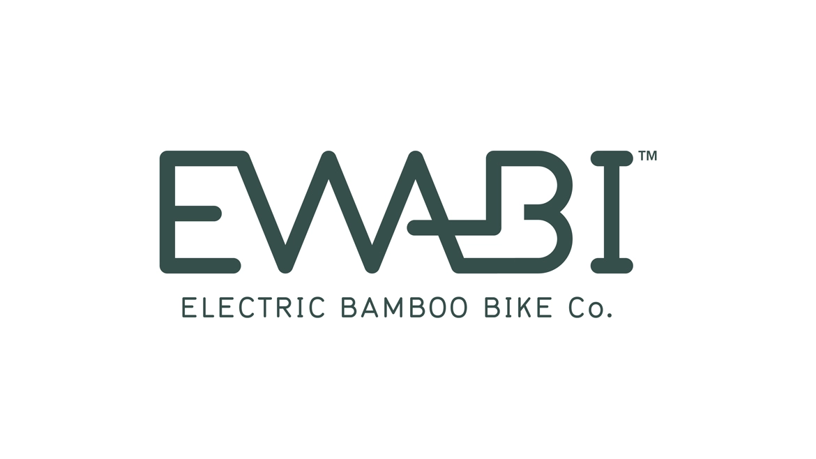
The name Ewabi drew inspiration from wabi-sabi, particularly its appreciation of modesty, simplicity and natural character. These associations offered a connection to bamboo and to the founders’ aspiration for a less materially demanding way of living.
The opening “e” introduced another layer of meaning. It referred to electric power, environmental intent and the business’s E-CORP philosophy, expressed through the idea of equality for everyone, everywhere.
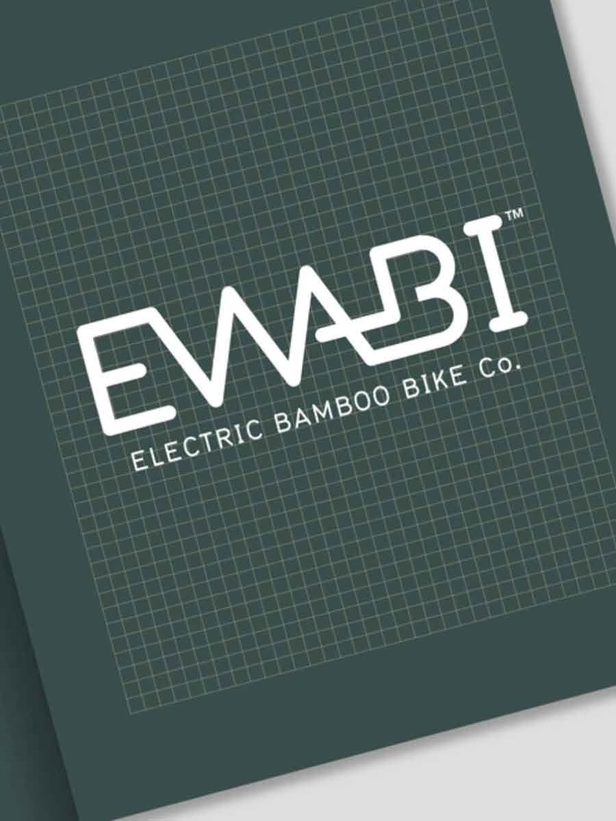
The visual system extended that thinking. A bespoke logotype gave the name an approachable presence, while a circular emblem used a rotated “e” to suggest movement and balance.
The colour palette drew on earth green, bamboo, sand and related natural tones. Together, the name, symbol and palette connected the technical aspect of electric assistance with the material character of the bicycles.
Our brand identity work translated those ideas into a system that could be used consistently across product and communications.


The Result
A documented identity connecting the business’s purpose with its public presentation.
The project established a name, brand narrative, visual identity and guidelines for introducing Ewabi to its audience.
The brand manual brought the philosophy and design system together, covering the logotype, emblem, typography, colour and applications. This gave the business a reference for maintaining consistency as it developed its communications.
Founder Mark Donovan’s feedback recognised the identity as meaningful, distinctive and adaptable. That reflects the central task of the project: giving a venture with substantial ethical ambitions a clear and usable expression.
Ewabi demonstrates how sustainability can shape the foundations of a brand. Here, it informed the naming, narrative and visual decisions, connecting the product with the intentions behind the business.