THE PARK, DARLINGHURST
Hospitality placemaking, branding and interior creative direction for an inclusive LGBTQI+ venue in the heart of Darlinghurst.
Hospitality venues are important for reasons that go well beyond food and drink.
For many years, the Green Park Hotel on Victoria Street was one of those places. A much-loved Darlinghurst pub with a long connection to Sydney’s LGBTQI+ community, it provided a familiar place for friends to meet and drink. When the hotel was sold to neighbouring St Vincent’s Hospital and closed as a pub in late 2020, it left a very visible gap in the local community.
For entrepreneur Nick Armstrong, the loss was personal as well as local. He wanted to create a new LGBTQI+ hospitality venue nearby: somewhere comfortable, inclusive and welcoming, with the ability to move from all-day share dining into drinks, music and late-night socialising.
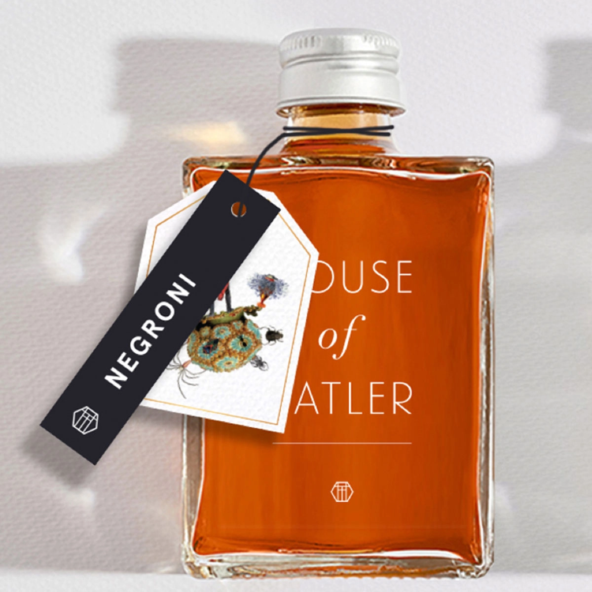
At almost the same time, a large first-floor venue at 235 Victoria Street became available for lease, having previously been home to the Victoria Room. Nick took the lease and engaged the Ludbrook Agency to develop the name, brand and interior concept. Around the same period, we were also rebranding Barons Brewing, another of Nick’s ventures, which became the principal beer served at The Park.
The idea was to create an urban sanctuary that welcomed everyone. Led creatively by Kirsty Ludbrook, the project developed as a complete hospitality branding and placemaking exercise, bringing the brand identity, interior creative direction, artwork, environmental graphics and guest experience together from the beginning.
Scope
Brand Strategy
Brand Identity
Placemaking
Custom Artwork
Interior Creative Direction
Murals and Installations
Restaurant Collateral
Marketing Collateral
Website
Social Content
Photography
The Challenge
The existing space presented both an opportunity and a problem. Originally a mechanics workshop, it was very large, with high ceilings and substantial volume, but very little natural light. That was particularly unsuitable for a venue intended to operate throughout the day.
The budget was also relatively tight for a space of this size, so the interior could not rely on expensive architectural finishes or large-scale custom construction. The creative direction therefore focused on a small number of interventions that would make a significant difference to how the room felt and functioned.
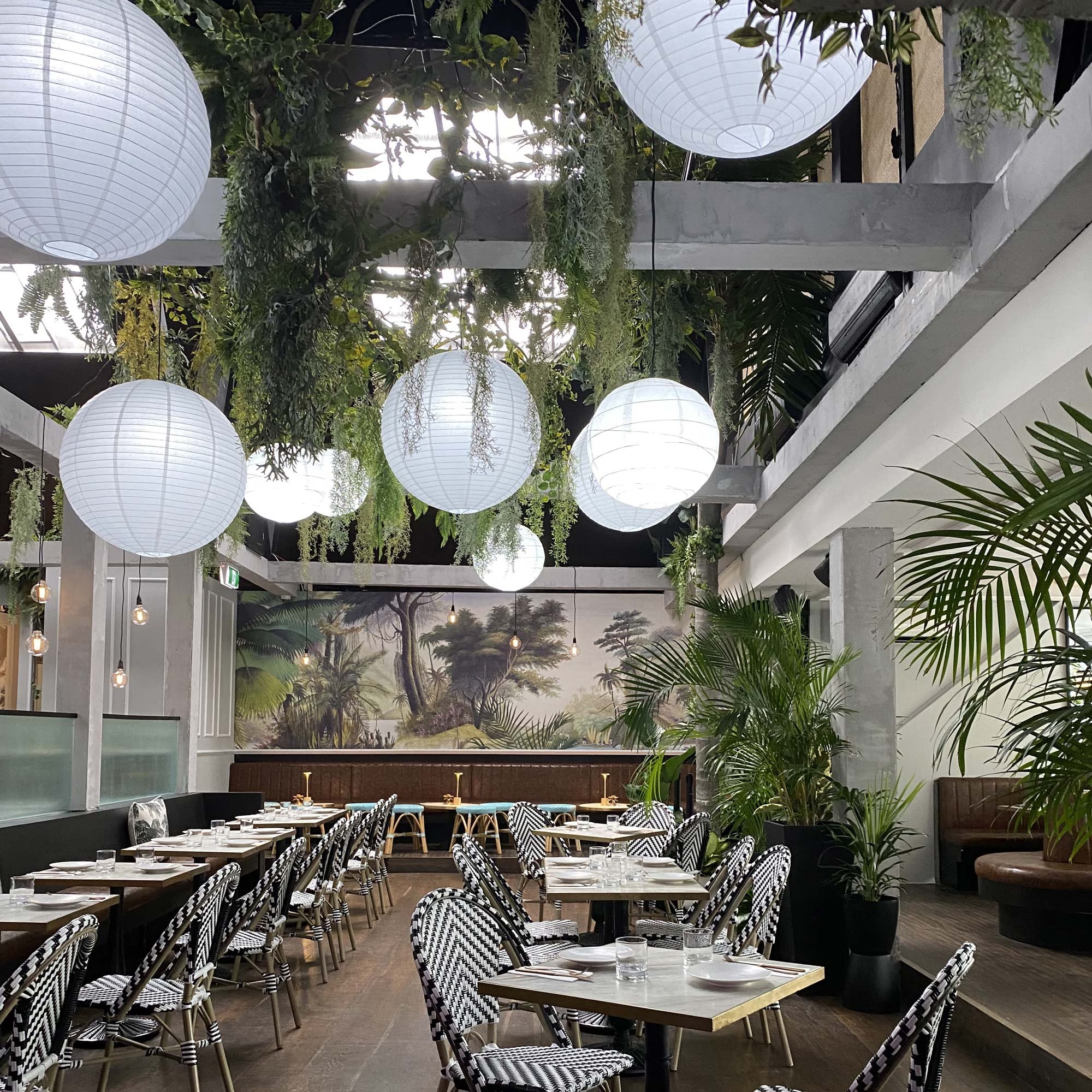
A large skylight was cut into the roof to bring daylight into the centre of the venue. Planting was introduced throughout the interior, helping soften the scale of the former workshop and reinforcing the idea of an urban sanctuary.
The size and height of the room still needed to be addressed. Rather than commission an expensive lighting installation, we filled the ceiling with Chinese paper lanterns. Individually they were inexpensive; used in quantity they created scale, warmth and visual rhythm across the room.
The lanterns were fitted with dimmable lamps that could change colour temperature, allowing the atmosphere to shift through the day. Cooler light worked with the skylight and planting during lunch and afternoon service, while warmer light at around 2400 Kelvin created a more intimate atmosphere for dinner, drinks and music.
The same space could therefore operate convincingly as a daytime restaurant and an evening venue without being physically reconfigured.
Placemaking & Interior Creative Direction
The interior concept came directly from the Ludbrook Agency, with Kirsty developing the visual character of the venue across lighting, colour, planting, artwork, wallpaper and decorative elements.
French wallpaper was sourced and imported specifically for the project, bringing pattern and richness into the large industrial space. Alongside the greenery, paper lanterns and artwork, it helped create a more layered and personal environment without requiring expensive architectural treatments.
This approach became central to the hospitality placemaking strategy. The aim was not simply to decorate a large room, but to create a place with a recognisable mood and personality that could change naturally from day into night.
The project also demonstrated how branding and interior design can work together when the brand agency is involved early. The identity was not developed separately and then applied to a finished restaurant. The brand idea informed the interior itself.
That relationship between brand and place is particularly important in hospitality, where guests experience the environment, service, artwork, lighting, menus and visual identity as one thing.
Brand Identity, Art and the Guest Experience
The sense of community behind The Park also shaped the brand identity.
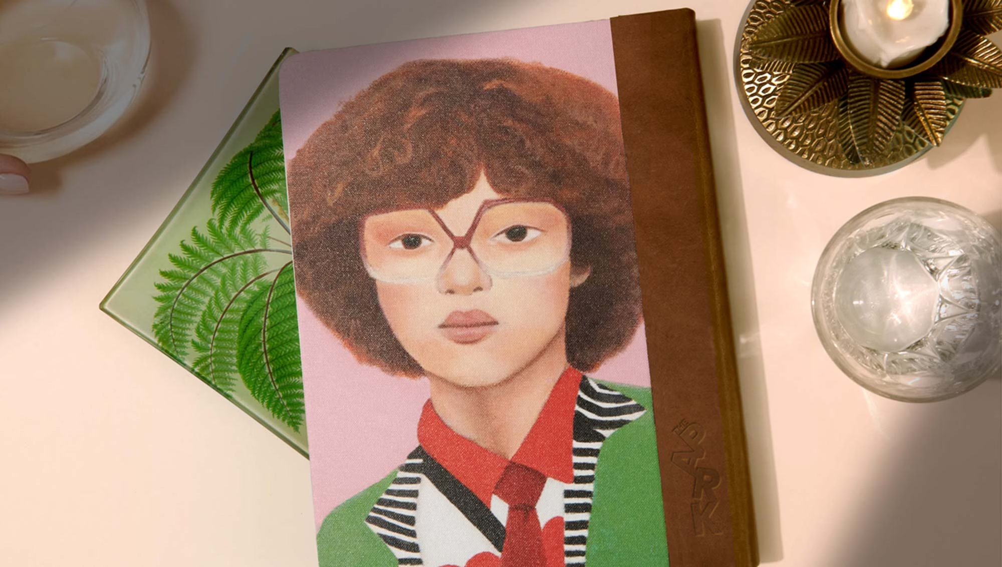
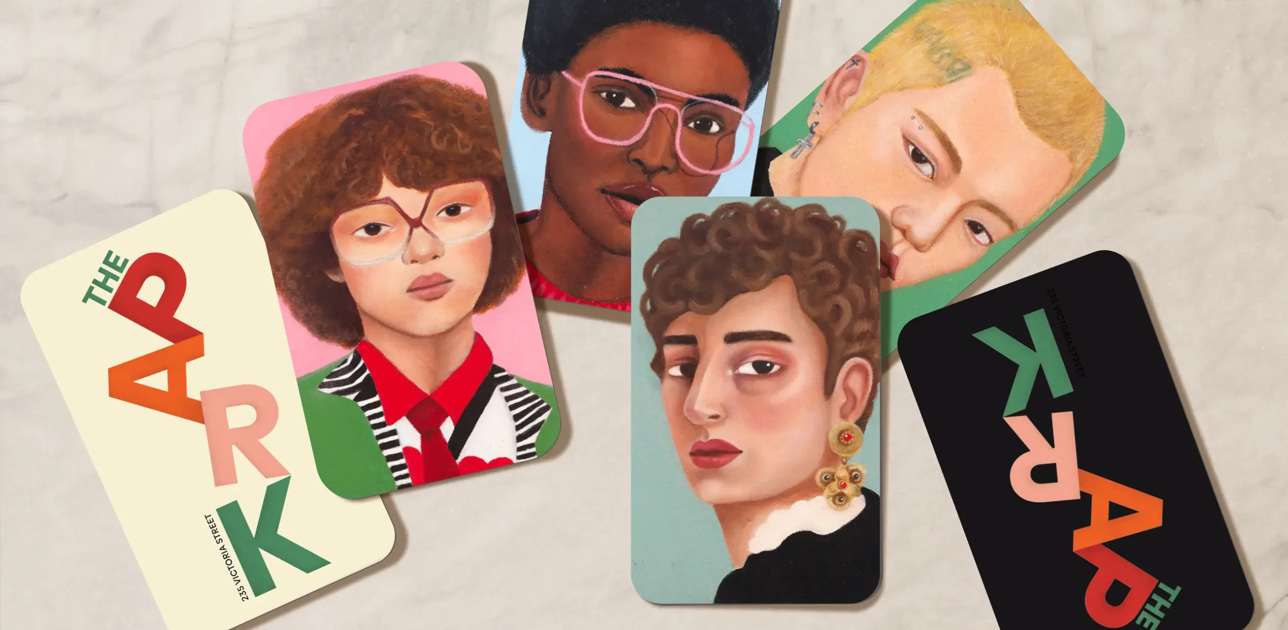
We collaborated with local artist Camille Ormandy to create a series of portraits inspired by the diverse characters of the surrounding neighbourhood. Rather than treating artwork as decoration added at the end of the project, the portraits became part of the identity from the outset.
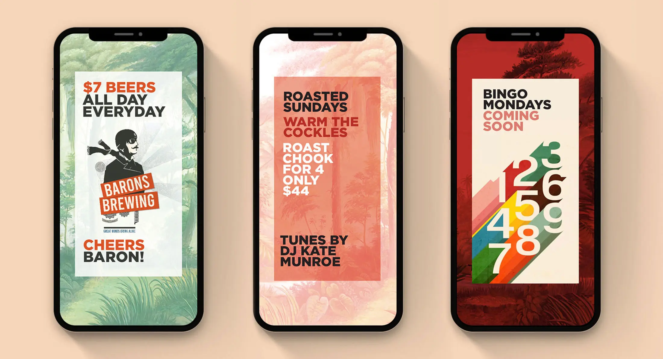
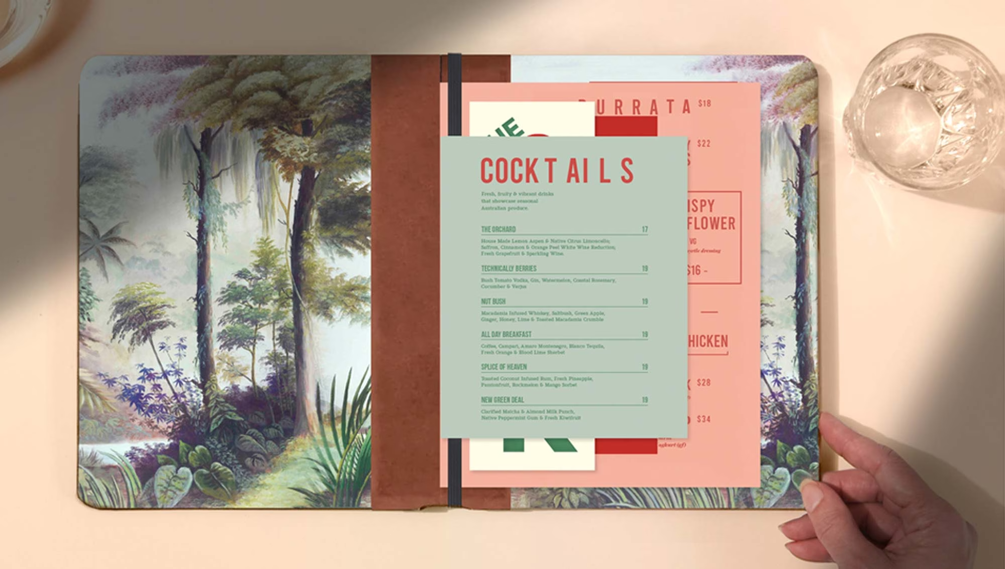
They appeared across internal murals and installations as well as restaurant collateral, marketing communications and digital content, creating a flexible visual language that could change over time while remaining recognisably The Park.
The portraits also gave the venue a human quality that was particularly appropriate for its purpose. The Park had been created partly in response to the loss of an important LGBTQI+ meeting place, so it made sense for people — rather than abstract graphics — to sit at the centre of the identity.
The Ludbrook Agency’s work extended across naming, brand identity, placemaking, interior creative direction, environmental graphics, custom artwork, murals and installations, restaurant collateral, website, social content, photography and marketing.
The Result
The Park was conceived at an extraordinarily difficult time to open a hospitality venue.
Its original opening was delayed by COVID lockdowns, and the restrictions and changes in hospitality behaviour that followed made establishing a new restaurant and late-night venue particularly difficult. The Park ultimately closed.
The project nevertheless remains one of the clearest examples of the Ludbrook Agency’s approach to hospitality branding and placemaking.
The original building was dark, oversized and constrained by budget. The solution did not come from expensive finishes. It came from a series of considered decisions: introducing natural light through the skylight, using planting to soften the industrial scale, filling the ceiling with inexpensive paper lanterns, adjusting colour temperature between day and evening, importing wallpaper with character, and bringing local artwork directly into the brand.
Together, those elements turned a former workshop into a place with its own identity.
For us, The Park is also a useful example of what a hospitality branding agency can contribute when involved early enough in a project. Brand strategy, interiors, artwork and environmental graphics do not need to be separate layers. When they are developed together, they can shape the complete experience of a place.