THE BRENTWOOD HOTEL
Brand positioning, identity and guest communications for a Wellington hotel with a mid-century character.
A conference hotel brings together people with different reasons for staying. Delegates move between meetings and social occasions. Sporting teams arrive as a group. Business travellers need a comfortable base between appointments. The identity has to accommodate these different visits while giving the hotel a character people can recognise.
The Brentwood Hotel in Wellington, New Zealand, offered a particular starting point for hotel branding. Its mid-century origins and history of hosting touring musicians, including the Rolling Stones, provided material for a more individual story than conference facilities alone could tell.
The opportunity was to bring that character into the hotel’s presentation. A casual, cheerful motel-style direction connected its history with the sociable nature of a property accustomed to welcoming groups.
Scope
Brand Positioning
Brand Narrative
Brand Identity
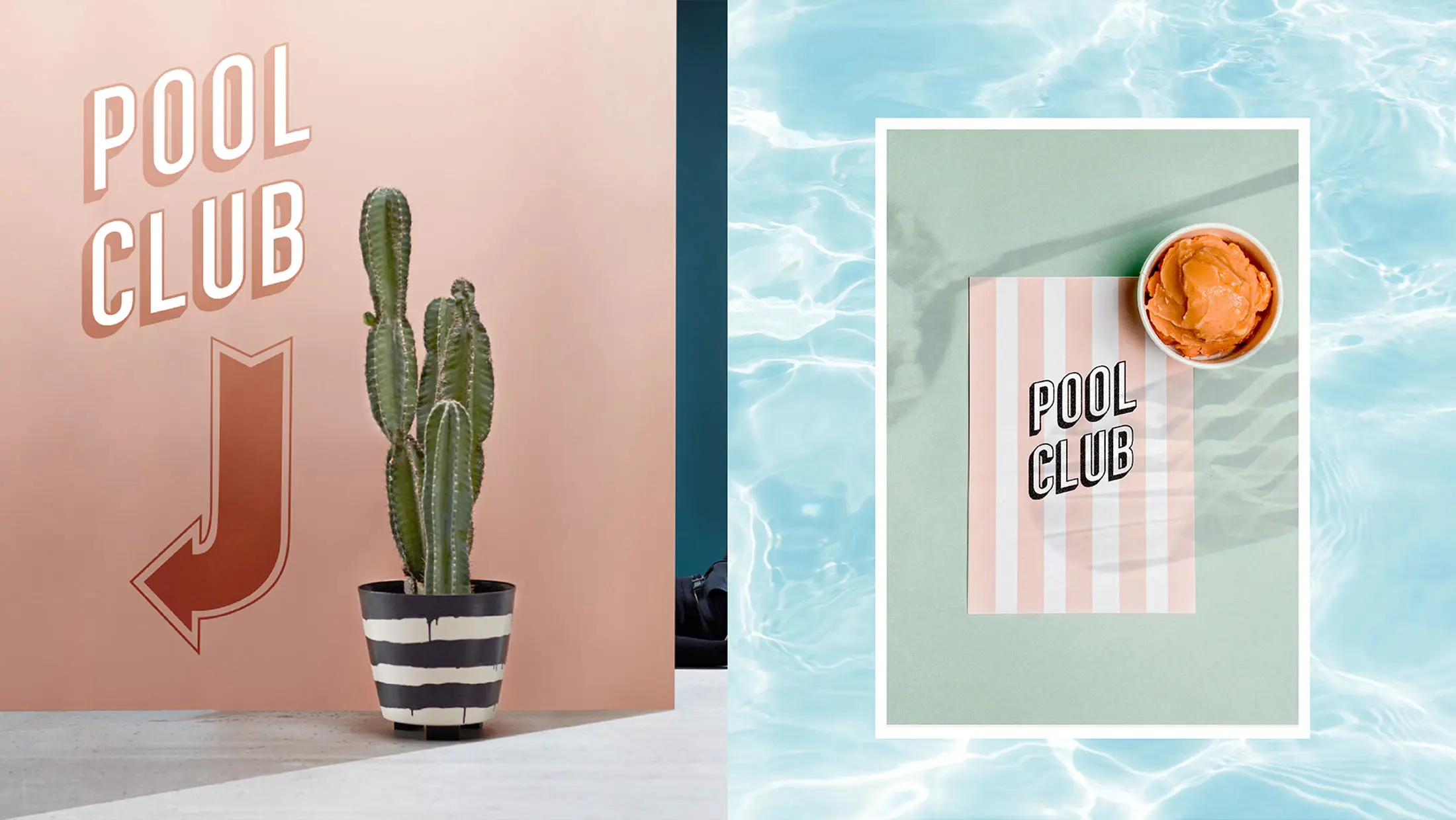
Signage and Wayfinding
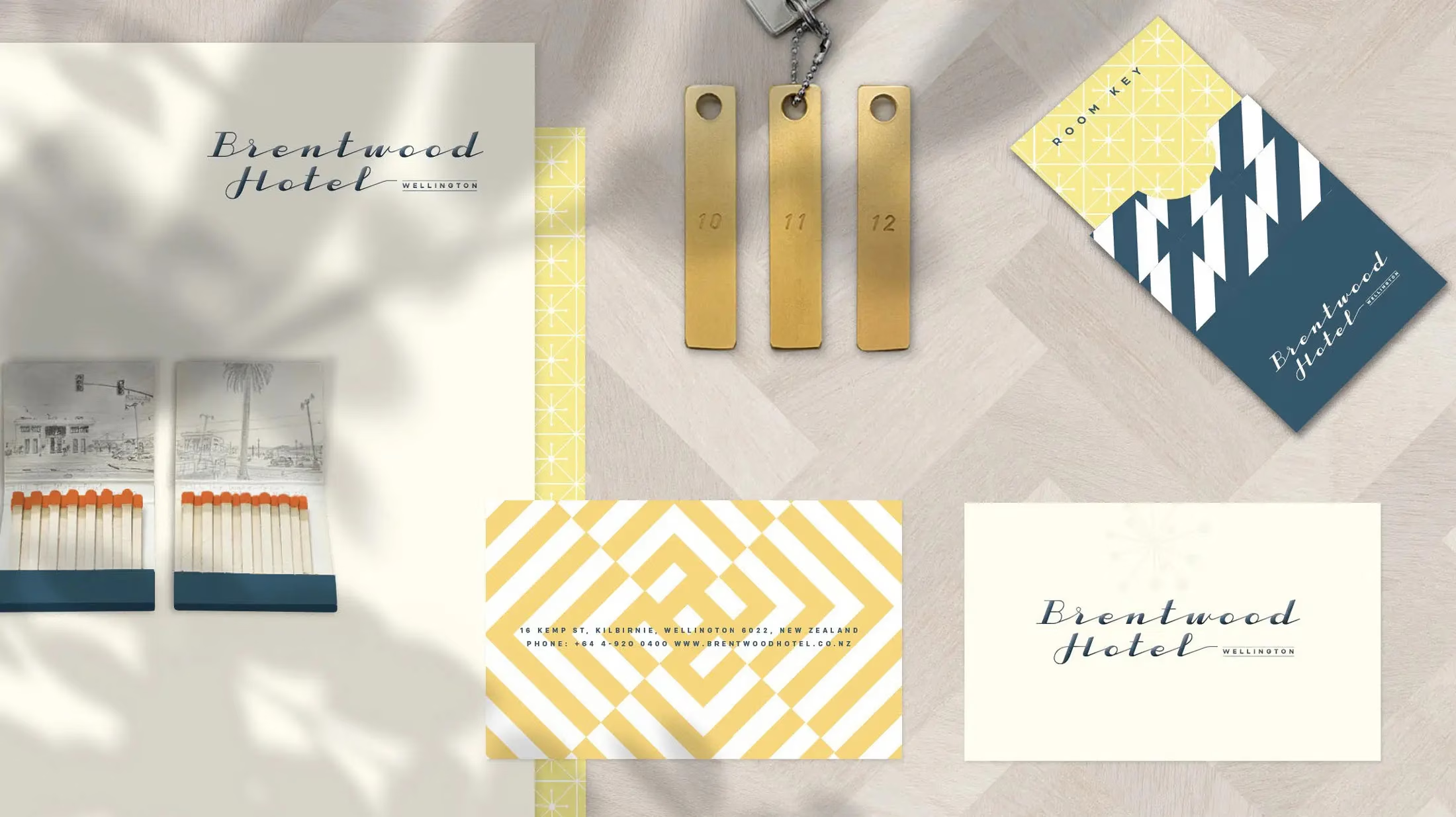
Hotel Print Collateral
Social Creative Styleguide
Custom Amenities & Merchandise

The Challenge
Balancing the practical expectations of a conference hotel with a more relaxed personality.
Conference organisers need confidence in a venue’s ability to accommodate their event. Guests also need to feel welcome once the working day is over. The Brentwood’s identity had to make room for both.
A purely corporate presentation would leave little space for the hotel’s history or the informal character of its shared spaces. An overly nostalgic approach could distract from its role as a working conference and accommodation business.
The challenge was to establish a direction that felt appropriate to the whole property. Guest rooms, conference spaces, social areas and the outdoor courtyard and pool all belonged to the same hotel, but served different moments during a stay.
Our brand strategy and positioning focused on how these functions could share a common character. The hotel’s mid-century background became a foundation for a welcoming identity with enough flexibility to work across business and leisure settings.

The Strategy & Creative Direction
Using mid-century references to connect the identity with the atmosphere of the property.
The creative direction embraced the ease and sociability associated with motel-style hospitality. This gave the Brentwood a way to express its personality while remaining relevant to conference delegates, corporate guests and sporting groups.
Brand and interiors shared a mid-century aesthetic, connecting the hotel’s visual presentation with its physical setting. The intention was for the identity to feel at home throughout the property, rather than exist only on printed communications.
The brand identity extended into signage and wayfinding, hotel collateral, guest amenities and merchandise. Each application had a practical role, from helping someone find their way to introducing the hotel through an item used during their stay.
For signage and wayfinding, the relationship between character and clarity was particularly relevant. A hotel accommodating groups needs information that is easy to recognise and follow. The visual language needed to support that task while remaining consistent with the wider identity.
The Result
A coordinated brand across the hotel environment and guest communications.
The project established a shared direction for the Brentwood’s identity and its applications. The scope encompassed brand positioning and narrative, signage and wayfinding, printed collateral, a social creative style guide, and custom amenities and merchandise.
Together, these elements gave the hotel a consistent foundation for presenting its accommodation, conference offer and social spaces. Environmental graphics and printed communications carried the identity through the property, while amenities and merchandise brought its character into everyday moments during a stay.
The value of the approach lay in drawing from something particular to the Brentwood. Its history and mid-century setting provided a credible basis for the identity, connecting the presentation of the business with the place guests encountered.
This is central to our approach to hospitality branding: understanding what gives a property its character, then expressing it consistently across the guest experience.
*This project was delayed during Covid and is yet to be developed.