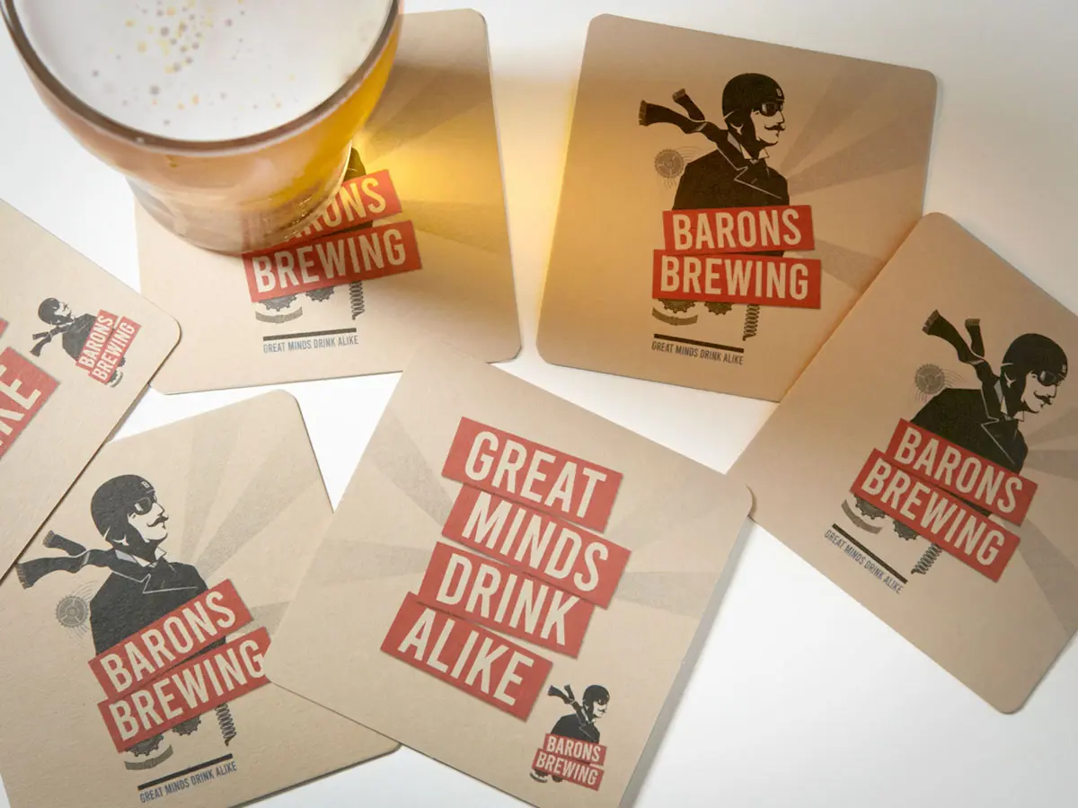
BARONS BREWING
Barons Brewing is an award-winning Australian craft beer that enjoyed huge success before expanding overseas, an over-reach that forced the brand to lay dormant for several years. The new owners sought to build on the reputation and visual recognition of existing assets, but breathe life into the rebrand with a fresher appeal. Heavily skewed towards a male audience, the identity needed to appeal equally to the mainstream and to urban craft brew lovers alike. This year Barons is launching into pub venues, and will be rolling out next year onto retail shelves.
Taking the lead from the original character, we re-crafted the illustration of the Baron to be a little more dashing, a little more hip — and a whole lot cheekier. Infusing the aviation theme with a dose of steampunk and a dash of constructivism, the new logo system was delivered with a colour palette to differentiate the flavour variants, we sought to create a cohesive identity that would stand together on taps and on cans.
Scope
Brand Identity
Custom artwork
Packaging
Marketing Collateral
Website
Social Content
Illustration


VIEW MORE PROJECTS

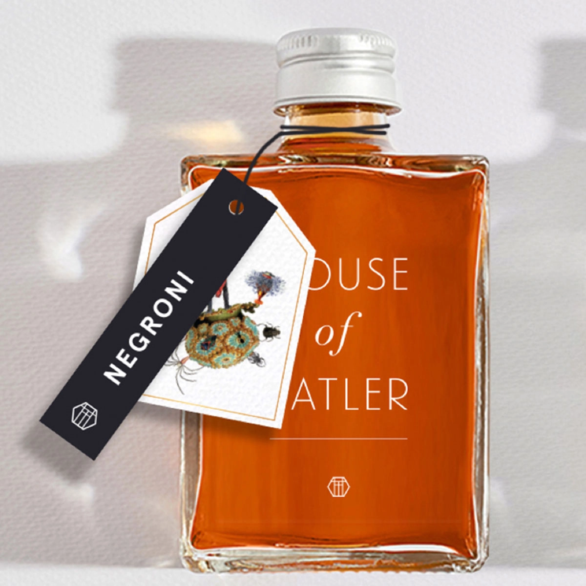
Brand strategy, visual identity and environmental design for Tatler Super Club, Darlinghurst, Sydney. A bold hospitality brand brought to life through brand environment, menus and restaurant collateral.


The Standard Store have been retailing niche fashion in Sydney and Melbourne for over 20 years. They approached us during the Covid lockdown for a new website and brand refresh. The new site immediately attracted more traffic and online sales nearly doubled.