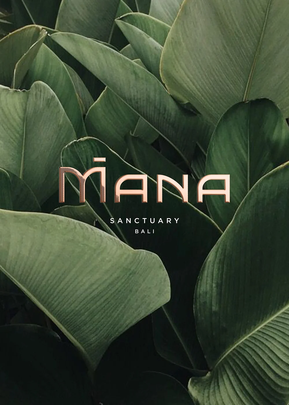
MANA SANCTUARY
Brand Strategy, Identity & Digital Experience for a Luxury Wellness Retreat.
Services Provided
Brand Strategy
Naming
Brand Identity Design
Brand Guidelines
Photography Direction
Website Design & Build
Print Collateral
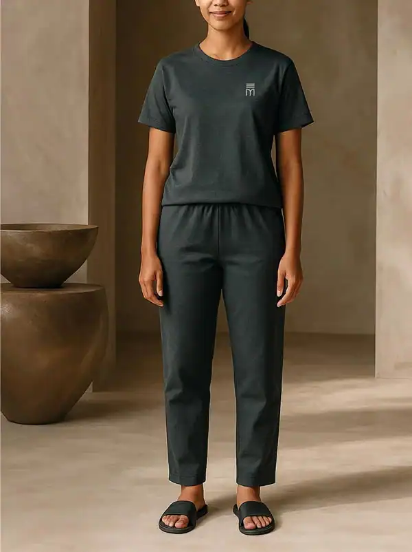
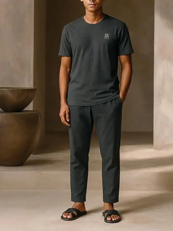
Merchandise & Uniforms
Content Creation
Mana Sanctuary is a next-generation wellness retreat in Bali, created as an evolution of the founders’ long-running women’s retreat brand, Escape Haven.
Conceived in response to a growing demand for restorative, evidence-led wellbeing, Mana welcomes both men and women into a shared experience of recovery, longevity and calm.

The Challenge:
Creating Distinction in a
Saturated Wellness Market
Originally envisioned as a women-only retreat under the working name Palm Tree Sanctuary, the project required strategic reframing. The name lacked distinction in a crowded global retreat landscape, and a women-only model risked diluting the audience of Escape Haven.
The opportunity was not simply to design a new identity, but to define a new position — one that felt intelligent, inclusive and commercially sound.

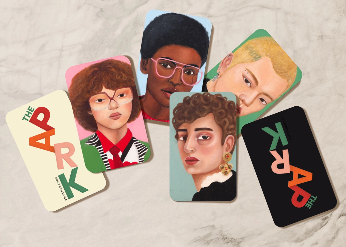
Luxury Wellness Retreat
Brand Identity
Brand Strategy & Naming:
Defining a Recovery-First Positioning
Following a two-day, in-person workshop in Bali, we repositioned the retreat around a recovery-first philosophy. Rather than another aspirational “escape” brand, Mana was conceived as a sanctuary for rebuilding inner strength.
The name draws from Māori and Polynesian culture, referencing the founder’s heritage and referring to a life force strengthened through integrity, respect and connection to others and nature. The addition of Sanctuary anchored the brand in protection and restoration, reinforcing its nervous-system-led approach to wellbeing.

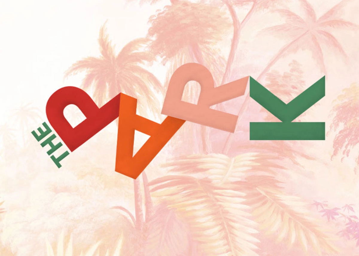
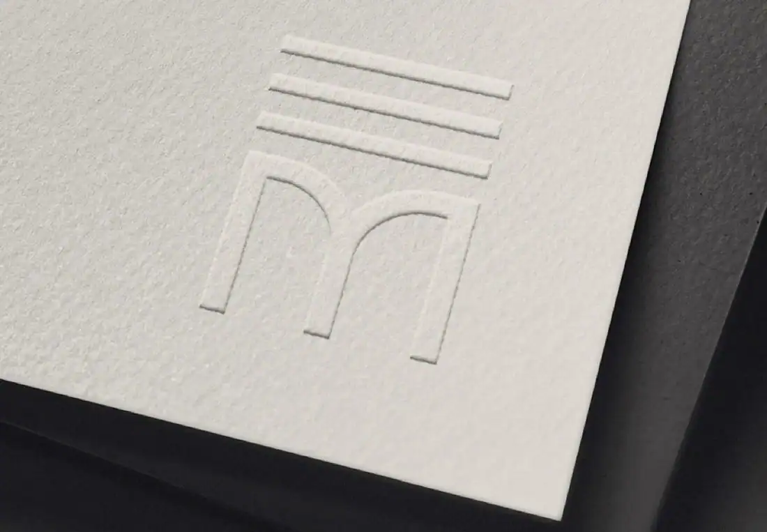
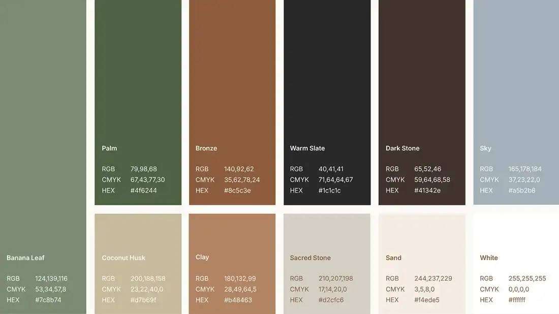
The Mana Logo was constructed to visually represent the brand’s dynamic recovery-first personality, balanced with a steadying sense of inner strength.
HOTEL Visual Identity System:
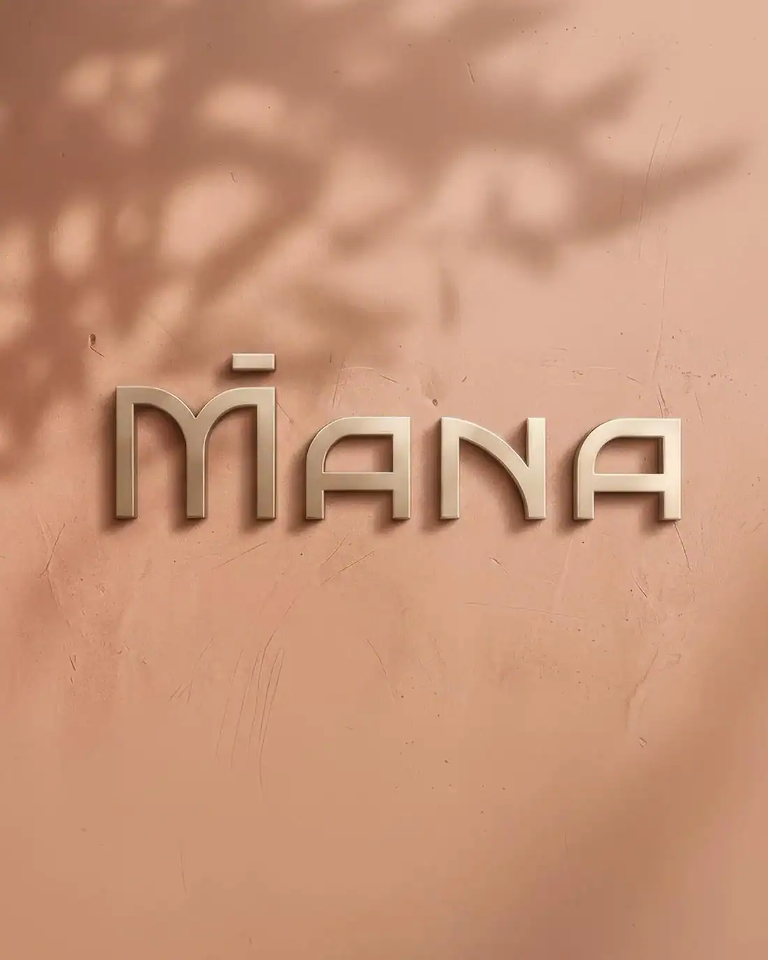
A Dynamic, Balanced Brandmark
The Mana logo was constructed to express strength with steadiness — a grounded, architectural wordmark that feels calm yet powerful. The accent above the “M” symbolises activation and renewal — a subtle visual cue to the idea of “powering up” one’s inner mana. The identity system was designed to be dynamic across environments, from large-scale 3D brushed bronze signage to tactile print and digital applications.
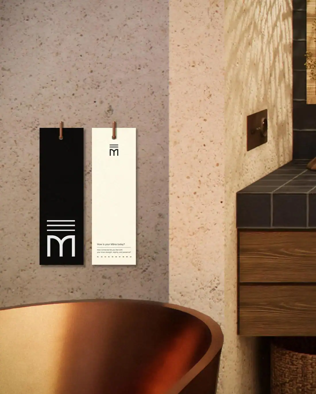
The colour palette draws from mineral, foliage and clay tones, reinforcing biophilic design principles and sensory calm. Typography was selected for clarity and warmth across signage, print and digital environments.

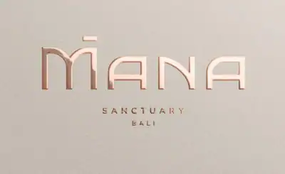
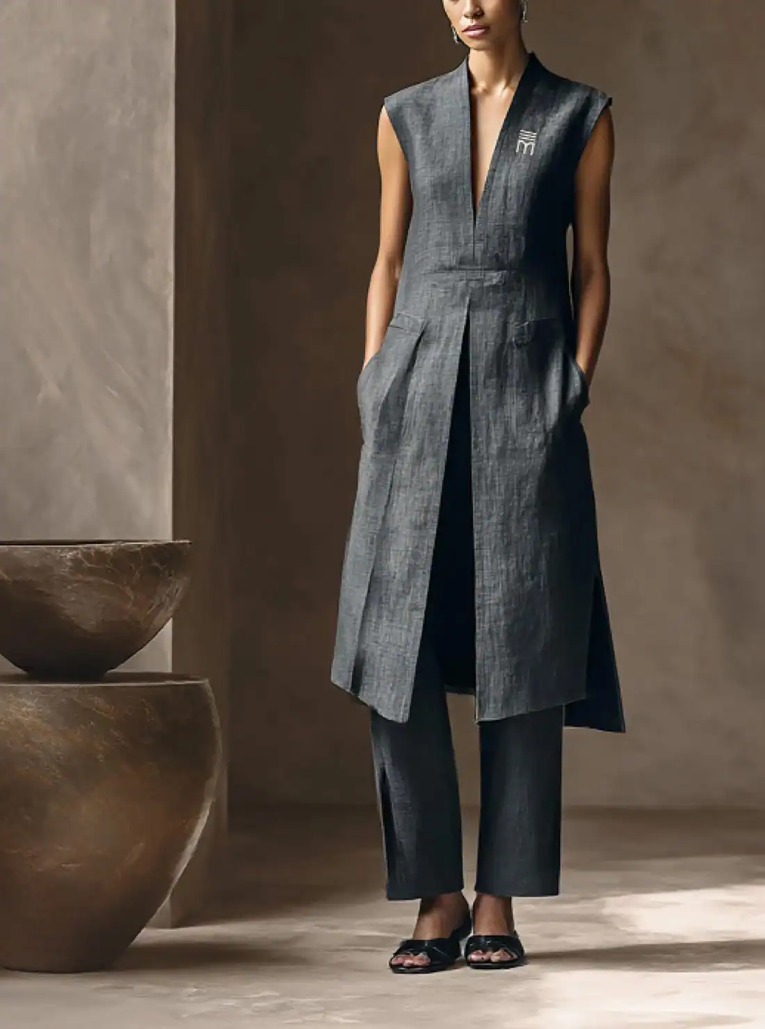
We developed comprehensive brand guidelines to ensure consistency across every touchpoint, including: Brand positioning and verbal identity, Logo usage and typography system, Earth-led colour palette inspired by Bali’s natural environment, Photography and video direction, Social media visual guidelines, Merchandise, uniforms and retail applications.


The Mana retail offerings includes lifestyle and wellness accessories. Staff uniforms are designed for elegance and practical comfort.
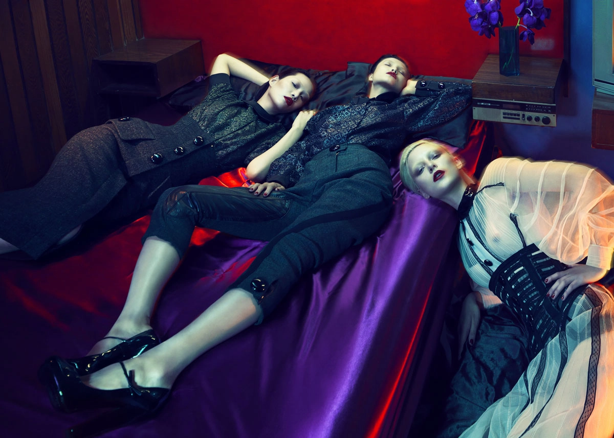
CAMPAIGN ART DIRECTION
& CONTENT CREATION
We art directed a two-day location shoot in Bali to establish Mana’s visual language. The campaign balances motion and stillness, intimacy and landscape, light and shadow — creating a large-scale image library that carries a clear and recognisable brand signature across website, social media and PR. The photography direction reinforces the retreat’s ethereal yet grounded personality, ensuring every touchpoint feels cohesive.


A MOBILE FIRST DIGITAL EXPERIENCE
Mana’s website was designed as a calm, immersive digital experience, prioritising a clear narrative structure, emotional pacing, natural texture and restrained colour, a sidebar navigation system that feels architectural and grounded, and mobile-first performance across devices. The digital experience translates the physical retreat philosophy into an online environment that feels restorative rather than overwhelming.


A dedicated social media visual guide ensures the brand
remains consistent across digital communications.

Print, Collateral
& On-Site Brand Experience
To extend the brand beyond screen and signage, we developed a premium stationery suite, including personalised pathways and protocol folders, with-comps slips to be used as menu templates. Textural print finishes, from embossing, foil detailing, and uncoated paper stocks reinforce the tactile luxury of the retreat environment and engage the senses.

Results & impact
Ahead of launch, Mana Sanctuary has already generated strong industry and media interest, achieving significant PR traction within the wellness and hospitality sector, clear differentiation from Escape Haven and competitor retreats, strong early engagement across digital channels, a scalable brand platform supporting longevity programs and future partnerships.
Mana Sanctuary now stands as a distinct, strategically positioned luxury wellness retreat brand — built for long-term authority, not trend-driven visibility.

VIEW MORE PROJECTS


Environmental graphics and brand storytelling for Subaru dealerships across Australia. A human-centred retail experience designed to create moments of joy, strengthen community, and redefine the car-buying experience for the 21st century.

Brand strategy and identity design for boutique inner-city commercial suites targeting premium office tenants.