IN ESSENCE
Re-brand for an iconic Australian aromatherapy brand with over 40 years of heritage.
In Essence is one of Australia’s most established aromatherapy brands, loved for over 40 years for creating transportive sensory experiences through the therapeutic power of natural botanicals.
The brand required a rebrand that honoured this heritage while bringing the identity into a more contemporary health and wellness context. As a wellness branding project, our role was to sharpen the brand strategy, verbal identity and visual identity, creating a more consistent and distinctive expression across packaging, point of sale, marketing and photography.
At the centre of the strategy was the core brand idea:
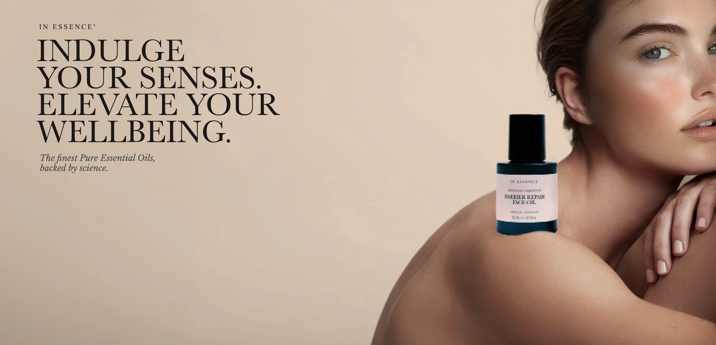
“Sensory wellness in every drop.”
This idea gave In Essence a clear and ownable platform — connecting the emotional, sensory and therapeutic dimensions of the brand.
Scope
Brand Strategy
Brand Identity
Brand Guidelines
Retail POS Display
Packaging Design
Marketing Collateral
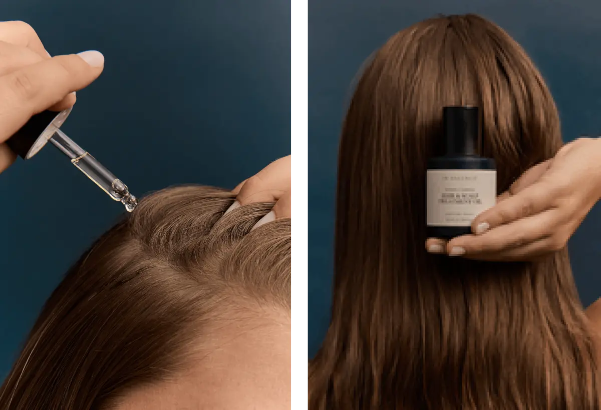
Photography
The Challenge:
In Essence had strong recognition and significant heritage in the Australian aromatherapy category, but the brand needed to feel more refined, consistent and relevant in a changing wellness market.
The challenge was to elevate the brand without losing the trust and familiarity built over decades. It needed to communicate purity, calm and clinical credibility, while also feeling more evocative, sensorial and premium.
The rebrand also needed to work across a broad retail environment, from packaging and point of sale to marketing collateral and photography — ensuring the brand could stand out on shelf while presenting a coherent and contemporary wellness branding system.


BRAND STRATEGY, VISUAL IDENTITY AND PACKAGING
Our brand strategy delivered a newly differentiated positioning, helping In Essence express its role in sensory wellness with greater clarity and confidence.
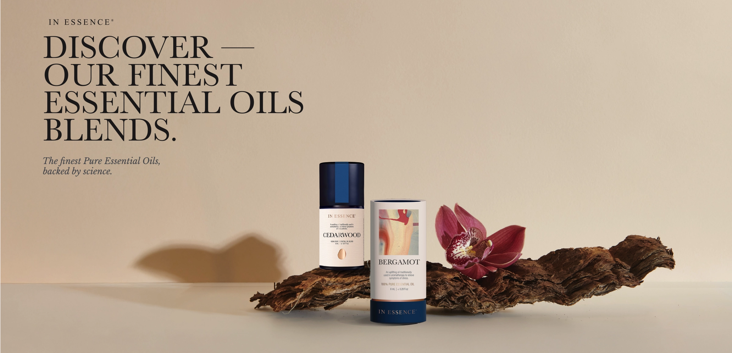
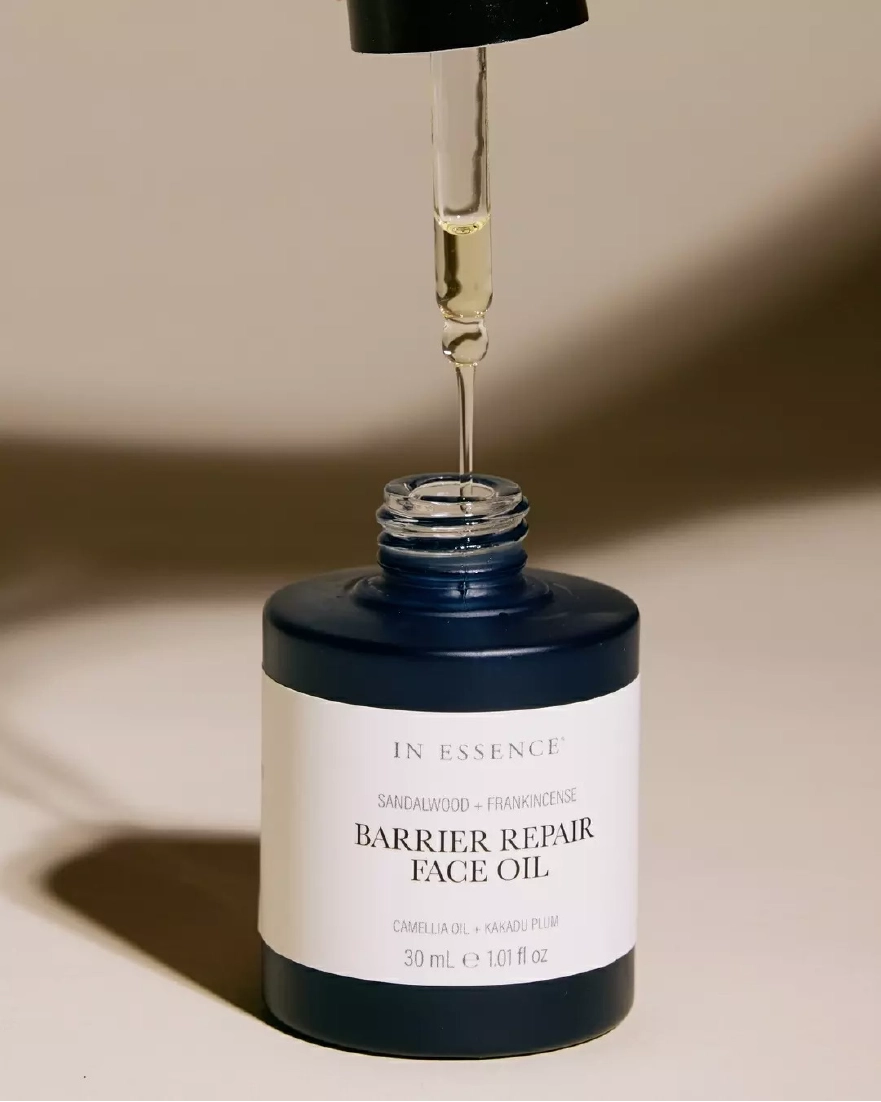
We elevated the brand aesthetic through evocative imagery, distinctive typography, tactile packaging and a redesigned point of sale experience. The visual identity system was developed to create stronger cross-platform consistency, from logo and typography through to packaging hierarchy, marketing collateral and retail display.
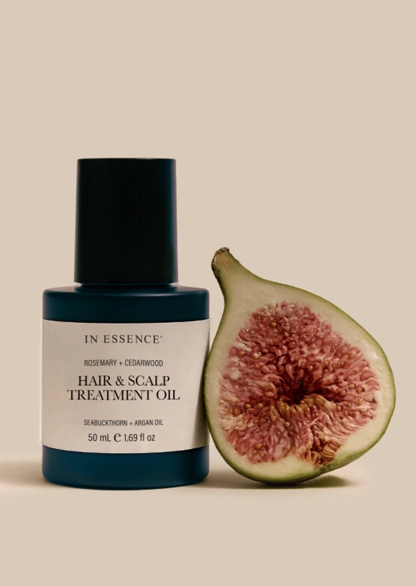
The aromatherapy packaging design was created to stand out on shelf while communicating the brand’s essential qualities: purity, calm, sensory immersion and therapeutic credibility. Every packaging decision, from material choice to typographic hierarchy, reinforced the core promise of sensory wellness.
The result is a wellness branding project that balances provenance and modernity — respecting the heritage of one of Australia’s most recognised aromatherapy brands while giving it a more contemporary and compelling brand expression.