KID CASHMERE
Art direction, photography and look-book for premium luxury cashmere brand.
Cashmere is experienced through touch as much as appearance. Photography has to communicate what a customer cannot feel: the softness of the knit, the weight of the fabric and the way a garment falls.
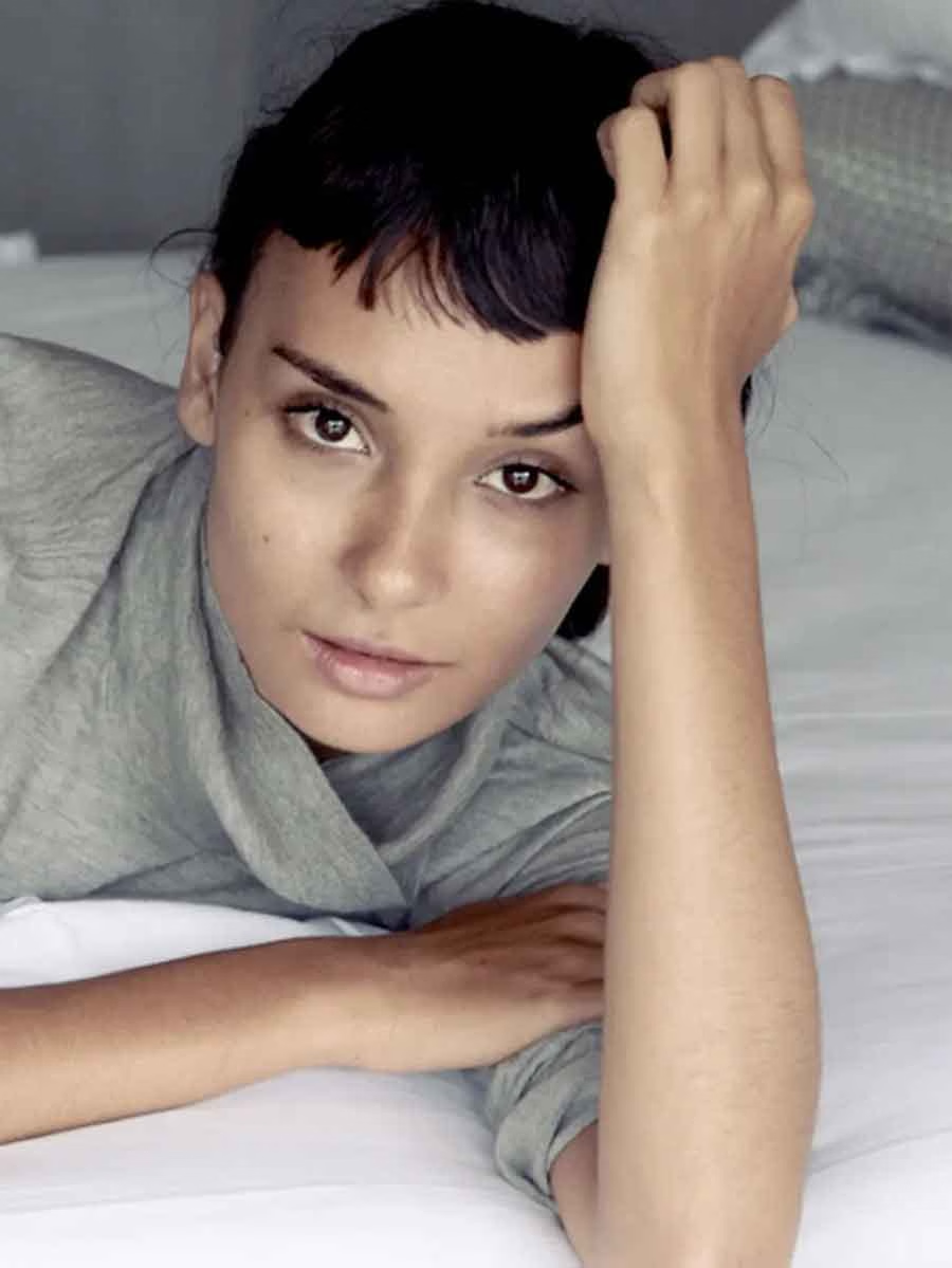
For Kid Cashmere, our work brought together art direction, photography and lookbook design to present the loungewear collection. The emphasis was on giving the garments a clear visual character while keeping their material qualities central to the story.
Scope
Art Direction
Photography
Lookbook Design

The Creative Direction
Using light, texture and setting to communicate the feel of the collection.
The photography focused on warmth, softness and the natural drape of the garments. Relaxed interior settings placed the collection in the context of everyday wear, allowing the relationship between clothing, comfort and movement to guide the imagery.
Art direction established a consistent mood across the shoot. Lighting and composition drew attention to the fabric without competing with it, giving individual photographs a shared character.
This connection between the product and its presentation is central to our campaign creative and content creation: deciding what the imagery needs to communicate, then shaping the photography around that purpose.

The Result
A photographic collection brought together through lookbook design.
The lookbook gave the photographs an editorial sequence, moving from individual images to a considered presentation of the range. Image selection, pacing and page composition helped connect the mood of the shoot with the practical task of showing the garments.
Together, the photography and lookbook provided a consistent expression of Kid Cashmere’s collection, with the softness and ease of the clothing remaining the focus.