GREI WEALTH MANAGEMENT
Brand strategy, identity and digital design connecting financial expertise with a more approachable investment experience.
Financial services branding has to communicate confidence before a customer has experienced the service. For an online platform, that first impression carries particular weight. There may be no adviser across the table, no physical office and no existing relationship to draw upon.
The design must help establish what the business offers, who it serves and how someone can begin. Authority matters, but so does the willingness to take a first step. An identity that feels too institutional can create distance for someone still learning about their finances.
Grei brought this question into focus. The Sydney-based platform combined financial education, wealth management tools and access to professional service providers for Chinese-speaking audiences in China and Australia. Its proposition connected learning with action: helping people understand their financial circumstances and explore ways to pursue their goals.
For wealth management branding, this creates an interesting responsibility. The identity needs to support the seriousness of financial decisions while making the subject easier to approach. It must allow room for education, explanation and conversation.
Scope
Workshop Facilitation
Brand Positioning
Brand Identity
Brand Guidelines
Website Design
App User Interface
Brand Rollout Digital + Print
The challenge: speaking to different levels of investment experience
Creating an identity that welcomes new investors and reassures established clients.
Grei’s brief encompassed younger, digitally confident investors and ultra-high-net-worth individuals. The identity also needed to work across Chinese and Australian markets.
These audiences brought different expectations. Someone beginning to explore financial planning needed an accessible introduction. An experienced investor needed confidence in the organisation behind the platform.
The challenge was to accommodate both within a recognisable brand. Making the identity friendly could not come at the expense of credibility; communicating expertise could not make the service feel remote.


The strategy: giving a digital platform a human presence
Balancing financial authority with an invitation to learn.
The strategic emphasis was on approachability supported by clear communication.
For a platform built around financial education, the brand needed to invite curiosity. Users should feel able to explore a subject before committing to a service or speaking with a provider. This placed particular importance on how information was introduced and explained.
Our brand strategy and positioning work considered the relationship between financial authority and personal participation. Grei needed a character people could recognise, alongside a visual language capable of explaining its offer.
Recognition helps someone identify a business. Explanation helps them understand whether it is relevant to their circumstances. The identity needed to support both tasks.


Creative direction: personality with a practical purpose
A characterful identity with a graphic language that extends beyond the logo.
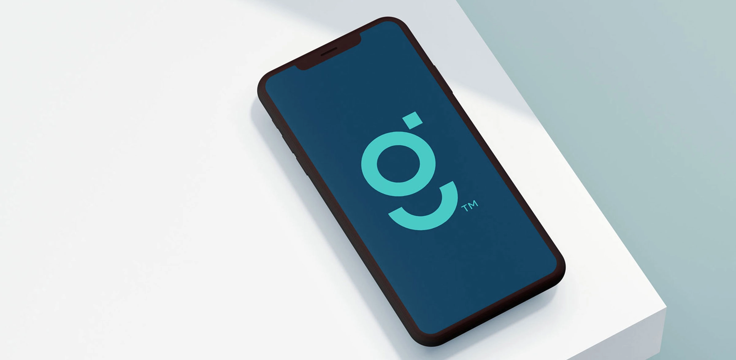
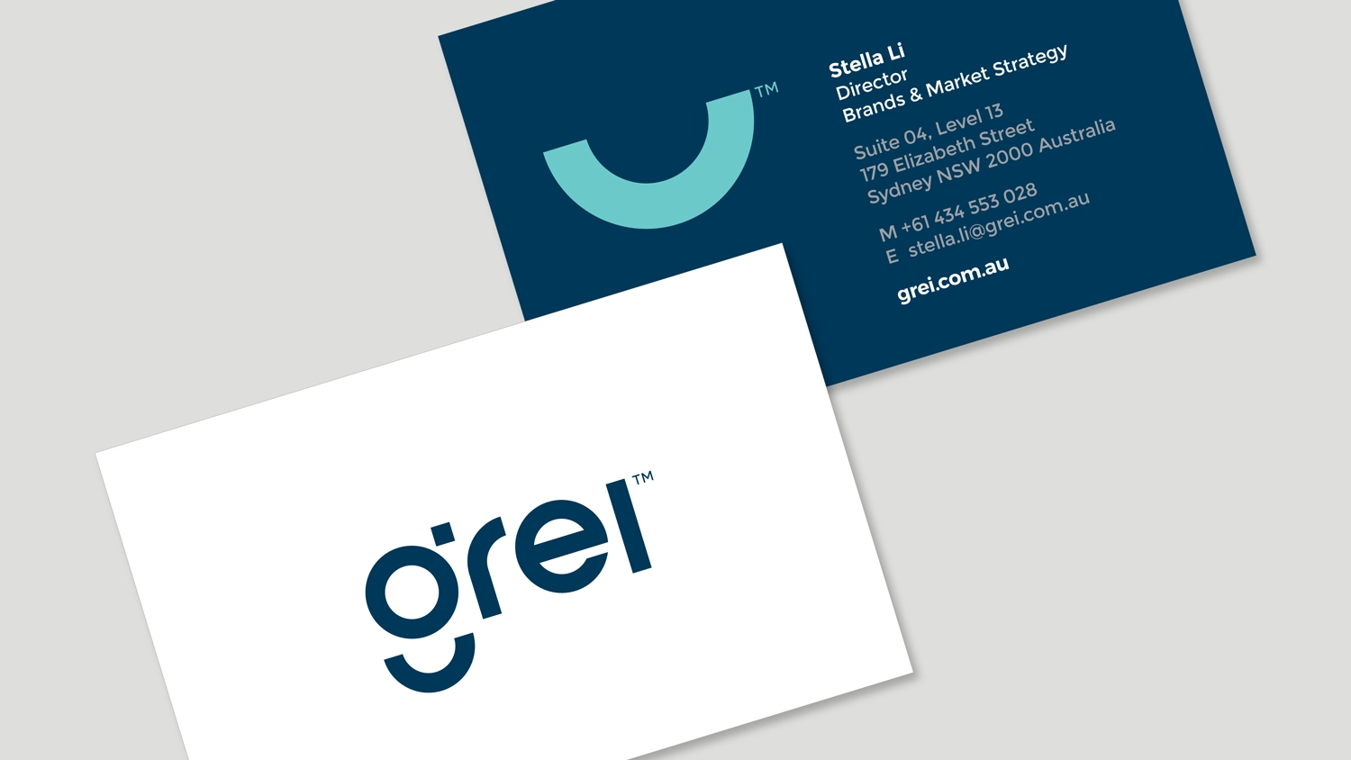
The identity centred on a symbol incorporating a robo-advisor and a “cup full of smiles”. Its graphic components could be separated and used throughout the wider communications.
This gave Grei a vocabulary beyond the main logo. Individual elements could introduce messages and connect applications while retaining a clear relationship to the identity.
The approach illustrates how brand identity can support communication. A useful identity system provides enough consistency to remain recognisable, with sufficient flexibility to explain different subjects.
For Grei, personality served a specific purpose: giving an online financial platform a more human presence.

Execution: connecting identity with understanding
Bringing the brand into the website, app interface and explanatory communications.
The work extended into website design, the app interface, explanatory graphics, brand guidelines and digital and printed communications.
Infographics and website schematics helped explain the platform’s wealth-building pathway. Their role was to organise information into a sequence that a new customer could follow.
This connected the character of the brand with the practical task of understanding its services. An approachable identity establishes an expectation; the information that follows needs to honour it. Clear explanations give substance to the welcome expressed by the visual design.
Across the different applications, the graphic system provided continuity between the introduction to Grei and the experience of exploring its platform.

The result: a coherent foundation for the platform
A shared visual language connecting financial education, tools and professional services.
Grei gained an identity system that could connect its educational content, financial tools and customer communications.
Public coverage in September 2017 reported approximately 300,000 users across China and Australia. That figure records the platform’s audience at the time, rather than a measure of the branding’s effect on growth.
The project established a recognisable identity, explanatory graphics and digital design around a broad financial proposition. Each had a practical role: introducing the business, explaining its offer and helping people find a starting point.