


Brand
Identity
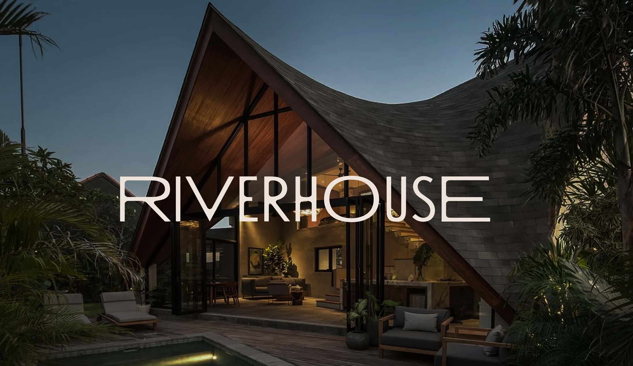
The River House Bali — hotel brand identity developed around architecture, landscape and the experience of staying beside the river.
Creating recognisable visual and verbal identities across hospitality, wellness, lifestyle and the built environment.
Visual Identity
Logo Design
Verbal Identity
Typography & Colour
Brand Graphic Systems
Photography & Art Direction
Brand Guidelines
Brand Toolkits
Brand Assets
Identity Rollout
Brand identity design translates strategy into a cohesive and recognisable visual language. We create distinctive identity systems across logo design, typography, colour palettes and brand guidelines — ensuring consistency across every touchpoint.
Our work spans beauty, wellness, hospitality and architectural brands, balancing contemporary aesthetics with enduring design principles. From packaging and print to digital and spatial applications, each identity system is built to scale, adapt and perform across global markets.
Brand identity brings these elements together into a clear and recognisable system.
Ludbrook Agency is a Sydney brand identity agency working across hospitality, wellness, lifestyle and culture and the built environment. Brand identity is central to almost every project we undertake, whether we are establishing a new business, refreshing an established organisation or creating greater consistency across a growing brand.
The objective is not to make every application look the same. It is to create enough continuity that each expression is recognisably part of the same brand.
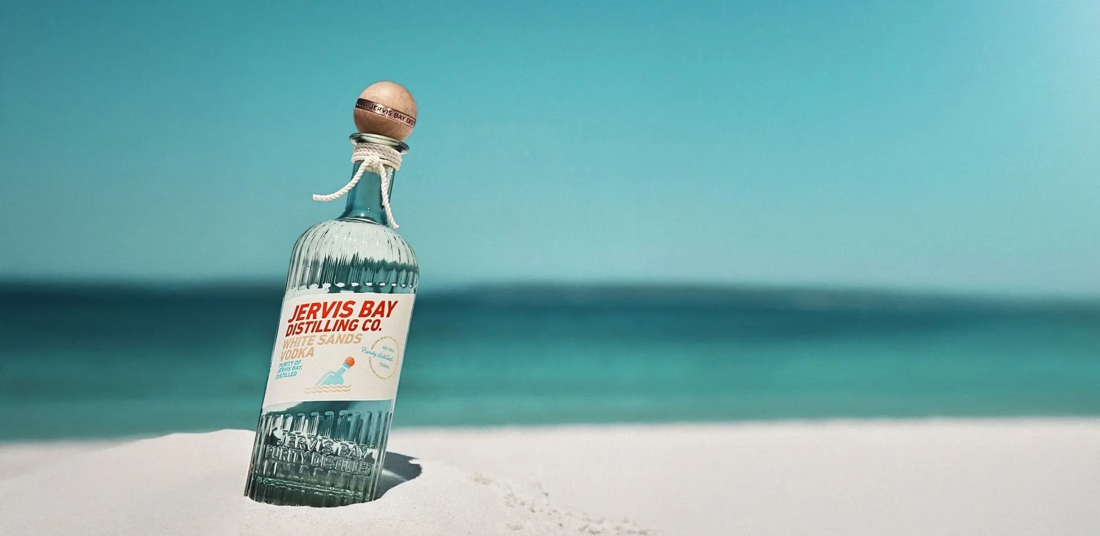
Complete visual identity for Jervis Bay Distilling.
Visual Identity
Visual identity is the design language through which a business becomes recognisable.
It can include the logo, typography, colour, graphic devices, imagery and the principles governing how these elements work together. Each component has a particular role, but its value comes from how the complete system performs.
A successful identity needs to retain its character across very different applications. It may appear on a building sign, a mobile screen, a hotel room card, a restaurant menu, a bottle label or a small social media graphic.
For Jervis Bay Distilling, the identity needed to capture the relaxed character of the NSW South Coast while giving a range of small-batch spirits a strong and coherent presence. The visual system extended from the central identity and bottle design into packaging, photography, signage, merchandise and digital communications.
We develop identities around the real requirements of the business. This allows practical applications to inform the design from the beginning rather than being considered after the central identity has been approved.
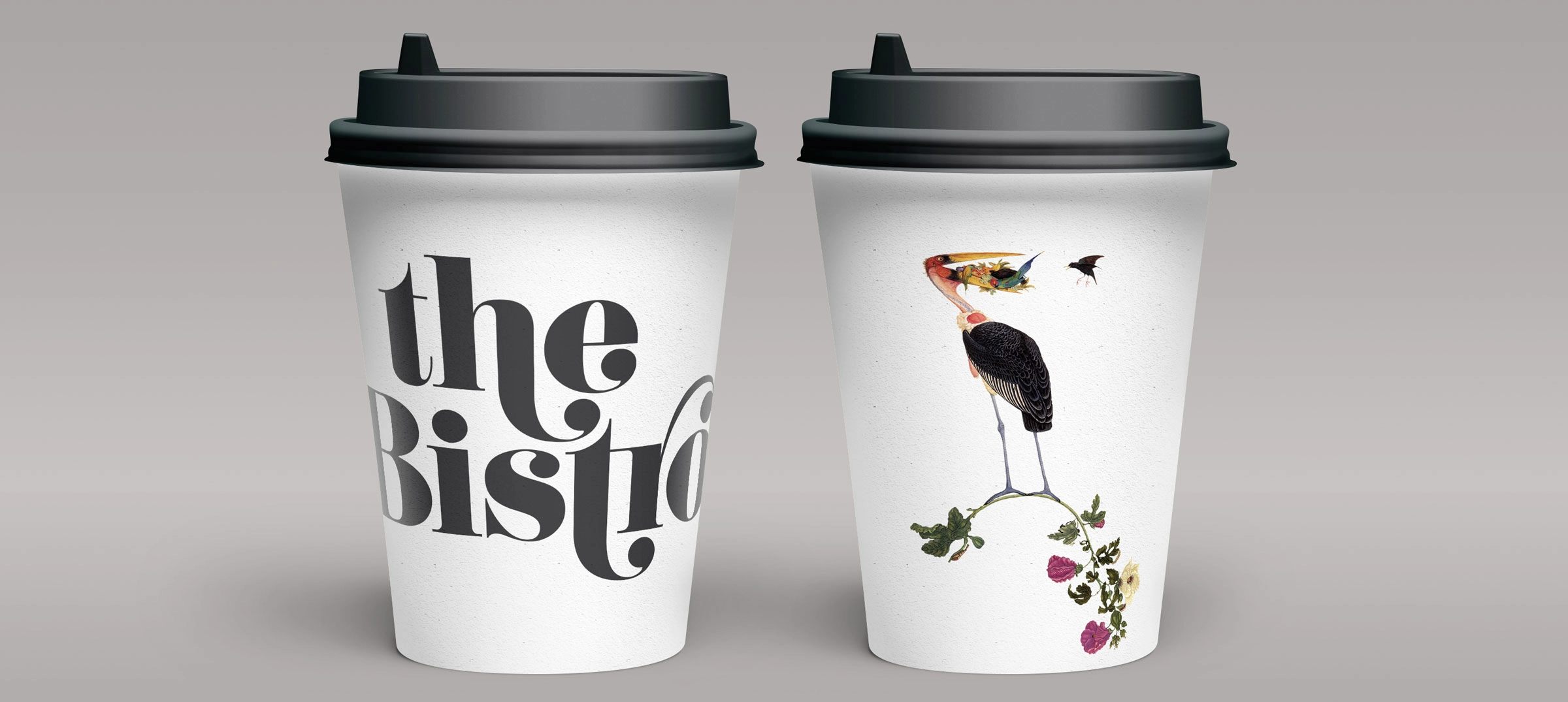
The Bistro — logo and collateral for a contemporary European-style café in Darlinghurst.
Logo Design
A logo gives a business a consistent mark, but it does not carry the complete responsibility for the brand.
We design logos as part of a broader identity system. This involves considering where the mark will appear, how it needs to scale, what it will sit beside and how it relates to typography, colour, photography and other graphic elements.
Depending on the business, an identity may require a primary logo, secondary configurations, wordmarks, monograms, symbols or venue-specific variations. Each version should have a defined purpose rather than being created simply to provide more options.
For The Bistro, the logo was developed as part of a complete identity for a contemporary European-style café in Darlinghurst. The typography and illustrated bird gave the venue a recognisable character that could be carried across signage, menus, cups, printed material, its website and social content.
For an established business, we also consider whether the existing logo needs to be replaced. Sometimes the more useful approach is to retain a recognisable mark while improving the identity system around it.
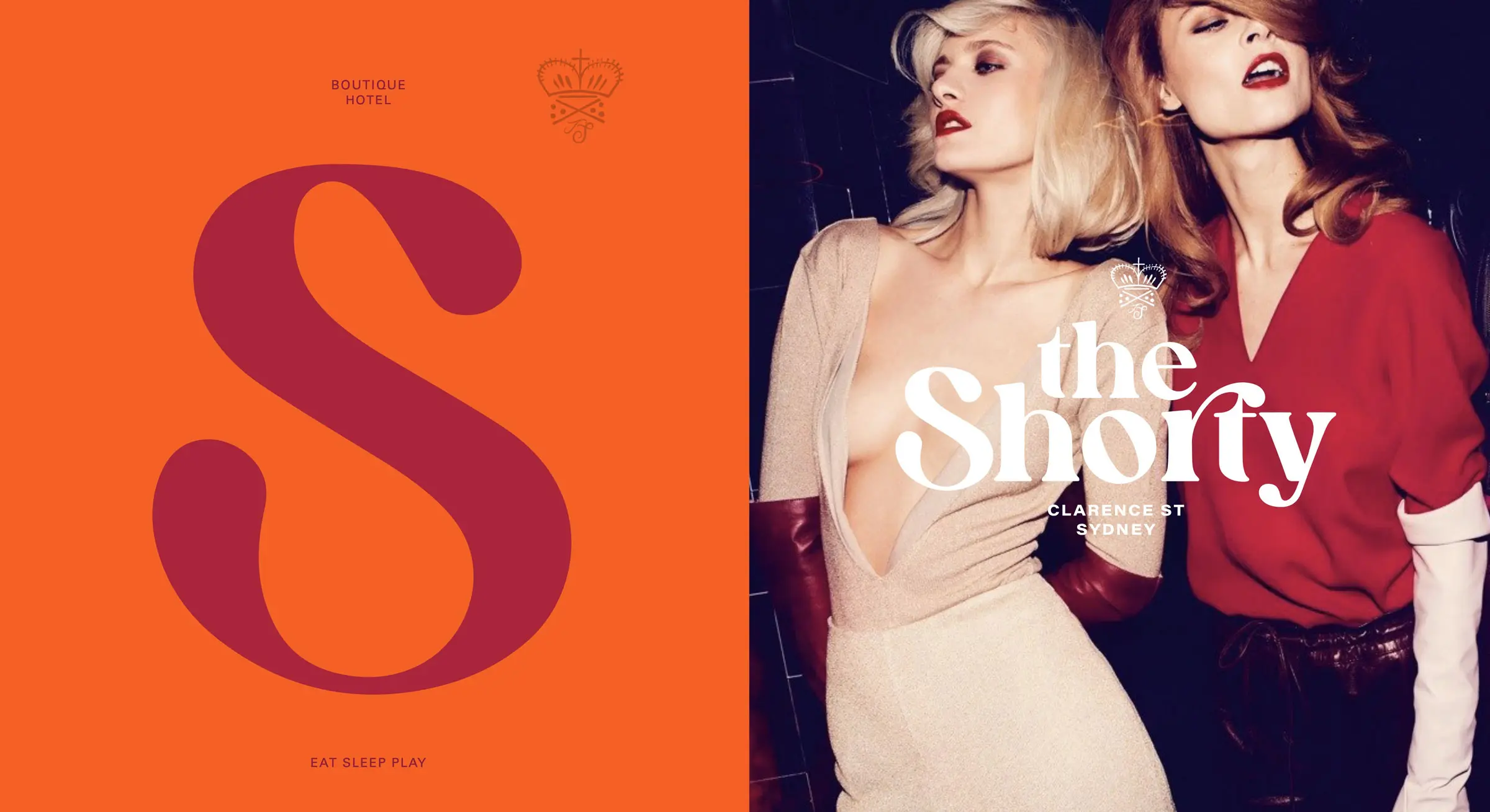
The Shorty Hotel — typography, colour and graphic language for a multi-venue hotel in Sydney’s CBD.
Typography, Colour & Graphic Language
They shape how the brand appears across headlines, long-form content, signage, menus, packaging, websites and internal documents. A well-developed typographic system creates hierarchy and consistency while allowing different kinds of information to be understood clearly.
Colour can distinguish a business within its category, establish continuity and help organise information. The palette must also work under practical conditions: on screens, in print, across different materials and within physical environments.
Graphic devices, patterns, illustrations and compositional principles may be introduced where they give the identity greater range. These elements should serve a clear purpose rather than decorate an otherwise unresolved layout.
For The Shorty Hotel, the graphic language grew from the history of Shorter House, an 1890s ceramics warehouse in central Sydney. Maker’s marks, bold typography, botanical references and glaze-inspired colours created a flexible identity for the hotel, its restaurants, bars and guest experiences.
Each venue could establish its own atmosphere without becoming disconnected from the wider hotel brand.
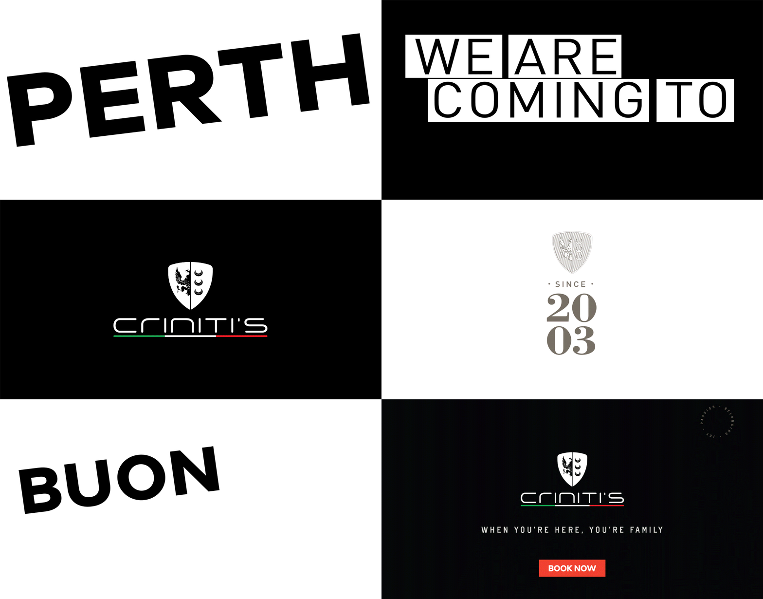
Criniti’s Restaurants — verbal and visual identity for an established Australian restaurant group.
Verbal Identity
Brands are recognised through language as well as design.
Verbal identity defines how an organisation expresses itself once its broader position has been established. This can include tone of voice, key messages, naming conventions, headlines and the language used across websites, marketing material, guest communications and everyday customer interactions.
The purpose is not to create a collection of slogans. It is to give the organisation a clear and consistent way to speak.
This is particularly important in hospitality and wellness, where familiar phrases can make very different businesses sound almost identical. Specific language about place, service, culture and experience is more credible than relying on broad claims.
For Criniti’s Restaurants, the identity needed to retain the warmth, generosity and family energy of the existing business while supporting expansion into new locations. The verbal and visual language was designed to carry that personality across campaigns, outdoor advertising, restaurant collateral, social media and customer communications.
Where a client first needs to establish the business’s purpose, audience, market position or central idea, that work belongs within our separate Brand Strategy & Positioning service.

Karma Spa Bali — wellness branding, photography, packaging and collateral for Karma Group’s destination spas.
Photography & Art Direction
Photography is one of the most visible expressions of an identity.
For hotels and restaurants, it communicates atmosphere, scale, service and the experience of being there. For wellness and consumer brands, it may need to explain a product, build trust or create continuity between packaging, digital communications and retail.
We establish an image direction that supports the identity rather than treating photography as a separate layer of content. This can include subject matter, composition, casting, lighting, locations, colour treatment and the balance between people, product and place.
Our work for Karma Spa Bali developed over six years while we were living in Bali. We produced the art direction and photography alongside packaging, retail concepts, spa menus, signage, marketing collateral and individual spa websites.
The photography needed to communicate more than treatments and facilities. It became part of a sensory identity built around ritual, restoration and the atmosphere of a destination spa.
Where required, we can develop photography briefs, commission photographers, provide art direction and oversee the selection and treatment of final images. The customer should begin to recognise the brand through its imagery before seeing the logo.
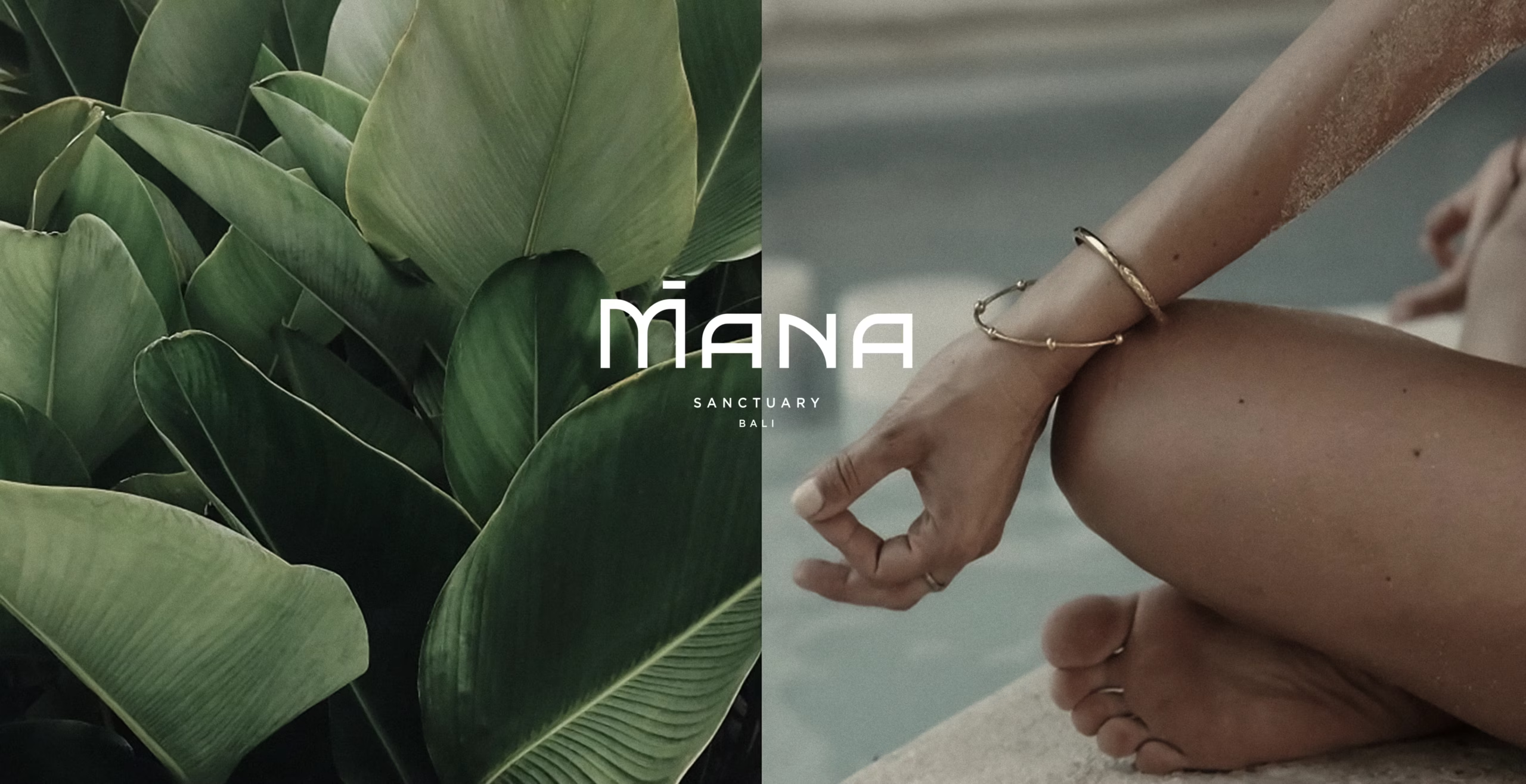
Mana Sanctuary — creating a visual and verbal identity grounded in place, ritual and the experience of retreat.
Hotel & Hospitality Brand Identity
Hospitality identities have to work across an unusually broad range of experiences.
A guest may first encounter a hotel through search, move to its website or booking platform, arrive at the property, find their room, visit its restaurant and interact with menus, signage, amenities and in-room information. Each stage contributes to how the hotel is understood and remembered.
Our hospitality branding work considers how identity moves through this sequence. We develop visual and verbal systems for hotels, restaurants, bars, clubs, spas and destination businesses, connecting digital communications with the physical experience of the venue.
For Mana Sanctuary, the identity needed to express a particular relationship between wellness, ritual, community and place. The work extended across naming, visual identity, language, photography and the website, creating a connected experience for guests discovering the retreat and later arriving in Bali.
The identity of a hospitality business may extend across façades, wayfinding, menus, room collateral, uniforms, packaging, merchandise and food and beverage offers. These applications should not be identical, but they should share enough visual and verbal continuity to belong to the same place.
For owners and operators, that recognition has a commercial role. It can distinguish the property, support direct bookings, build awareness of restaurant and event offers, and help guests remember and recommend the experience.
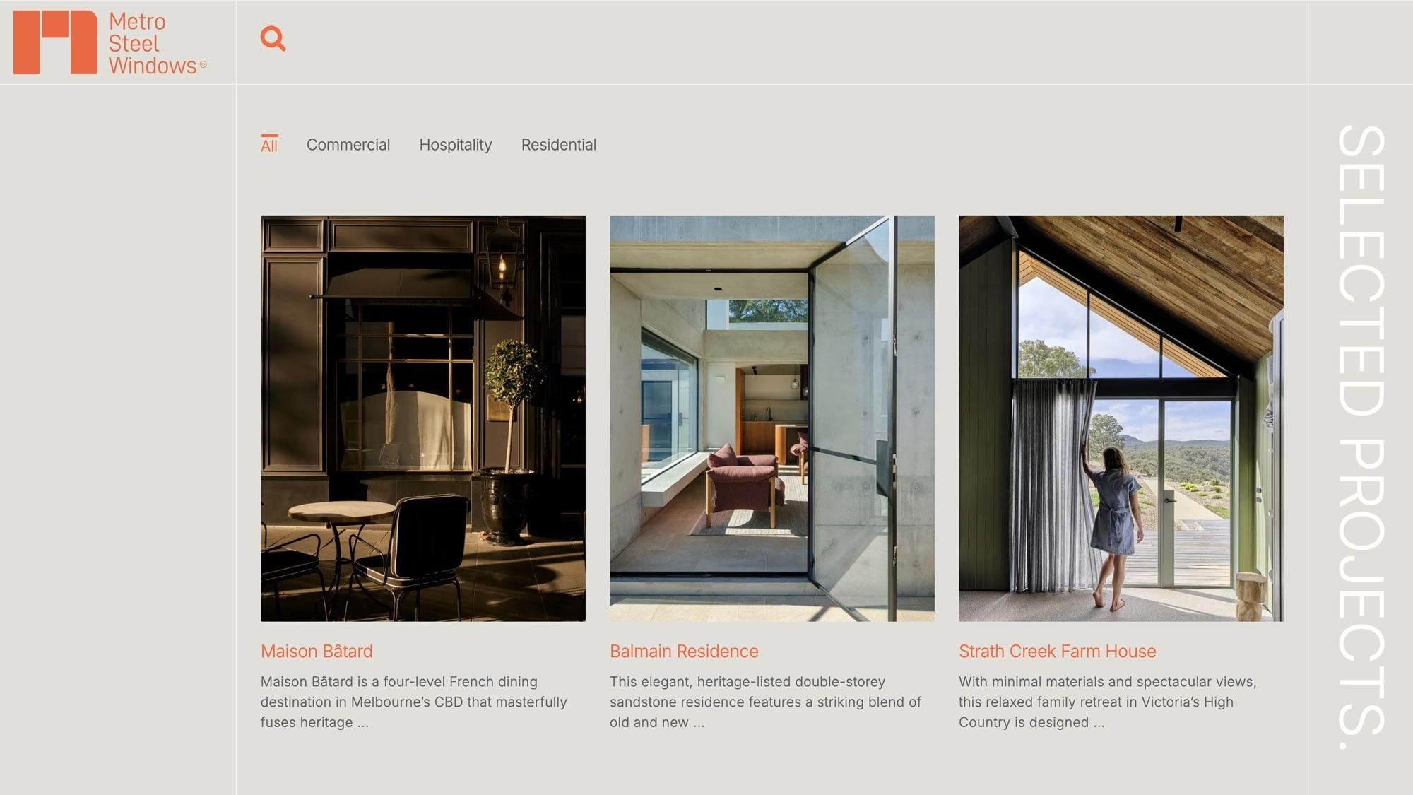
Metro Steel Windows — brand identity and website design developed as one connected system.
Identity Across Digital Experiences
For many customers, the website is where the identity becomes an experience rather than an image.
Typography, colour, photography, movement, content and navigation all influence how the brand is understood. An identity that works in print cannot simply be transferred to a website without considering how people will read, move and make decisions on screen.
Because we work across brand identity and website design and development, we can consider the digital experience while the identity is being created. This is particularly valuable when a new brand and website are developed together.
For Metro Steel Windows, the identity and website were created as connected parts of the same system. The digital experience needed to reflect the precision of the company’s steel windows and doors while helping architects, builders and homeowners understand its products and capabilities.
The relationship between brand identity, website structure and ongoing performance marketing contributed to a sevenfold increase in qualified enquiries within months of launch. It is a practical example of design supporting a measurable commercial outcome.
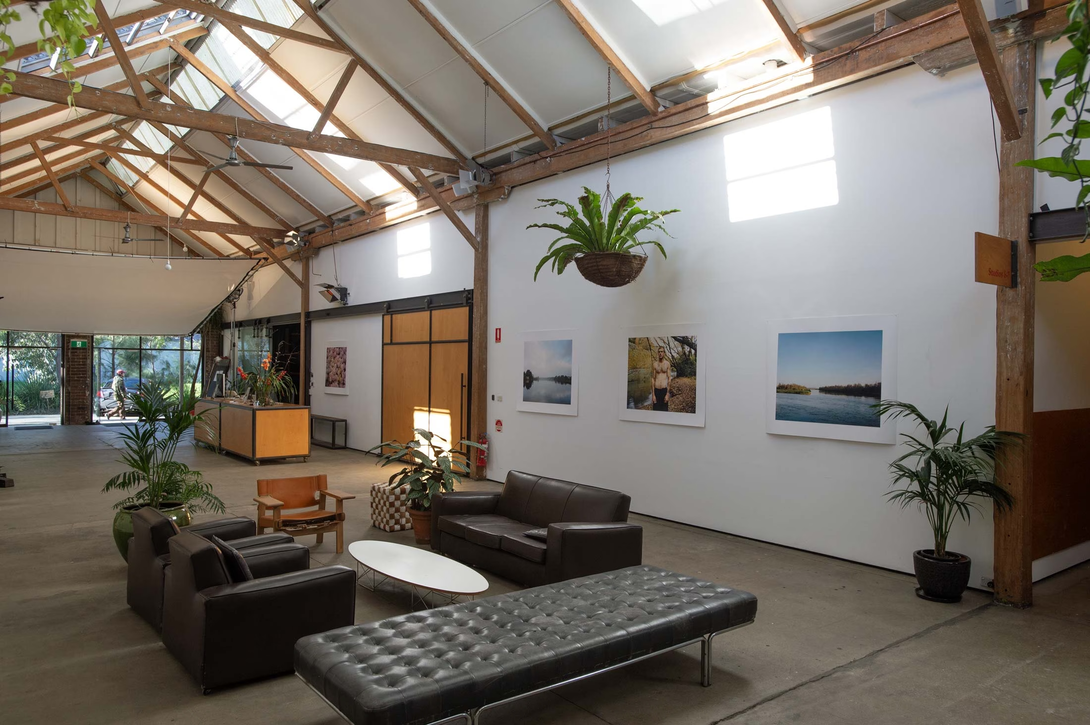
Sun Studios Australia — an identity expressed through signage, vehicles, exhibitions, events and the culture of the place.
Identity Across Physical Environments
For businesses with a physical destination, brand identity extends beyond communications.
Signage, wayfinding, environmental graphics, materials, uniforms, vehicles and printed objects all influence how people understand and move through a place. These applications need to support the environment without becoming an unrelated decorative layer.
Our work across brand environments, signage and wayfinding allows identity to be considered in relation to architecture, interiors and the way people experience a site.
Sun Studios Australia is a useful example. The identity extended across signage, wayfinding, branded vehicles, exhibitions, competitions, events and the culture of a large professional photography facility housed within a former wool store.
The identity did more than identify the business. It helped connect studios, equipment rental, a Canon showroom, set construction, furniture rental, a café and a central event space within one recognisable destination for the photographic community.
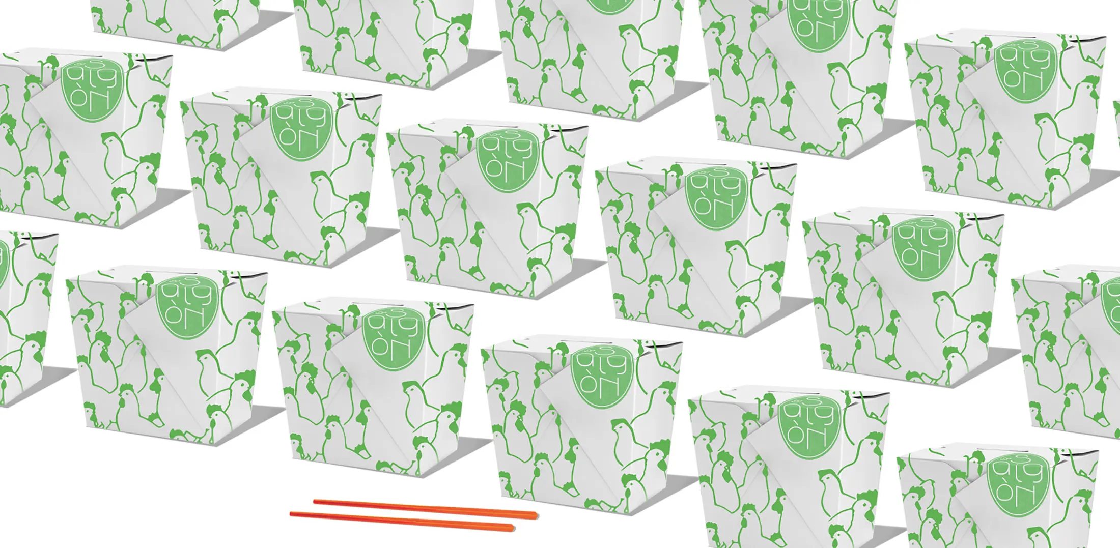
Saigon Street — restaurant branding, packaging and printed collateral for a Bali hospitality venue.
Packaging, Print & Brand Collateral
Physical objects allow customers to hold, use and sometimes take the identity home.
Packaging, menus, brochures, stationery, room collateral, invitations, merchandise and retail material all need to feel part of the same system while responding to their individual purpose.
Our Packaging Design & Retail POS work considers how identity performs across product ranges, printed communications, hospitality collateral and retail environments.
For Saigon Street, the identity extended across menus, takeaway packaging, signage, wayfinding and printed material. These applications allowed the brand to become part of the atmosphere of the restaurant rather than something confined to its logo.
The same principle applies across different sectors. For hotels, identity may be carried through room collateral, minibar material, menus, gifting and merchandise. For beauty and wellness businesses, packaging often needs to organise a large product range while clearly communicating purpose, ingredients and product differences.
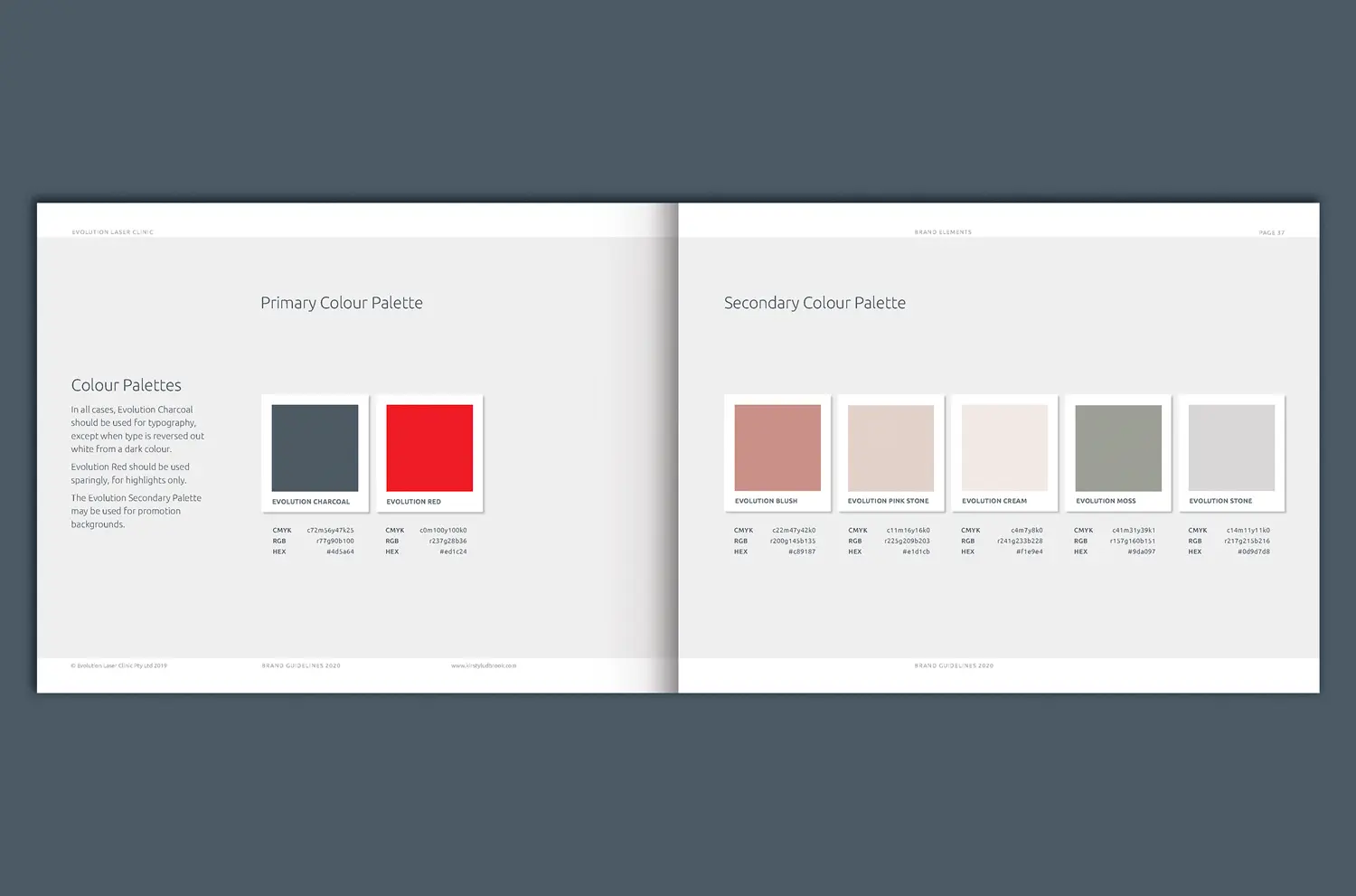
Colour palettes for Evolution Laser Clinics
Brand Guidelines & Toolkits
Brand guidelines turn an approved identity into a system that other people can use.
They explain how the logo, typography, colour, imagery, graphic elements and verbal identity should be applied. The level of documentation depends on the size of the organisation, the number of people using the identity and the range of applications involved.
A smaller business may need a concise guide supported by a carefully organised asset package. A larger organisation may require detailed guidelines, templates, messaging guidance, signage principles, social media formats and instructions for external suppliers.
For a growing national network such as Evolution Laser Clinics, guidelines were essential to maintaining recognition across multiple locations, marketing teams, franchisees and suppliers.
Good guidelines should provide clarity without making the identity rigid. They protect the elements that create recognition while allowing the brand to respond to new content, campaigns and business requirements.
We can also prepare practical brand toolkits containing approved logos, fonts, colours, templates, image libraries and frequently used design assets.
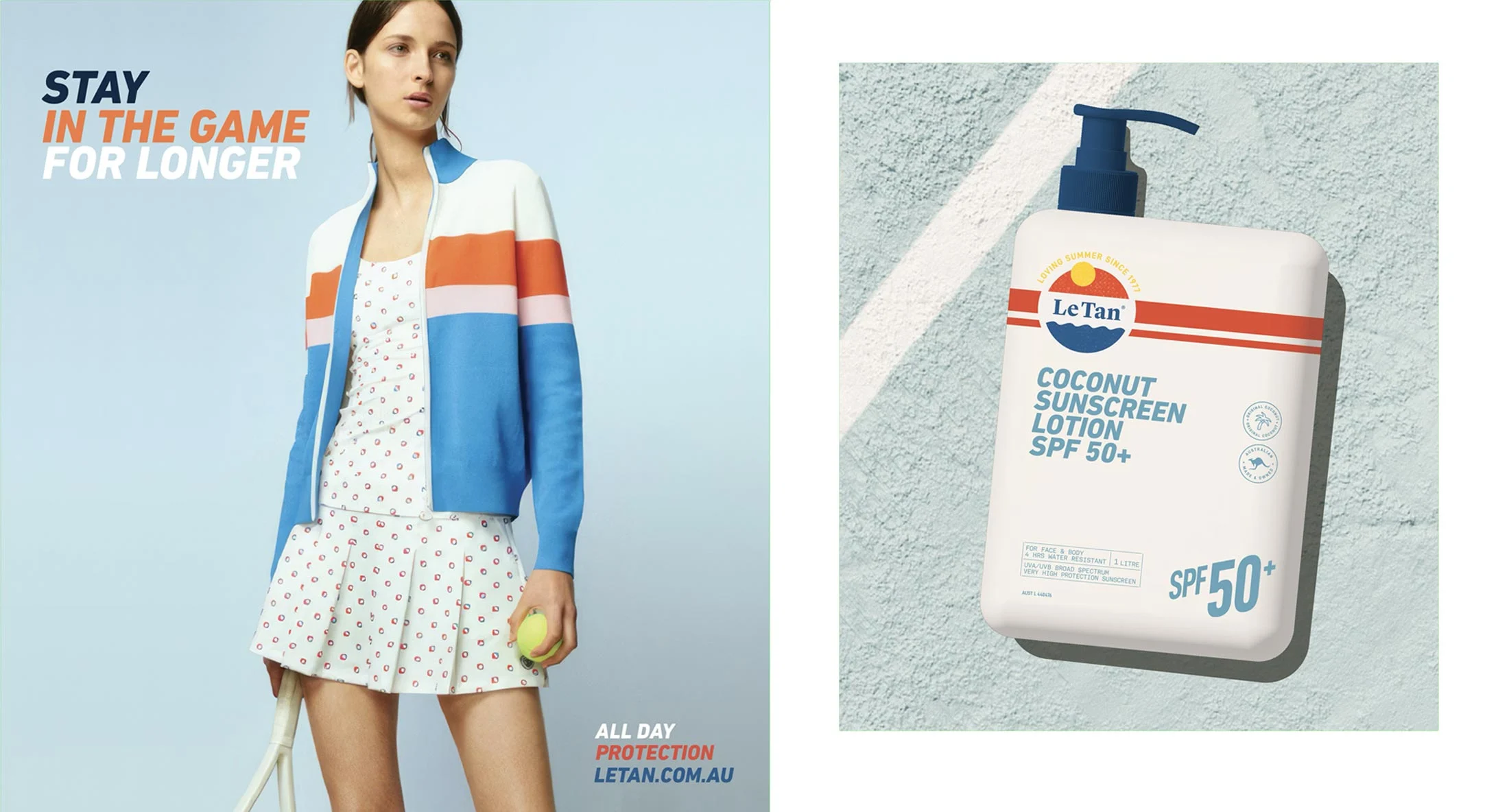
Le Tan — refreshing an established Australian sun care brand while retaining recognition.
Refreshing an Established Identity
The challenge is to reposition a well-known brand without losing its familiarity.
Businesses build recognition through years of use. A familiar name, colour, symbol or typographic element may continue to hold value even when the broader identity has become inconsistent or dated.
We begin by identifying what should be retained and what needs to change. The work may involve refining the logo, improving typography, introducing a more useful colour system, reconsidering image direction or establishing clearer rules across digital and physical applications.
The appropriate degree of change depends on the condition of the existing identity and the direction of the business. An evolutionary refresh can protect recognition while making the brand more relevant and easier to use. A more substantial redesign may be required when the identity no longer represents the organisation or cannot accommodate its current needs.
Our work for Le Tan refreshed an established Australian sun care brand without discarding the familiarity it had built over time. The new system retained recognisable elements while introducing a more confident typographic language, clearer product presentation and a visual direction that could work across packaging, campaigns, retail and digital communications.
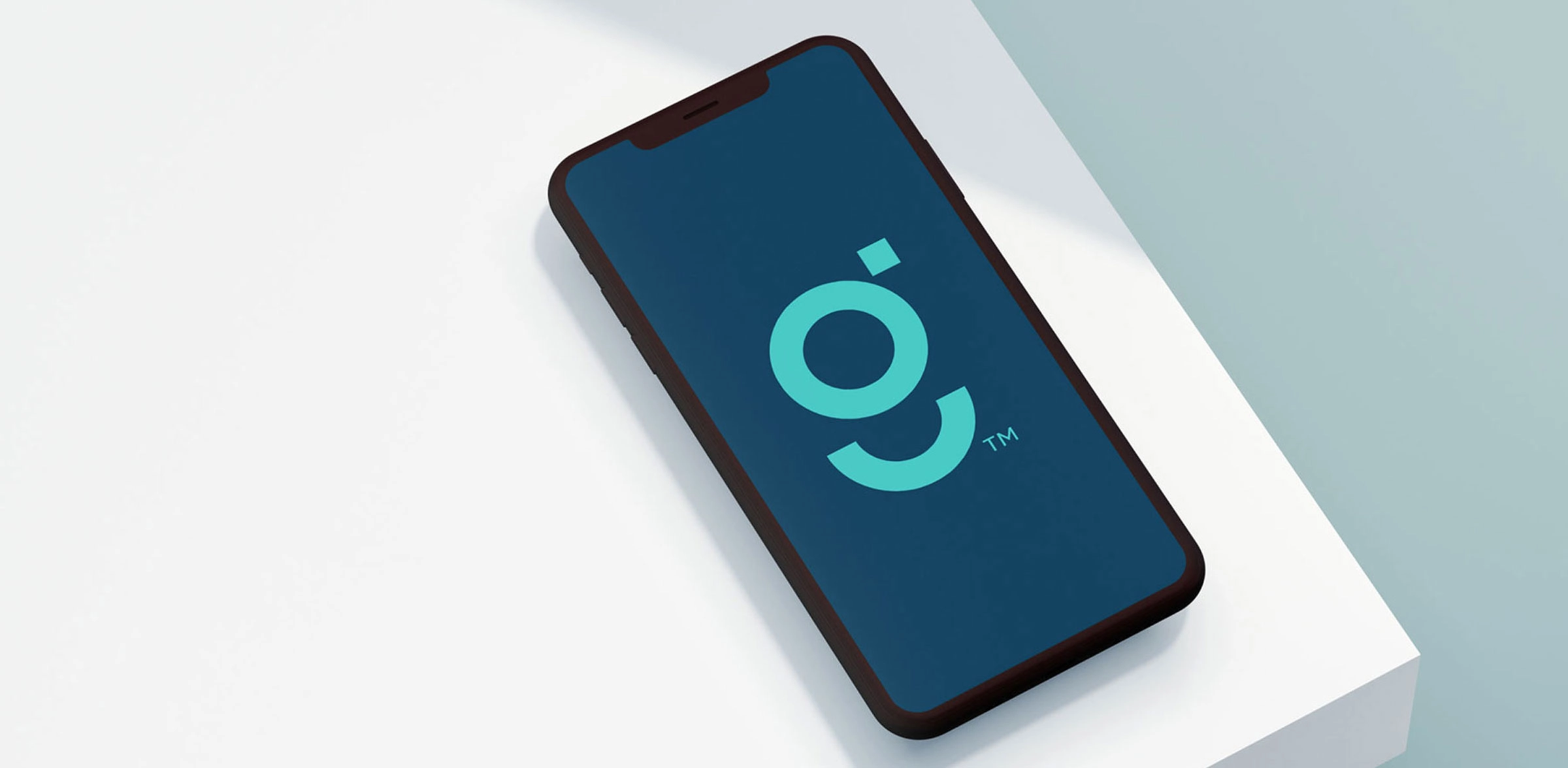
Grei Wealth Management — a clear and recognisable identity for a specialist wealth-management business.
Creating a Practical Identity System
Once the direction of the business is clear, we begin developing the visual and verbal identity.
Initial concepts explore how different combinations of typography, colour, imagery, language and graphic form can express the required character. These are presented as systems rather than isolated logos, allowing the client to see how an idea could work across relevant applications.
Grei Wealth Management demonstrates the value of this approach. A financial-services identity needs to communicate trust and capability without becoming indistinguishable from its category. Testing the identity across digital and business applications showed how the system could remain clear, professional and recognisable in daily use.
The selected direction is refined and tested at different scales and in different settings. For a hospitality client, this might include signage, menus, room collateral and a website. For a consumer brand, it may involve packaging and retail POS. For an architecture or property business, the focus may be digital communications, documents, environmental graphics and site signage.
Following approval, we prepare the final identity assets, guidelines and agreed applications. We can then continue into website design, packaging, print, signage, photography or environmental branding where required.

